The new Coke can that tells you how cold it is
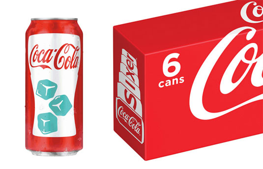
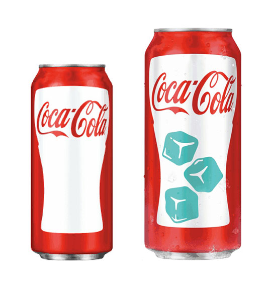
How clever is this? Coke's new Chill Activated Can uses thermochromatic ink to show you whether it's been chilled properly.
Sign up to Creative Bloq's daily newsletter, which brings you the latest news and inspiration from the worlds of art, design and technology.
You are now subscribed
Your newsletter sign-up was successful
Want to add more newsletters?

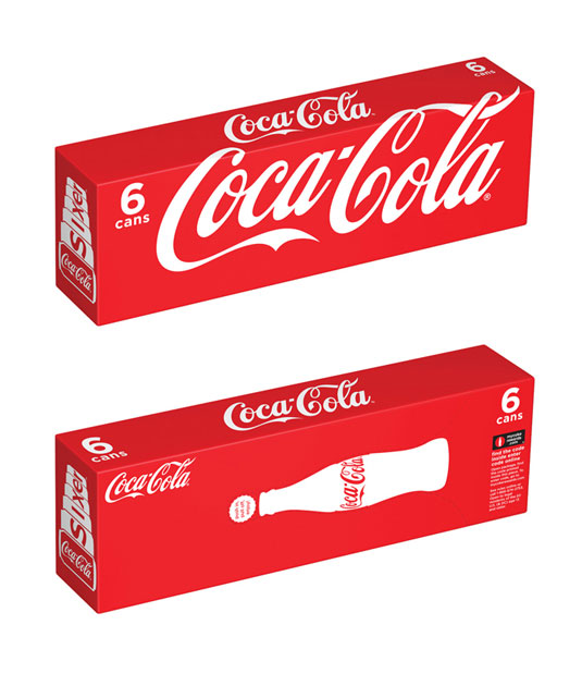
Coca-Cola has one of the most iconic logo designs and packaging designs of any top brand out there. At this year's NACS Show, the drinks-maker unveiled two new packaging designs - The Chill Activator and the Sixer - which aim to save consumer space and enhance the drinking experience.
The Chill Activator consists of ice cubes printed with special thermochromatic ink - when the can is at an ambient temperature, the thermochromatic ink blends into the package, displaying a white contour cup glass with a red Coca-Cola logo. When the can is chilled to 46 degrees, the ink changes colour to reveal three blue-colored ice cubes.
Meanwhile the Sixer can aims to save storage space in the fridge by the box's ability to be stored vertically or horizontally. It's great to see the company innovative with its packaging design like this. We just hope they don't think about messing with their classic logo...
Article continues below 

[via The Dieline]
Like this? Read these!
- The ultimate guide to logo design
- Our favourite web fonts - and they don't cost a penny
- Useful and inspiring flyer templates
What do you make of the new packaging? Let us know in the comments box below!
Sign up to Creative Bloq's daily newsletter, which brings you the latest news and inspiration from the worlds of art, design and technology.

The Creative Bloq team is made up of a group of art and design enthusiasts, and has changed and evolved since Creative Bloq began back in 2012. The current website team consists of eight full-time members of staff: Editor Georgia Coggan, Deputy Editor Rosie Hilder, Ecommerce Editor Beren Neale, Senior News Editor Daniel Piper, Editor, Digital Art and 3D Ian Dean, Tech Reviews Editor Erlingur Einarsson, Ecommerce Writer Beth Nicholls and Staff Writer Natalie Fear, as well as a roster of freelancers from around the world. The ImagineFX magazine team also pitch in, ensuring that content from leading digital art publication ImagineFX is represented on Creative Bloq.
