Project diary: Red Antler's Vevo rebrand
As music video platform Vevo looked to expand its offering, it was time to give the brand a bold new look. That’s when branding consultancy Red Antler stepped in
Sign up to Creative Bloq's daily newsletter, which brings you the latest news and inspiration from the worlds of art, design and technology.
You are now subscribed
Your newsletter sign-up was successful
Want to add more newsletters?
Vevo wanted to create a bold new look to coincide with the launch of VevoTV, with both the channel and the rebrand making their debut at SXSW in March. Vevo creatives had already begun working through a new identity when Red Antler was asked to join the effort.
The design brief
Emily Heyward, Head of strategy, Red Antler
Launched four years ago by parent companies Sony Music International and Universal Music Group, Vevo is the primary – and arguably the only – source on the internet for official music videos. But in terms of brand recognition it still has plenty of room to grow. As an established branding consultancy we were brought in to evolve the Vevo story and help it become the world’s premier brand for music fans across the globe, delivering top quality music experiences any time, anywhere and ultimately expanding into all forms of entertainment. The rebranding exercise coincided with Vevo’s plan to announce the launch of its latest initiative, VevoTV, at SXSW (South by Southwest festival) in March.
Our approach to the rebrand started with us thinking about the core problem that Vevo is solving and what the brand delivers. We decided that even though technology has made music more accessible than ever, the proliferation of choice has actually made it harder for music fans to find high quality, immersive experiences.

When Vevo came to us, it had already done a lot of thinking about the off ering, and the team knew it had to evolve from being a functional platform into a brand that embraced music and music fans. Its internal creative team had started work on a logotype that moved away from its corporate, upper case letterforms in favour of something friendlier and more approachable. We of course respected the work that been done so far, but we also needed to allow ourselves to come up with a fresh perspective. This involved an intensive discovery stage, culminating in a core strategy centred on the idea that Vevo offers entertainment in full force: the chance for true fans to live and breathe music. It was this strategy that provided the basis for everything that followed.
Work in progress
Simon Endres, Creative director
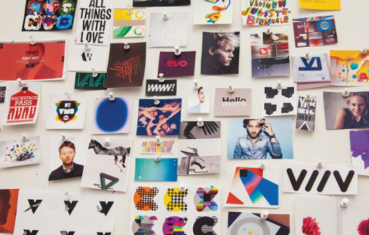
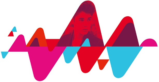
Vevo’s creative team had already started working on a rebrand when Red Antler was brought in, so our job was to continue to evolve what they were doing – to deliver something fresh that had staying power as well. We had the idea to evolve the Vevo marque by creating distinctive asymmetrical ‘V’s, as well as expanding the brand’s use of colour. Red is part of the current brand’s equity, but we brought in a fresher, more vibrant red and developed a bright, pop palette in support.

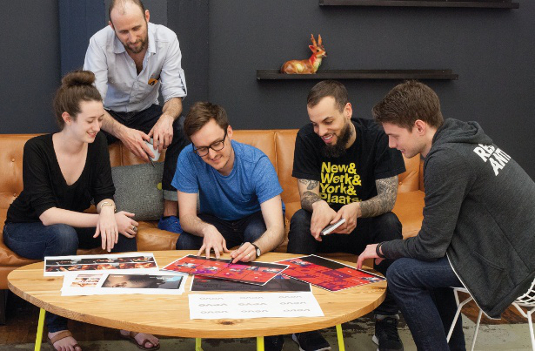
After an afternoon meeting with Vevo’s senior design manager, Mike DiTomo, we worked up three design directions. Vevo’s reaction to all three directions was really positive – in fact, it ended up liking the logotype from one, the tonality from the second and graphic elements from the third. Luckily, the directions were closely enough related that we could build a cohesive brand experience from these different pieces. We spent a week working all these elements into one cohesive direction and then pulled out the logotype and workshopped it intensively – the aim being to create something that expressed the idea and personality of the new brand, and which was robust enough to work across a variety of platforms. In the end we created around 100 diff erent iterations of the custom-drawn logotype, choosing as a secondary typeface National, an amazing typeface family by Kris Sowersby.
One of the biggest challenges we faced was deciding on when it was appropriate to make a big brand statement, and when it was better to strip everything back and let the content speak for itself. Our solution was to deliver a flexible system that can communicate at three different levels, depending on the differing contexts. Developing the remaining brand assets progressed smoothly with additional refinement where needed. TV spots were presented and signed off with a pretty quick turnaround, and overall we felt the collaboration was very seamless.

Conclusion
Rachel Higgins, Account manager
When all our hard work finally went live in March, the reaction couldn’t have been better. Vevo finally had a brand that genuinely reflected its content and how it wanted to move forward – something to help energise its business both internally and externally, with positive feedback from both its partners and advertisers.
It’s been great to see Vevo emerge from under YouTube’s shadow and cast its own distinctive light on the world. The brand has truly come to life on a huge variety of platforms – from YouTube to vevo.com to Roku, Xbox and, of course on mobile apps like Vevo HD for iPad. It was also gratifying to see the ‘V’ app icon appear alongside Facebook, Twitter and so on. But perhaps the biggest reward has come from Vevo’s customers. The rebrand helped Vevo win two top prizes at the Webby Awards in May, scooping Webby Winner and People’s Choice prizes in the Music category.
We’re thrilled about the success of the project, and very excited to have an ongoing relationship with Vevo. As a result of the project we also learned two very important lessons. The first is that developing a fully-fledged brand system is one thing, but creating an entire motion package at the same time is quite another. The second is that working closely with key decision makers can help you deliver some of your best work. Why? Because of the time constraints we were under, our creative teams were forced to work more intuitively, to make decisions more decisively and to engage in more productive dialogue with the client.

We achieved this by creating milestones that ensured both the creative work and the decision making process would be driven as forward as much as possible. It also involved maintaining regular contact with Vevo over the phone, looking through the work that we had posted. We also met with them every two weeks so we could have that critical face time and remind ourselves we were working with human beings.
Sign up to Creative Bloq's daily newsletter, which brings you the latest news and inspiration from the worlds of art, design and technology.

The Creative Bloq team is made up of a group of art and design enthusiasts, and has changed and evolved since Creative Bloq began back in 2012. The current website team consists of eight full-time members of staff: Editor Georgia Coggan, Deputy Editor Rosie Hilder, Ecommerce Editor Beren Neale, Senior News Editor Daniel Piper, Editor, Digital Art and 3D Ian Dean, Tech Reviews Editor Erlingur Einarsson, Ecommerce Writer Beth Nicholls and Staff Writer Natalie Fear, as well as a roster of freelancers from around the world. The ImagineFX magazine team also pitch in, ensuring that content from leading digital art publication ImagineFX is represented on Creative Bloq.
