CHECK THIS OUT! New Nike FC Barcelona shirt typeface
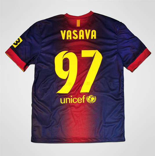
Here is the stylish new custom font for global soccer giant FC Barcelona's latest Nike football shirts by Studio Vasava - and it's inspired by Antoni Gaudi's chimneys!
Football's back! Okay, not everyone loves soccer (a quick vote in the Creative Bloq office demonstrates only a minority interest...), but scratch beneath the surface and there's always something fascinating to be found - as Ben Steers has discovered...

Take the typefaces used on the brand-new 2012/13 kits of one of the world's biggest clubs, FC Barcelona. These are custom fonts, created by the Catalan capital's Studio Vasava and commissioned by Nike, Barca's kit manufacturer.
Vasava has an 18-strong workforce which specialises in cross-media projects for internationally recognised clients such as Nike, Rocawear, Adobe, Diesel, and Red Bull.
Article continues below 
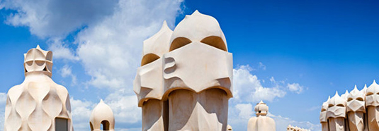
Having worked on numerous Nike sporting projects in the past, the team at Vasava took inspiration for the typeface from one of the city's most celebrated architects - Antoni Gaudi. The studio explained how they took inspiration from, "the subtle cuts and angles of the chimneys of Gaudi's Pedrera", when creating this unique typeface.

The typeface itself is a contemporary sans-serif with a clean, dynamic feel. Something I imagine would have been an essential part of the brief, as the typeface will have to be visible from long distances.
The introduction of the cuts, as influenced by Gaudi's architecture, add not only a subtle reference to the city's cultural history, but also an energy and depth which don't detract from the characters' style and legibility.
Ben Steers is co-founder and managing director of Fiasco Design, a small creative agency delivering big results.
Sign up to Creative Bloq's daily newsletter, which brings you the latest news and inspiration from the worlds of art, design and technology.
Like this? Then read these!
What do you think of the Barca typeface? Have you spotted any cool fonts on this season's football kits? Tell us in the Comments below!

The Creative Bloq team is made up of a group of art and design enthusiasts, and has changed and evolved since Creative Bloq began back in 2012. The current website team consists of eight full-time members of staff: Editor Georgia Coggan, Deputy Editor Rosie Hilder, Ecommerce Editor Beren Neale, Senior News Editor Daniel Piper, Editor, Digital Art and 3D Ian Dean, Tech Reviews Editor Erlingur Einarsson, Ecommerce Writer Beth Nicholls and Staff Writer Natalie Fear, as well as a roster of freelancers from around the world. The ImagineFX magazine team also pitch in, ensuring that content from leading digital art publication ImagineFX is represented on Creative Bloq.
