Helvetica reimagined as a hotel
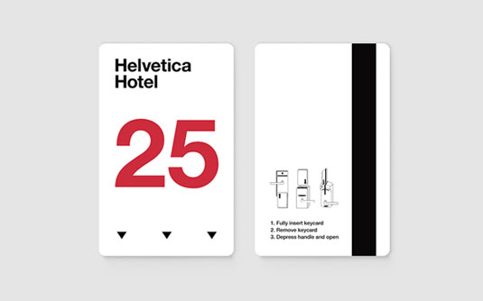
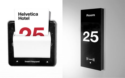
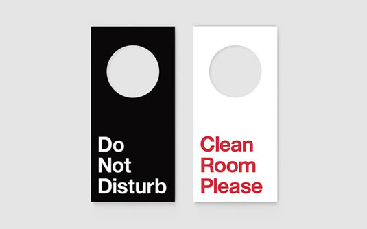
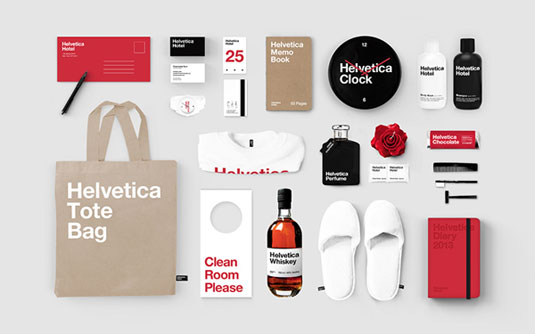
Designer Albert Son has reimagined the Helvetica font as a hotel, creating this beautiful branding in the process.
Sign up to Creative Bloq's daily newsletter, which brings you the latest news and inspiration from the worlds of art, design and technology.
You are now subscribed
Your newsletter sign-up was successful
Want to add more newsletters?
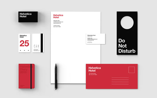
Everyone has their favourite typography design - and what is typography if it's not something that combines communication with passion? New York based designer Albert Son loves Helvetica so much that he decided to embark on a personal typography project. Here, he has created branding for an imagined Helvetica Hotel and it's really rather wonderful.
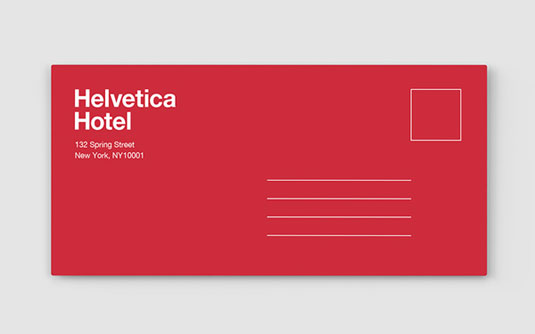
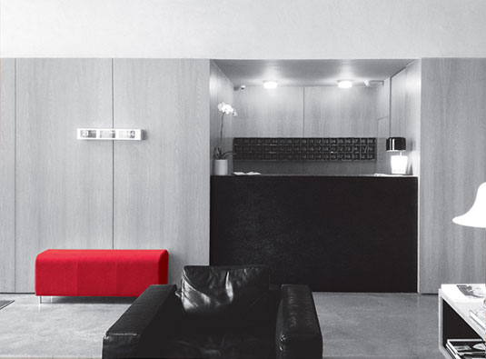
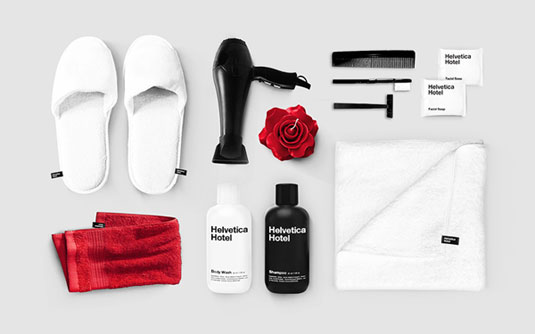
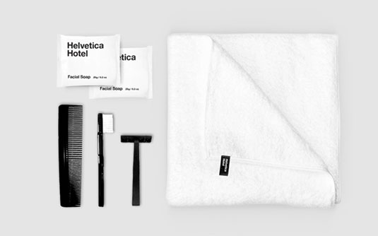
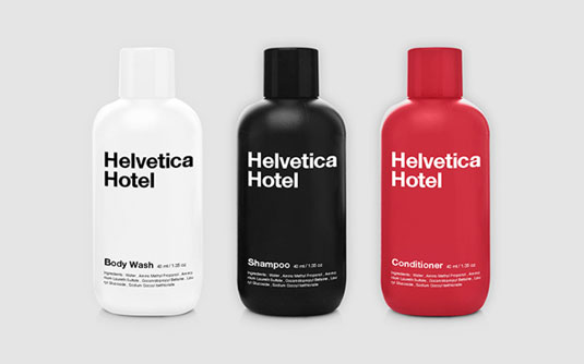
"Essential themes of the branding is based on the attributes of the typeface, which is neutral, clean, simple," Son explains. "As it's most beautiful when it's by itself, focus of the overall branding was on keeping everything simple and clean in terms of typography as well as use of colours".
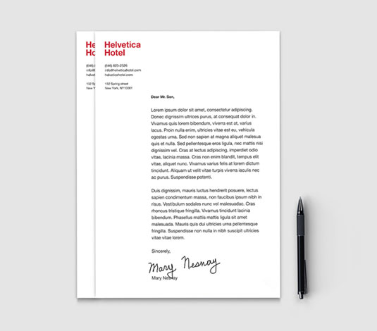
There's plenty of hotel products reimagined in the 'Helvetica' way, including business cards, shampoo bottles, letterheads and tote bags. Clean, crisp, simple and fresh, we'd certainly stay at the Helvetica hotel any time!
Article continues below 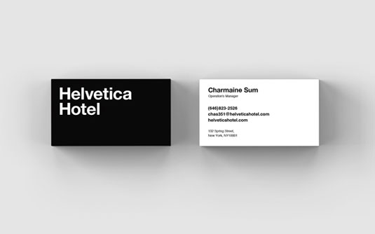
See more work from Albert Son over on Behance.
Like this? Read these!
- Free tattoo fonts for designers
- Create a perfect mood board with these pro tips
- The ultimate guide to logo design
What do you think of this hotel branding? Let us know in the comments box below!
Sign up to Creative Bloq's daily newsletter, which brings you the latest news and inspiration from the worlds of art, design and technology.

The Creative Bloq team is made up of a group of art and design enthusiasts, and has changed and evolved since Creative Bloq began back in 2012. The current website team consists of eight full-time members of staff: Editor Georgia Coggan, Deputy Editor Rosie Hilder, Ecommerce Editor Beren Neale, Senior News Editor Daniel Piper, Editor, Digital Art and 3D Ian Dean, Tech Reviews Editor Erlingur Einarsson, Ecommerce Writer Beth Nicholls and Staff Writer Natalie Fear, as well as a roster of freelancers from around the world. The ImagineFX magazine team also pitch in, ensuring that content from leading digital art publication ImagineFX is represented on Creative Bloq.
