This tasty typography turns food into words
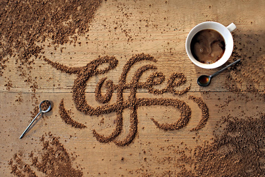
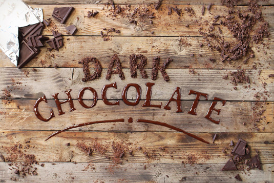
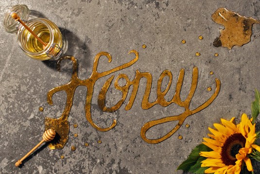
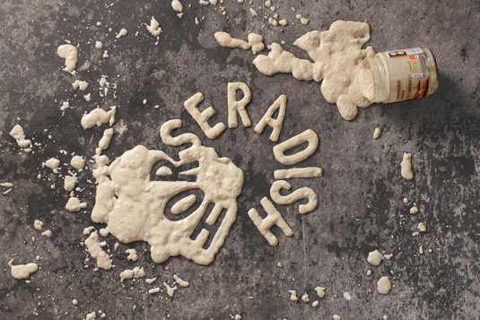
Top creative agencies created this edible typography for Sainsbury's 'Twist Your Favourites' campaign.
Sign up to Creative Bloq's daily newsletter, which brings you the latest news and inspiration from the worlds of art, design and technology.
You are now subscribed
Your newsletter sign-up was successful
Want to add more newsletters?

Five times a week
CreativeBloq
Sign up to Creative Bloq's daily newsletter, which brings you the latest news and inspiration from the worlds of art, design and technology.

Once a week
By Design
Sign up to Creative Bloq's daily newsletter, which brings you the latest news and inspiration from the worlds of art, design and technology.
Once a week
State of the Art
Sign up to Creative Bloq's daily newsletter, which brings you the latest news and inspiration from the worlds of art, design and technology.
Seasonal (around events)
Brand Impact Awards
Sign up to Creative Bloq's daily newsletter, which brings you the latest news and inspiration from the worlds of art, design and technology.
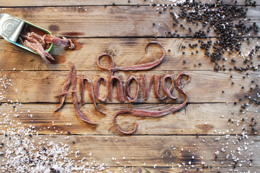
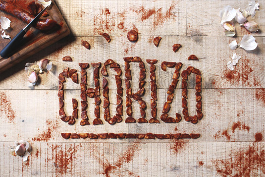
Typography doesn't come more tasty than these creations cooked up by Analog Folk in partnership with Side by Side, two creative agencies who produce mouth-watering work.
Designed to create a connection between the type and the ingredient, this bespoke lettering was made for Sainsbury's 'Twist Your Favourites' advertising campaign.
The idea for the campaign was beautifully simple – liven up your favourite dishes by adding an unexpected ingredient. Launched across Sainsbury's social media channels and online adverts in September, these wordmarks were all handmade with props sourced from antique shops.
Would these culinary creations encourage you to put coffee in your spaghetti bolognese, or sprinkle dark chocolate into your chilli con carne? Explore the images below and find out – and check out our piece on Food art for more culinary creations.
Liked this? Read these!
- This book will improve your web typography
- 20 websites with brilliant typography
- Web trends 2015-2016: dynamic typography
Sign up to Creative Bloq's daily newsletter, which brings you the latest news and inspiration from the worlds of art, design and technology.

Dom Carter is a freelance writer who specialises in art and design. Formerly a staff writer for Creative Bloq, his work has also appeared on Creative Boom and in the pages of ImagineFX, Computer Arts, 3D World, and .net. He has been a D&AD New Blood judge, and has a particular interest in picture books.
