UI design pattern tips: related content
In the fourth of a series looking at website design patterns, Chris Bank of UXPin looks at related content.
Sign up to Creative Bloq's daily newsletter, which brings you the latest news and inspiration from the worlds of art, design and technology.
You are now subscribed
Your newsletter sign-up was successful
Want to add more newsletters?
Once someone starts using your website or web application, they need to know where to go and how to get there at any point. If they can’t navigate through your your application easily, you’ll quickly lose them. Thus, designing effective navigation in your web application is crucial.
In this series for Creative Bloq, Chris Bank of UXPin, the UX design app, discusses the importance of navigation design patterns and details examples from some of the hottest websites and web apps today.
For more examples of web design patterns, download UXPin’s free e-book, Web UI Design Patterns 2014.
Article continues belowThe problem
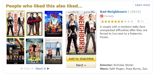
The user wants to browse similar content if the current content isn’t exactly what they’re looking for or they simply want more.
The solution
Show similar or related content to help the user find more items that are similar to what they’re currently viewing.

This is becoming an essential UI pattern for web apps that feature user-generated content. It's similar to Recommendations (pattern 3 in our series) although rather than tailoring the suggestions based on the user’s preferences or previous activity, Related Content is more about showing related items based on the way they are categorized and tagged.

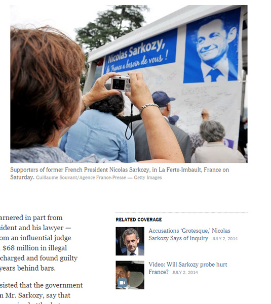
Amazon, TIME and New York Times are good examples of sites that show items and stories similar to the one currently being viewed. Medium takes this a step further by allowing readers to suggest related content by adding a link to the article’s Further Reading section.
Sign up to Creative Bloq's daily newsletter, which brings you the latest news and inspiration from the worlds of art, design and technology.
Words: Chris Bank
Chris Bank is the growth lead at UXPin, a UX design app that creates responsive interactive wireframes and prototypes.

The Creative Bloq team is made up of a group of art and design enthusiasts, and has changed and evolved since Creative Bloq began back in 2012. The current website team consists of eight full-time members of staff: Editor Georgia Coggan, Deputy Editor Rosie Hilder, Ecommerce Editor Beren Neale, Senior News Editor Daniel Piper, Editor, Digital Art and 3D Ian Dean, Tech Reviews Editor Erlingur Einarsson, Ecommerce Writer Beth Nicholls and Staff Writer Natalie Fear, as well as a roster of freelancers from around the world. The ImagineFX magazine team also pitch in, ensuring that content from leading digital art publication ImagineFX is represented on Creative Bloq.
