How to use flat design intelligently
Flat design continues to be popular - but can easily backfire if you don't use it properly, says Josh Kimnell of Collider.
Sign up to Creative Bloq's daily newsletter, which brings you the latest news and inspiration from the worlds of art, design and technology.
You are now subscribed
Your newsletter sign-up was successful
Want to add more newsletters?
Christopher Columbus may well have made it his life's work to prove that the world was round, but in the world of design, flat is where it's at. In the last few years we've seen a significant shift in web design and app design away from rich and detailed, to minimal and flat design.
It's not necessarily that we as designers have fallen out of love with rich design. I'd suggest that we've simply rediscovered a more concise mode of visual communication in digital.
It's a design ethos that has been around for a long time but has only been fit for digital application in recent years now that the technology and the user base has matured.
Article continues belowSwiss influence

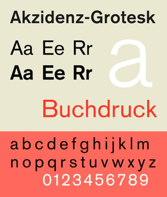
Flat design and its principles are not new: they've been around since the 1920s. If we look at Swiss Style (aka International Style) graphic design, we see that it is characterised by simplicity, vibrant fields of colour and bold typography.
These visual hallmarks are not accidental but rather define an approach to design that advocates form following function. As Antoine de Saint-Exupéry would say: "Perfection is achieved, not when there is nothing left to add, but when there is nothing left to remove."
And although that level of simplicity might appear easy to achieve, it does in fact throw your few design choices into focus. Proportion, white space, typography and information hierarchy are all exposed. So why go to all that effort?
An evolving style

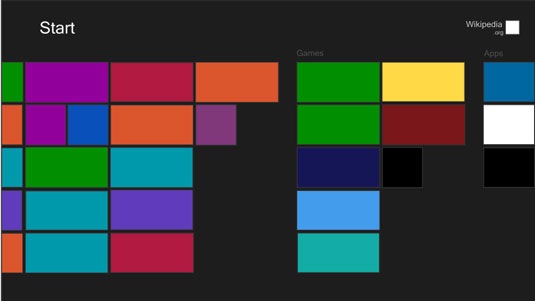
The answer to that question is evolution. One of the first and most highly visible examples of flat design in digital was Microsoft's Metro design language. The intention at the time was to create an experience that was authentically digital and worked on big screen and small, touchscreen or not.
Sign up to Creative Bloq's daily newsletter, which brings you the latest news and inspiration from the worlds of art, design and technology.
Their opinion, and an opinion that has been widely adopted since, is that we are all used to using technology now.
We're used to interacting with computers whether they sit on our desk or in our pocket and the obscuring surface that is the interface was becoming unnecessarily convoluted and pointlessly decorative for our highly evolved brains. We're now comfortable dealing with abstract concepts and nuanced control mechanisms like hidden and contextual menus.
Authentically digital
Flat design in web design is an extension of that 'authentically digital' ethos. We acknowledge that an online florist doesn't actually have to look like a bricks and mortar florist on screen for today's audience to understand it, but it also represents the way in which technology shapes our design choices.
The tools at hand - CSS3, HTML5, JavaScript and the growing importance of responsive web design - mean that we tend towards creating highly performant, extensible front-ends without the excess baggage of a highly embellished graphical user interface.
There are, however, certain pitfalls to avoid when making the switch from lumpy to flat.
Dangers of flat design

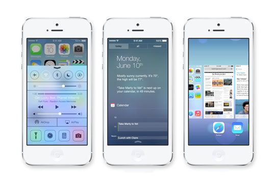
From an aesthetic standpoint there is the fear that you'll look dated if you don't do the 'flat' design thing - and so you might be itching to jump on the bandwagon. But as evidenced by the release of iOS 7, there is the very real possibility of failure.
This initially patchy and inconsistent interface, together with an awful mapping service, was widely seen as Apple playing catch-up with Windows and Google and generally botching the task. For a company with such a storied history of iconic design this was a big and unexpected misstep.
If negotiated elegantly and executed with skill the switch to 'flat' will leave you with something clean, powerful and effective - such as these examples of flat design done right.
Unlike the trendy, transient and fickle stylistic choices of Web 2.0, the glossy button and gradients look we all came to hate, flat design - or at least the principals, which govern it - should stick around for a good while yet.
Words: Josh Kimnell
Joshua Kimnell is senior creative at Collider, a 360 agency, specialising in integrated launch communications strategies.

The Creative Bloq team is made up of a group of art and design enthusiasts, and has changed and evolved since Creative Bloq began back in 2012. The current website team consists of eight full-time members of staff: Editor Georgia Coggan, Deputy Editor Rosie Hilder, Ecommerce Editor Beren Neale, Senior News Editor Daniel Piper, Editor, Digital Art and 3D Ian Dean, Tech Reviews Editor Erlingur Einarsson, Ecommerce Writer Beth Nicholls and Staff Writer Natalie Fear, as well as a roster of freelancers from around the world. The ImagineFX magazine team also pitch in, ensuring that content from leading digital art publication ImagineFX is represented on Creative Bloq.
