With just over a month until its release, not one but two new posters have arrived for the 25th James Bond film, No Time To Die – and one of them has finally got us excited.
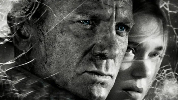
The first poster, shared by the official 007 social media channels on Friday, is giving us serious Sin City vibes. It's a moody, monochrome affair, and we're wondering if it means that No Time to Die will will be taking Daniel Craig's final appearance as 007 into grittier territory. Either way, we like it – and it's the closest any No Time to Die poster has come to our best poster designs list.

We're big fans of the film's typographical logo (in lovely Futura Black) and are rather enjoying that the designers have colour-matched it to Craig's eyes. The new poster also confirms our suspicion that said eyes are so blue, they should have their own Pantone. (If you'd like to create your own Bond stare, perhaps use the RH Hover Color Picker from our list of photoshop plugins?)
Less impressive to us is the new IMAX exclusive poster, featuring Bond doing some Sid James-style gurning while riding a Massive Motorbike. While the trailers have promised that the new film will "change everything", all this poster tells us is that Daniel Craig's last ride as 007 will involve some dangerous two-wheeled driving. Nothing new there, then (unless we're looking at 007's cycling proficiency test).

There's also little that screams 'Bond' here. "If you could swap out Craig's head with another actor in a Bond poster and it doesn't feel out of place," says Reddit user Ryecue, "it's a bad Bond poster." We can't help but agree – it's all a bit Fast & Furious.
Aside from the new black-and-white offering, we've been disappointed by No Time to Die's poster campaign. We were particularly unimpressed by the initial teaser poster (below), an extremely basic effort featuring the title slapped over an image of a shifty looking 007 apparently trying to making an inconspicuous exit from somewhere he shouldn't have been.

And of course, who can forget the subsequent, tantalising series of posters (below), in which the film's minor characters seemed to be showing off their LinkedIn profile pictures?

Taken as a whole, No Time to Die's poster campaign leaves us wishing the studio had taken more time to design. Still, the new monochrome poster finally has us excited for Daniel Craig's 007 swansong, and intrigued about where it'll be taking the character. If there's another poster to come, we're hoping for more black-and-white, and less motorbike.
Read more:

