If you're trying to choose the right logo colour for your next project, there's a lot to consider. The psychology of colour plays a pivotal role in building a brand association, whether you’re crafting a symbol-based logo or a wordmark. Not only do different colours provoke different emotions, but the combinations of colours used can have specific effects, too.
The world's biggest brands are very aware of how important their logo colours are, from Cadbury's ownership of specific shade of purple to brands using green to appear more environmentally conscious. Below, we offer five tips to help you successfully use colour theory in your logo design work. If you'd like to learn to help guide your choice of the right logo colour, see our guide to colour theory. For more general advice, see our pieces on how to design a logo design and steps for creating better logos.
How to use colour theory to choose your logo colour
01. Understand the colour wheel
At the core of colour theory is the colour wheel, an essential tool for combining colours in different ways that was originally sketched by Sir Isaac Newton in 1666. The most common version features 12 colours, based on the ‘RYB’ colour model.
Here, the primary colours are red, yellow and blue, with the three secondary colours (green, orange and purple) created by mixing two primary colours. Finally, six tertiary colours are created by mixing primary and secondary colours.

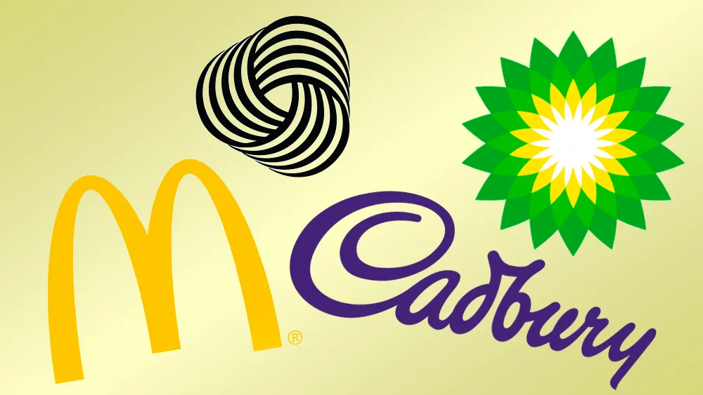
There are six main techniques for creating pleasing logo colour harmonies using a colour wheel, as shown in the above image. Complementary colours are opposite each other on the wheel (such as red and green, eg. Heineken, or blue and yellow, e.g. IKEA, which tweaked its logo design very slightly in 2019); analogous colours sit next to each other on the wheel; and triadic colours involve three evenly spaced colours around the wheel.
Other schemes include split-complementary (which uses two colours adjacent to the main base colour’s complement); rectangular, a four-colour scheme based around two complementary pairs; and finally square, another four-colour scheme where, unlike rectangular, the colours are evenly spaced. For example, IKEA’s complementary colour scheme is instantly recognisable, and makes for a punchy, high-contrast logo design.
02. Manage logo colour schemes carefully
Many of the colour harmonies above require careful management in order to be successful in a logo design, and colours often shouldn’t be used in equal quantities.
Complementary colours can be too intense if used excessively, for instance, while analogous schemes have the opposite problem: they are gentle and pleasing to the eye, but lacking in contrast – and you should select a dominant colour, using the others as support and accent colours only.

Landor’s rebrand of BP attracted its fair share of controversy for ‘greenwashing’ the oil giant, but one thing’s for sure: it’s a great example of an analogous colour scheme.
Triadic schemes are much more vibrant, but again pick one dominant colour of the three. For beginners, it’s often safest to opt for a split-complementary scheme as there’s a good natural balance of contrast and harmony.
Rectangular and square schemes are both relatively versatile given the extra colour to play with, but again one should always be dominant – and you should pay particular attention to the balance between warm and cool colours.
03. Use logo colour to control mood

Like BP, McDonald's is an example of an analogous colour scheme – but on the warm side of the spectrum, to invoke feelings of happiness and fun. Your choice of colour palette can make or break a logo design, partly for simple aesthetic reasons, but also because of the psychological associations of colours. On a simple level, colours on the warm side of the spectrum – such as red and yellow – are bold, uplifting and energetic, while their cooler counterparts, blue and green, exude calmness and feel more reserved.
This is particularly relevant when it comes to branding: on an emotional level, in terms of how consumers feel when they look at it; but also on a practical level, in terms of market standout.
Read our designer’s guide to using colour in branding for more on this.
04. Research sector-specific logo colour trends
A brand 'owning' a colour in its sector can provide an enormous competitive advantage, achieving instant recognition – in some cases even without a logo, or even a mention of its name.
Of course, owning an entire colour isn't easy, and it goes way beyond the logo design: skilful planning and execution is needed across all elements of the brand and its advertising.
Depending on the popularity and market saturation of a particular colour, we could be talking as specific as an officially registered Pantone shade (such as Cadbury 2685C), or as general as being the only brand in competitive set to use that colour.
In order to achieve colour-based standout in any given market sector, the first step is to understand what the prevailing trends are – blue, for instance, is commonly used in the financial sector, while green is frequently found in branding for environmental organisations. Sometimes it pays to avoid the obvious.
05. Don’t forget black and white

After all this talk of colour, it’s easy to forget that some of the world’s most iconic logo designs are purely monochrome, and make powerful use of the stark contrast that this palette affords. For example, designed by Italian graphic artist Francesco Saroglia, the Woolmark logo is a triumph of monochromatic design, and is lauded as one of the greatest logos of all time.
Of course, even if your primary logo design is in glorious technicolour, it still needs to work effectively in black-and-white for different applications.
If your logo design uses colour to convey meaning, think about how you can reflect that meaning when the colour is removed. Sometimes this may mean changing the contrast between different elements of your design so that they still convey meaning when reproduced in monotone.
Remember that logo colour isn't the only think to consider. You might even want to consider sound, as in the best audio logos. See our picks of the best new logos for inspiration, and see our pick of the best graphic design software or today's best deals on Adobe's Creative Cloud below if you need the right software to craft your design.

