Colourful and eye-catching branding for design school
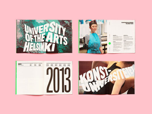
This colourful branding for the University of the Arts in Helsinki instantly grabs your attention.

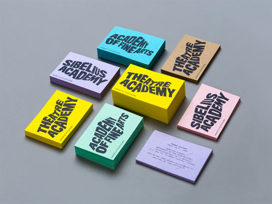
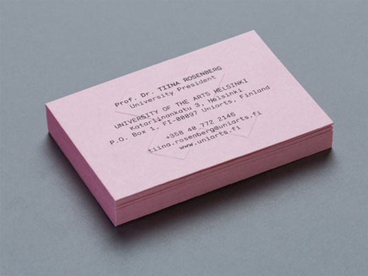
For a university that specialises in the arts, you have to get your branding right. Representing a school that teaches design means that your branding - from business cards to leaflets, tote bags to pencils - has to evoke a strong sense of creativity.
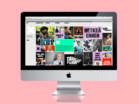
Thankfully, the University of the Arts in Helsinki have truly outdone themselves with this inspiring, colourful and eye-catching branding. The strategy for the identity was to create a distinctive set of logotypes based on a common design language, and to introduce an anchor symbol that acts as a point of connection between the university mother brand and the three academy brands.
The simple and bold 'X' is designed to be seen as a starting point, which is perfect seeing as many of the university's students embarking on their own new journey.
Article continues below 


See more images of this branding over on Behance.
Like this? Read these!
- Create a perfect mood board with these pro tips
- The ultimate guide to logo design
- Our favourite web fonts - and they don't cost a penny
What do you think of this branding? Let us know in the comments box below!
Sign up to Creative Bloq's daily newsletter, which brings you the latest news and inspiration from the worlds of art, design and technology.

The Creative Bloq team is made up of a group of art and design enthusiasts, and has changed and evolved since Creative Bloq began back in 2012. The current website team consists of eight full-time members of staff: Editor Georgia Coggan, Deputy Editor Rosie Hilder, Ecommerce Editor Beren Neale, Senior News Editor Daniel Piper, Editor, Digital Art and 3D Ian Dean, Tech Reviews Editor Erlingur Einarsson, Ecommerce Writer Beth Nicholls and Staff Writer Natalie Fear, as well as a roster of freelancers from around the world. The ImagineFX magazine team also pitch in, ensuring that content from leading digital art publication ImagineFX is represented on Creative Bloq.
