Develop an intricate illustrated logo
How Taxi Studio developed a striking wordmark and identity to tie together an eccentric range of deliciously sinful liqueurs.
When eccentric 'alcoholic alchemist' Kate Hudnott needed a branding solution for her range of blended spirits – which included Blackberry Gin, Bitter Lemon Vodka and Coffee Rum – Taxi Studio rose to the challenge. Senior designer Casey Blackmore recalls the process…
Kate Hudnott's pride, so well concealed in her daily life, pours unstoppably into her fine flavoured spirits. But her existing branding didn't live up to the quality of her premium tipples – so she asked us to put that right.
There are two sides to Kate's character – the 'darker' one only emerging in her drinks. So to tie the two together, we used the seven deadly sins to segment the range. Each sin relates to an aspect of the product, and cleverly aligns with Kate's unswerving passion for concocting liquid perfection.
After establishing our core idea of tying tastes together, my main role was to work with a typographer and illustrator to bring the idea to life.
We took great care in ensuring every detail of the design was perfect, from the rope detailing on the Hudnotts brand mark to the choice of illustrations across each flavour.
We wanted to tell the story of Kate Hudnott and her unique flavour combinations through the packaging. The final range does this really well and the design system we implemented allows each bottle's individual personality to shine through.
Here, I'll walk through the design process. You can watch the video walkthrough above and follow using the steps below…
Sign up to Creative Bloq's daily newsletter, which brings you the latest news and inspiration from the worlds of art, design and technology.
01. Identify the brand
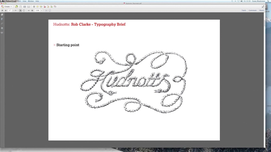
We immediately identified Kate as an alcoholic alchemist and came up with the central proposition of 'Tying Tastes Together'. The initial idea for the brand mark came from an early sketch, we thought it would be a lovely idea to create a beautiful brand-mark from a single piece of rope.
02. Evolve the logo into lettering
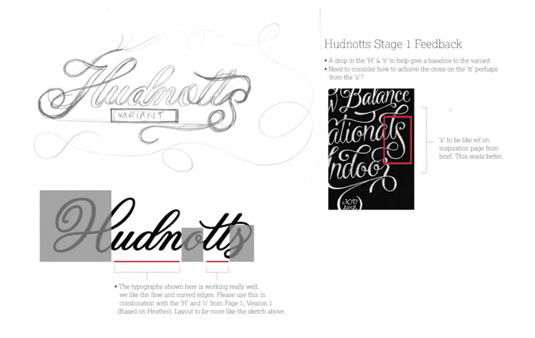
We then briefed typographer Rob Clarke to transform our early sketch into a beautiful piece of lettering. We knew ultimately that the mark would be made from rope; it was important at this stage to consider how each letterform joined up so it would really feel as though it came from a single piece of rope.
03. Create a complex illustration
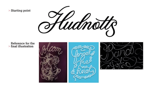
After collaborating with Rob to refine the logo it was time to turn it into a beautiful illustration. To do this we enlisted the help of illustrator Sam Hadley. It was quite a complex task as we wanted it to feel as if it was one piece of rope, twisting and turning to create the mark.
04. Fine-tune the brand mark
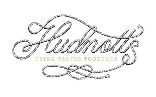
After lots of tweaking and plenty of debates over the legibility of the mark we arrived at this final solution. We all felt it stayed true to the original idea of the single piece of rope and also captured the essence of the brand we were trying to convey.
05. Focus on the story
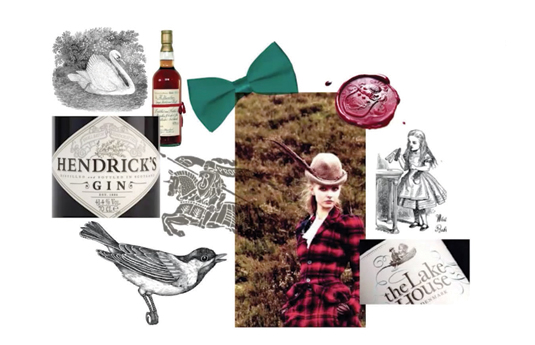
We wanted each of the labels to tell the story of each unique flavour. To do this we decided to add discoverable illustrations around each brand mark. Each flavour was based on one of the deadly sins and captured different parts of Kate's personality; this was reflected through the illustration sets.
06. Balance the label
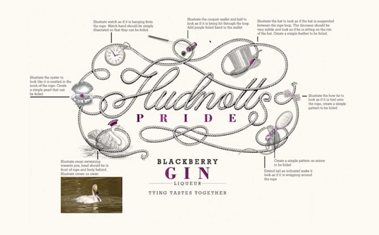
We extended the brand-mark to accommodate each set of illustrations. Each one was then added around the mark to create a considered and balanced label for each bottle. Gin was all about the pride Kate takes in her flavoured concoctions and her English eccentricity.
07. Symbolising sin
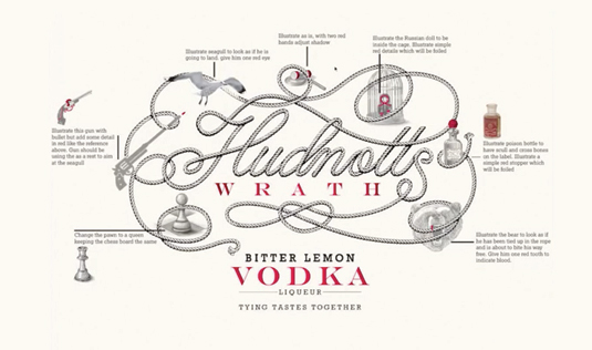
We wanted everything about the logo to be a little unexpected, somewhat witty and irreverent. For Wrath, for example, we wanted to capture the fury and passion that goes into creating the vodka range, so each element reflected something about this.
08. Embellish the brand with detail
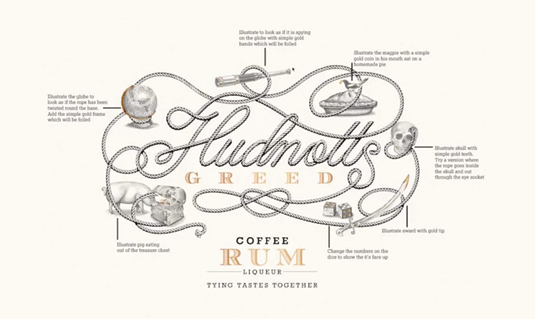
The third in the set was Greed. This rum-based liqueur was inspired by piracy, so we added an eclectic mix of curious objects, from a pirate's treasure chest to a skull with gold teeth. Across the entire range the coloured details were foil embossed, adding to the care and craft Kate pours into every bottle.
09. Add flourish with the bottle
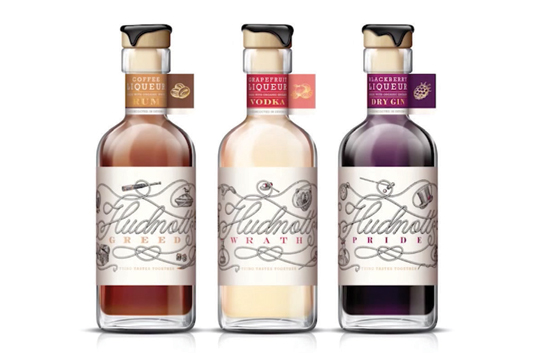
We took great care in choosing a bottle that suited Kate's brand and added further details such as a foiled neck label and a wax seal. There's a consistent brand story that runs through the range but each individual bottle has its own standalone personality.
Words: Casey Blackmore
Senior designer Casey Blackmore is an experienced and award-winning member of the Taxi team. The full version of this article first appeared inside Computer Arts issue 240, a self-promotion special. Get up to 55 per cent off a subscription to CA here.
Liked this? Try these...
- Create an engaging 'journey film' for a brand
- How to promote yourself on any budget
- The ultimate guide to logo design

The Creative Bloq team is made up of a group of art and design enthusiasts, and has changed and evolved since Creative Bloq began back in 2012. The current website team consists of eight full-time members of staff: Editor Georgia Coggan, Deputy Editor Rosie Hilder, Ecommerce Editor Beren Neale, Senior News Editor Daniel Piper, Editor, Digital Art and 3D Ian Dean, Tech Reviews Editor Erlingur Einarsson, Ecommerce Writer Beth Nicholls and Staff Writer Natalie Fear, as well as a roster of freelancers from around the world. The ImagineFX magazine team also pitch in, ensuring that content from leading digital art publication ImagineFX is represented on Creative Bloq.
