Reinventing ice cream to build a luxury brand
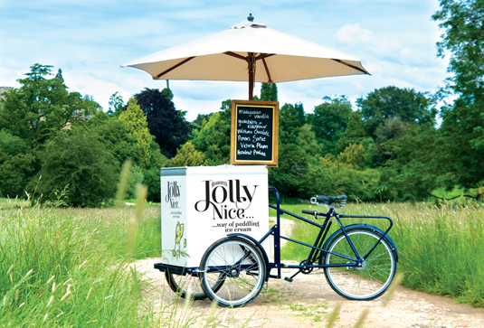
Design and branding agency Taxi has just completed a rather tasty brief for Jolly Nice Ice Cream.
Sign up to Creative Bloq's daily newsletter, which brings you the latest news and inspiration from the worlds of art, design and technology.
You are now subscribed
Your newsletter sign-up was successful
Want to add more newsletters?

Jolly Nice Ice Cream was formerly known as Westonbirt Ice Cream, and entrepreneur Harriet Wilson wanted to revisit the brand and packaging to compete with the more established luxury ice cream brands.
That’s when she called Taxi, which, under the guidance of creative director Spencer Buck, covered all aspects of the project including brand strategy, positioning, naming and tone; the packaging; the visual identity system; copywriting and more.

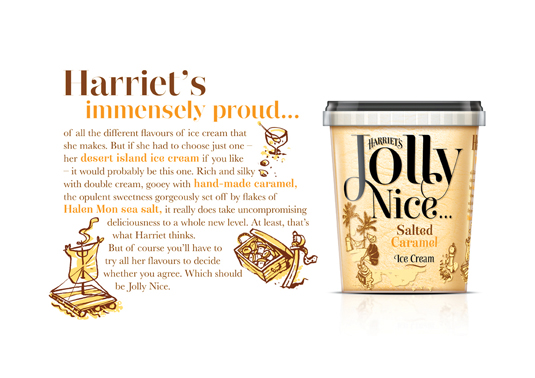
Casey Sampson, senior designer at the studio, says: "We proposed the name Jolly Nice, because that's what Harriet is. Her personality is built into the products, which from a branding perspective is a dream. The name led to a wonderful set of stories, one for each product, each relevant to her pursuit of perfection and deliciousness."
Article continues below 
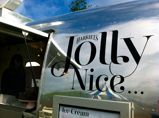
With the main concept being to exemplify the 'uncompromising deliciousness' of Wilson's ice creams, the main logo was first drawn by hand before being vectorised in Illustrator CS6. Geoffrey Appleton was called in to illustrate the packaging, bringing the stories of copywriter Lyndsay Camp to life.
This showcase was originally published in Computer Arts issue 207.
Now read:
- Where to find textures for 3D work
- Create the perfect design portfolio: 30 pro tips
- The top 15 designer resumé tips
Sign up to Creative Bloq's daily newsletter, which brings you the latest news and inspiration from the worlds of art, design and technology.

The Creative Bloq team is made up of a group of art and design enthusiasts, and has changed and evolved since Creative Bloq began back in 2012. The current website team consists of eight full-time members of staff: Editor Georgia Coggan, Deputy Editor Rosie Hilder, Ecommerce Editor Beren Neale, Senior News Editor Daniel Piper, Editor, Digital Art and 3D Ian Dean, Tech Reviews Editor Erlingur Einarsson, Ecommerce Writer Beth Nicholls and Staff Writer Natalie Fear, as well as a roster of freelancers from around the world. The ImagineFX magazine team also pitch in, ensuring that content from leading digital art publication ImagineFX is represented on Creative Bloq.
