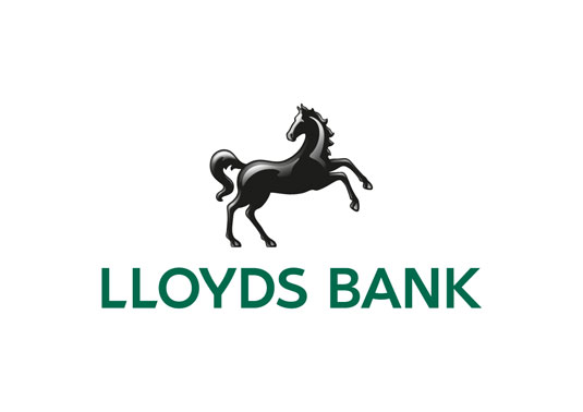
Lloyds Bank's new logo and branding
Lloyds Bank invited a number of creative agencies to reinvented their branding and customer experience. Here's what they came up with.
Sign up to Creative Bloq's daily newsletter, which brings you the latest news and inspiration from the worlds of art, design and technology.
You are now subscribed
Your newsletter sign-up was successful
Want to add more newsletters?

Lloyds Bank is one of the top brands in the UK, with an iconic logo design and instantly recognisable branding to boot. Renamed Lloyds TSB following a merger in 1998 (see previous logo, below), the group was recently forced to split off TSB into a separate bank as part of the EU bank bailout deal. So the re-renamed Lloyds Bank enlisted the help of a number of creative agencies to relaunch the brand, with the emphasis on making it more 'customer friendly'.

Rufus Leonard, RKRC/Y&R, Proximity London, and media agency MEC, all joined forces to help redefine the Lloyds brand. As Rufus Leonard's creative director James Ramsden explains: "We modernised the iconic Black Horse for the digital age, sourced an enormous range of emotive imagery that reflects the reality of customers’ lives and created a tone of voice that feels like ‘a breath of fresh air.’”
Rufus approached Fontsmith to create the new typeface, which is a customised version of FS Jack. You can see some of the details and character changes they made to create the new font family in this blog post.
Article continues belowA whole new look and feel for personal, business and private banking has been created for the bank's debit/credit cards, websites and stationery - incorporating flexibility in order to manage the diverse range of specialist audiences without losing the clear logic of the brand.


See more work from Rufus Leonard, RKRC/Y&R, Proximity London and MEC.
Like this? Read these!
- The ultimate guide to logo design
- Our favourite web fonts - and they don't cost a penny
- Useful and inspiring flyer templates
What do you think of the new look? Let us know in the comments box below!
Sign up to Creative Bloq's daily newsletter, which brings you the latest news and inspiration from the worlds of art, design and technology.

The Creative Bloq team is made up of a group of art and design enthusiasts, and has changed and evolved since Creative Bloq began back in 2012. The current website team consists of eight full-time members of staff: Editor Georgia Coggan, Deputy Editor Rosie Hilder, Ecommerce Editor Beren Neale, Senior News Editor Daniel Piper, Editor, Digital Art and 3D Ian Dean, Tech Reviews Editor Erlingur Einarsson, Ecommerce Writer Beth Nicholls and Staff Writer Natalie Fear, as well as a roster of freelancers from around the world. The ImagineFX magazine team also pitch in, ensuring that content from leading digital art publication ImagineFX is represented on Creative Bloq.
