This new identity work mixes Tracey Emin neon with classic type
The new look for the Royal Academy's Keeper's House mixes classic inspiration with a vivid new piece of work by Tracey Emin.
Sign up to Creative Bloq's daily newsletter, which brings you the latest news and inspiration from the worlds of art, design and technology.
You are now subscribed
Your newsletter sign-up was successful
Want to add more newsletters?
Following on from its work last year designing a new identity for the Royal Academy, this year Pentagram has turned its attention on another corner of the 245-year-old institution.
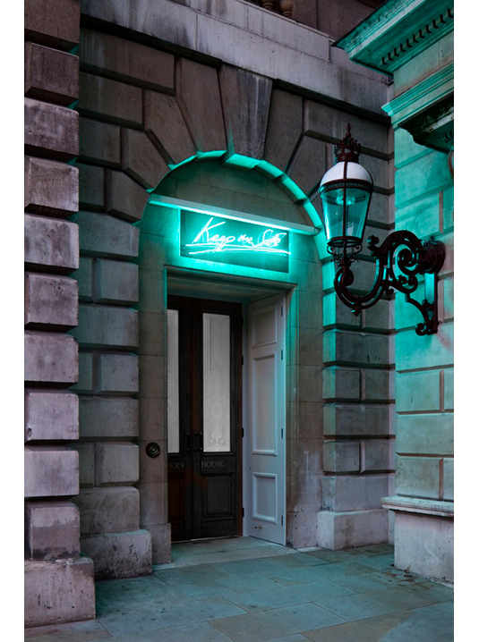
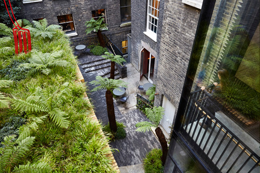
The Keeper's House, found in the corner of the RA's Annenberg Courtyard, has recently undergone a full restoration that retains many of its original details, dating back to the 1660s. The Mayfair townhouse now features a new restaurant, bar, lounge and secret garden and, to go with it, Pentagram's Harry Pearce has created a new identity for the restored building.

The most eye-catching feature is, of course, the brand new neon sculpture above the front door, created by Tracey Emin. However that's just a part of a project designed to give the Keeper's House its own distinct identity that nevertheless maintains a link with the larger Royal Academy branding.
Article continues below 
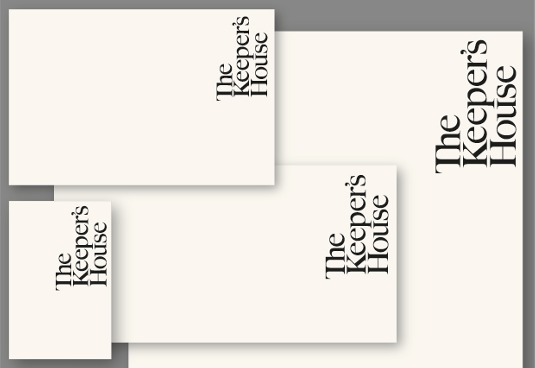
For the new logotype, Pearce and his team used Caslon, one of the main fonts from their RA identity work last year, and redrew it to create a more elegant typographic expression, accentuating the inner curves and serifs. The logotype is always placed vertically in the upper right hand corner whenever it's used, reflecting the Keeper's House's position in the upper right hand corner of the Annenberg Courtyard.

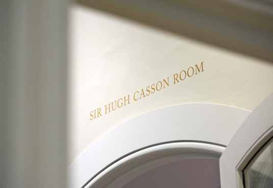
The use of Caslon – along with Akzidenz Grotesk – extends to the Keeper's House printed material and wayfinding throughout the complex 17th Century building, and the whole new look serves to reflect the building's idiosyncratic layout. Says the RA's Will Dallimore, “Harry’s identity has given us just what we were looking for. It’s got a quirky, domestic twist – reflecting the building’s history and the Keeper’s House vision to be a home for artists and art lovers – but vitally, it has great affinity with the main RA brand.”

Words: Jim McCauley
Liked this? Read these!
- Create a perfect mood board with these pro tips
- The ultimate guide to logo design
- Inspiring examples of landscape design
Seen some inspiring identity work? Tell us in the comments!
Sign up to Creative Bloq's daily newsletter, which brings you the latest news and inspiration from the worlds of art, design and technology.

The Creative Bloq team is made up of a group of art and design enthusiasts, and has changed and evolved since Creative Bloq began back in 2012. The current website team consists of eight full-time members of staff: Editor Georgia Coggan, Deputy Editor Rosie Hilder, Ecommerce Editor Beren Neale, Senior News Editor Daniel Piper, Editor, Digital Art and 3D Ian Dean, Tech Reviews Editor Erlingur Einarsson, Ecommerce Writer Beth Nicholls and Staff Writer Natalie Fear, as well as a roster of freelancers from around the world. The ImagineFX magazine team also pitch in, ensuring that content from leading digital art publication ImagineFX is represented on Creative Bloq.
