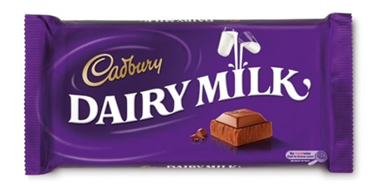
Cadbury alters iconic chocolate wrapper typography
Iconic chocolate company Cadbury's have introduced a new look. What do you make of it?
Cadbury have one of the most iconic logos and packaging design around - with that signature purple wrapper and glass and a half logo. Here, they've unveiled their new look, created by Pearlfisher and inspired by the idea of 'say what you see' and replace product shots with 'imaginative, joyful expressions of each flavour'.

Brighter colours have been introduced along with a new font to highlight the brand's on-shelf appeal. The new packaging also uses an on-pack QR code which will deliver "joyful content designed to make people smile", according to Cadbury.
It's the brands 21st major redesign since it launched Dairy Milk 108 years ago, and creates "a more modern and joyful look, while proudly keeping the identity that has been a part of its heritage since 1905".
Article continues below 
Marketing director at Cadbury owner Mondelēz International Matthew Willamson explains, "With our new packaging, we hope to bring out the personality of the Cadbury Dairy Milk brand in a generous, optimistic and spontaneous design, while celebrating the links with our past".

[via Design Week]
Like this? Read these!
- Free tattoo fonts for designers
- Create a perfect mood board with these pro tips
- The ultimate guide to logo design
What do you make of the new look? Let us know in the comments box below!
Sign up to Creative Bloq's daily newsletter, which brings you the latest news and inspiration from the worlds of art, design and technology.

The Creative Bloq team is made up of a group of art and design enthusiasts, and has changed and evolved since Creative Bloq began back in 2012. The current website team consists of eight full-time members of staff: Editor Georgia Coggan, Deputy Editor Rosie Hilder, Ecommerce Editor Beren Neale, Senior News Editor Daniel Piper, Editor, Digital Art and 3D Ian Dean, Tech Reviews Editor Erlingur Einarsson, Ecommerce Writer Beth Nicholls and Staff Writer Natalie Fear, as well as a roster of freelancers from around the world. The ImagineFX magazine team also pitch in, ensuring that content from leading digital art publication ImagineFX is represented on Creative Bloq.
