Can typography represent a flavour?
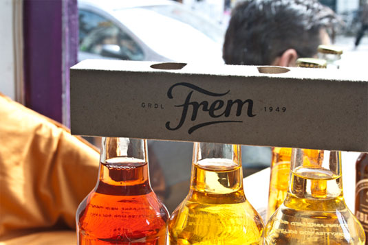
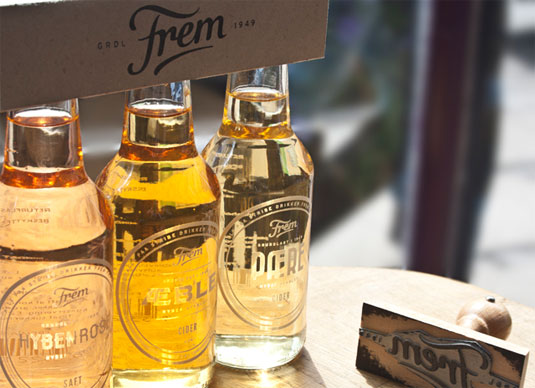
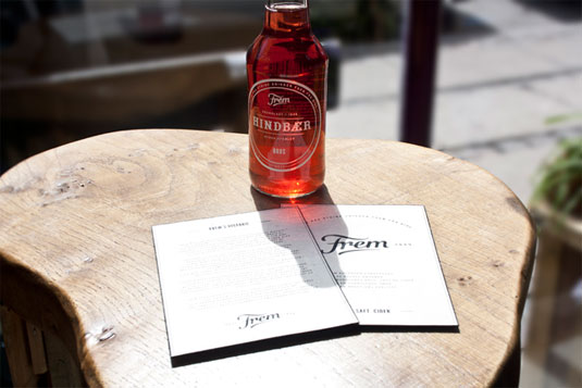
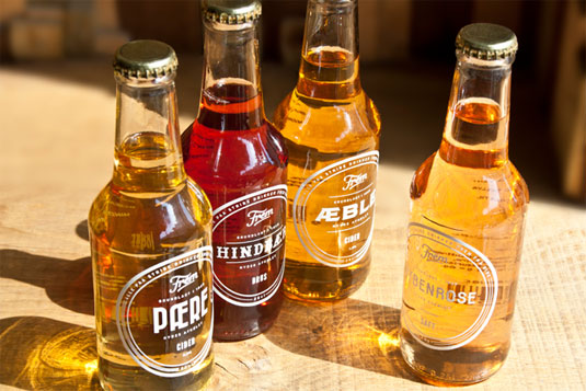
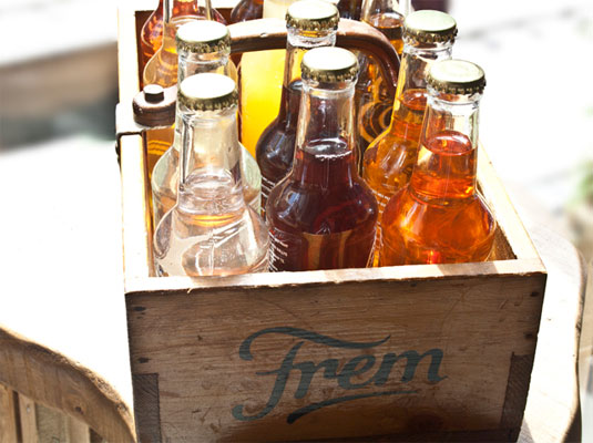
Danish soda brand Frem have created a different font label for each of their fruity fizzy drinks.
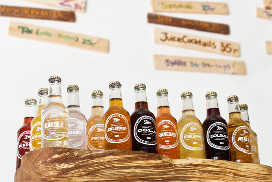
We love a good example of packaging design - anything that catches our eye be it its colour, shape, size or execution is a winner in our eyes. However, when it's teamed with a brilliant use of typography, we fall head over heels in love.
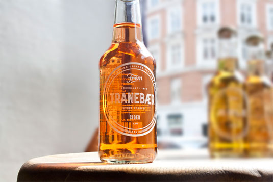
Danish soda brand Frem asked Copenhagen-based graphic designer Jonathan Faust to redesign the identity and packaging of their product but he decided to do things a little differently. Instead of creating an overall design, he created an individual design for each soda flavour.
The typography chosen for each flavour is designed to match its unique associations, clichés and shapes when drinking it. This explains the Cola flavor tied to its American roots with a western wood typeface. A wholly inspiring and creative execution in branding - bravo Faust!
Article continues below 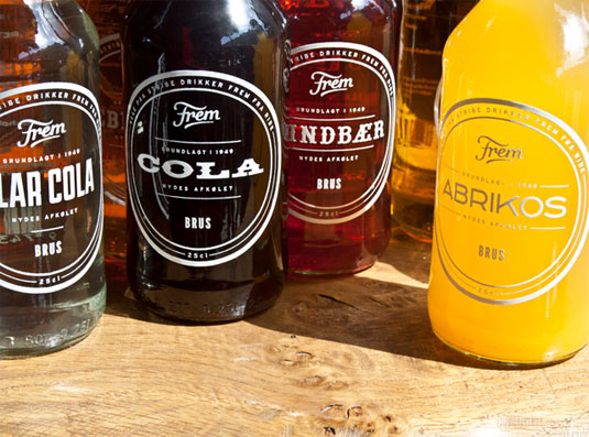
[via Design Taxi]
Like this? Read these!
- Free graphic design software available to you right now!
- Download the best free fonts
- Free graffiti font selection
What do you make of this packaging design? Let us know in the comments box below!
Sign up to Creative Bloq's daily newsletter, which brings you the latest news and inspiration from the worlds of art, design and technology.

The Creative Bloq team is made up of a group of art and design enthusiasts, and has changed and evolved since Creative Bloq began back in 2012. The current website team consists of eight full-time members of staff: Editor Georgia Coggan, Deputy Editor Rosie Hilder, Ecommerce Editor Beren Neale, Senior News Editor Daniel Piper, Editor, Digital Art and 3D Ian Dean, Tech Reviews Editor Erlingur Einarsson, Ecommerce Writer Beth Nicholls and Staff Writer Natalie Fear, as well as a roster of freelancers from around the world. The ImagineFX magazine team also pitch in, ensuring that content from leading digital art publication ImagineFX is represented on Creative Bloq.
