Design a stunning typeface with just six shapes
Angus MacPherson walks you through how to create an elegant modular alphabet using Illustrator’s Snap To Grid command
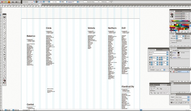
07 Playing around with the width and height of each character will have a profound effect on the feel of the typeface as a whole. Taller alphabets – known as ‘condensed’ – are high impact and eye-catching, but they’re generally not as legible. More conventionally proportioned alphabets are easier to read and generally feel ‘friendlier’. We’re making a regular typeface.
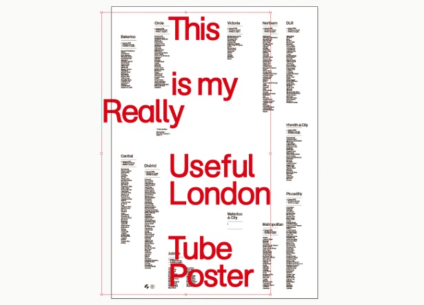
08 Now you have your height and width locked down and your five basic shapes drawn, you’re ready to construct the alphabet. It’s a simple case of moving and transforming your basic shape into place. With Snap To Grid turned on, everything should snap into place nice and easily.
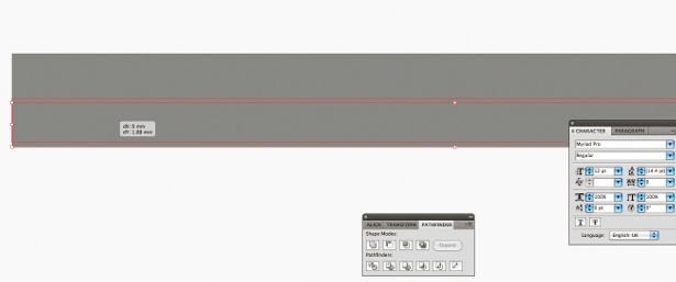
09 At this point you can do one of two things: if you know what your heading is you can just create and use the letters you need, or if you want more flexibility you can construct an entire alphabet, so that later on you can write whatever you like, without being restricted.
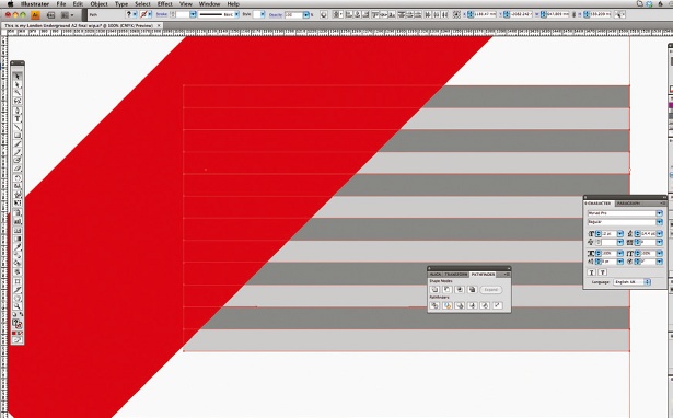
10 Once you’ve arranged all the pieces of the letters for your new modular alphabet, you need to use the Pathfinder Unite command to stitch all the individual modules together and make a continuous outline. Make sure you link up all the elements of each letter separately, otherwise the whole word will be a grouped object and you won’t be able to adjust the letter space – which we will do our next step.
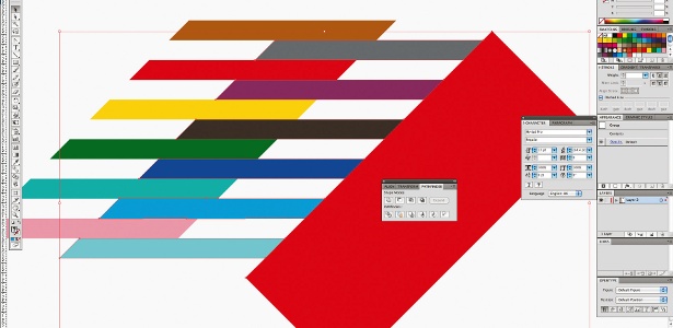
11 Now your letters are complete and have a continuous outline, you can flip to a black stroke to fill and see your finished characters. This is the stage at which you can sort out the letter spacing for whole words. I’ve put about two cells between each character, but this is by no means fixed. You should do whatever you think looks best or best fits in the space you’re working with.
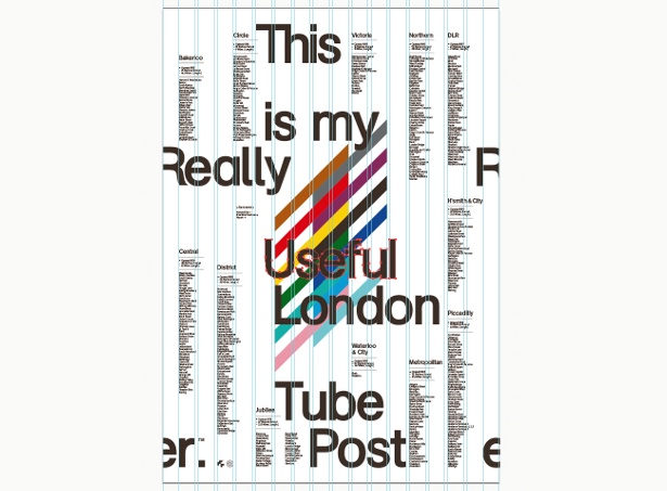
12 The article I’m creating this type treatment for is about autumn, so I’ve used an image of some vividly coloured autumn leaves to generate my colour scheme for it. The typeface has quite a fluid, organic, natural shape, so this, coupled with the gorgeous autumnal colour scheme, hopefully creates an appropriate and compelling spread.
Sign up to Creative Bloq's daily newsletter, which brings you the latest news and inspiration from the worlds of art, design and technology.

The Creative Bloq team is made up of a group of art and design enthusiasts, and has changed and evolved since Creative Bloq began back in 2012. The current website team consists of eight full-time members of staff: Editor Georgia Coggan, Deputy Editor Rosie Hilder, Ecommerce Editor Beren Neale, Senior News Editor Daniel Piper, Editor, Digital Art and 3D Ian Dean, Tech Reviews Editor Erlingur Einarsson, Ecommerce Writer Beth Nicholls and Staff Writer Natalie Fear, as well as a roster of freelancers from around the world. The ImagineFX magazine team also pitch in, ensuring that content from leading digital art publication ImagineFX is represented on Creative Bloq.
