Adaptive layouts with media queries
Create a beautiful website employing adaptive layouts and optimised for the latest mobile devices. Aaron Gustafson, founder of Easy! Designs, explains how.
Sign up to Creative Bloq's daily newsletter, which brings you the latest news and inspiration from the worlds of art, design and technology.
You are now subscribed
Your newsletter sign-up was successful
Want to add more newsletters?
- Knowledge needed: Intermediate CSS
- Requires: Text editor, modern browser, project files
- Project Time: 30 minutes
- Source file
In 1993, NCSA’s Mosaic browser gave the web a visual makeover that changed the medium forever. Designers from the print world began experimenting with this new canvas and did their best with the rudimentary tools that were available to them at the time. The web became home to thousands of ‘brochure’ sites, and print concepts (the ‘fold’, for one) began to find their way into pretty much every discussion of web page layout. The web became print.
Within a year, the web came alive with audio, followed quickly by video and animation. Tools such as Director and FutureSplash beckoned to designers from the motion graphics world and they came in droves. The web went through its second major shift and nearly every big site was redesigned as if it were an interactive CD-ROM. Any project that didn’t have the budget for full-scale interactive reinvention got an animated splash page and at nearly every design discussion someone would decry the scrollbar. The web became a kiosk.
Over time, the geeks returned and reshaped the web, yet again, as a series of APIs upon which software could be built. Developers more familiar with programming languages than markup poked, prodded and beat the building blocks of the web into submission, with their discussions centring around bringing the desktop to the browser. The web became a platform.
Article continues belowThis was all understandable, really. The web was new to us and, as with any new experience, we tried to make sense of it by focusing on its similarity to what we already understood. Thankfully, many working on the web began to realise that there was more to it and started to appreciate it for those things that made it unique. Those who ‘got it’ started pushing back, arguing that:
- The fold doesn’t exist
- People aren’t confused by scrollbars
- Users hate those inane animated intros and constant ‘loading’ dialogs
We were finally starting to understand that this medium was more than the sum of its parts.
As the years bore on, we began to fully comprehend how different the web was from any medium we’d known before. It was print because people were printing out web pages. It was interactive because people were watching movies and playing games on it. It was a platform because people were replacing their desktop applications with online equivalents. It was all these things and more. Beyond that, people were also beginning to demand that the web be available to them wherever they were: on their television, their video game console, their mobile phone and even their refrigerator. We wanted the web everywhere.
01. Adaptation
As designers and developers, we began noticing this trend early on, mainly because we were the very people placing these demands on the web (well, maybe not the refrigerator one). As such, the CSS2 spec introduced the capability for designers to tailor styles to a particular medium. Out of the gate, it proposed support for computers, mobile devices, televisions, printers, projectors and assistive devices.
Sign up to Creative Bloq's daily newsletter, which brings you the latest news and inspiration from the worlds of art, design and technology.
Shortly after the idea of media-specific styles was conceived, vendors began putting it into practice. The ‘screen’ medium was, of course, picked up by default in browsers, but some added support for print style sheets as well, opening the door for the first truly adaptive layouts.
In 2002, Eric Meyer made a case for jettisoning the separately maintained ‘printer friendly’ pages in favour of a style sheet designed specifically for the print medium. Using CSS, he showed us how to hide the stuff that didn’t make sense in print (navigation, background images) and even demonstrated a few ways to cater specifically to the print experience (such as using generated content to expose link destinations). Suddenly, the vision for the web of ‘publish once, deploy everywhere’ was looking like a reality.
A few short years later, Cameron Adams gave us the first resolution-dependant layout as a way of helping a site adapt to the myriad of browser dimensions it might be called upon to fill. The technique built upon the concept of style sheet switching popularised by Paul Sowden and was introduced to address the 800×600 vs 1024×768 debate. But it did far more than that, paving the way for other techniques such as ‘Invasion of the Body Switchers’ and ‘Switchy McLayout’. Though this technique (and the others that followed) worked well, they all relied almost entirely on JavaScript to work. Then along came media queries.
Drafted as a module of CSS3 back in 2001, CSS media queries are finally supported widely enough to be useful. In essence, they are just more descriptive media assignments. Here’s an example:
@media (min-width:801px) {
/* Browser window must be at least 801px wide to get these rules */
}
In effect, media queries are very similar to the hacky filters we used to use and the Conditional Comments you’re probably using today, but are far more robust. And, they can be used wherever media types can be assigned (ie link and style elements, @import directives and @media blocks).
The CSS3 module that defines media queries reached the Candidate Recommendation stage last Summer and offers introspection into the browsing environment based on the following factors:
- browser dimensions (width, height and aspect-ratio);
- device dimensions (device-width, device-height and device-aspect-ratio);
- browser orientation;
- colour information (color, color-index and monochrome) and
- device-specific details such as its resolution, whether its display is grid or bitmap-based, and the scan type (progressive or interlaced … applicable to televisions).
Not all of these properties are currently supported, but many are. Additionally, most of them support min and max prefixes like the one used above, enabling you to tailor your queries very specifically.
Media queries can also be combined using the and keyword and negated using the not keyword. This may lead you to believe that you could get really crazy with your media queries, but the syntax is still pretty limited; you can’t get nearly as specific as you could in a true programming language such as JavaScript or PHP (eg if A and B or B and C, but not A and C). You can, however, imply ‘or’ using a comma:
@media (max-width:800px), projection {
/* The browser window width must not exceed 800px or this device
must be projected media for these rules to apply */
}
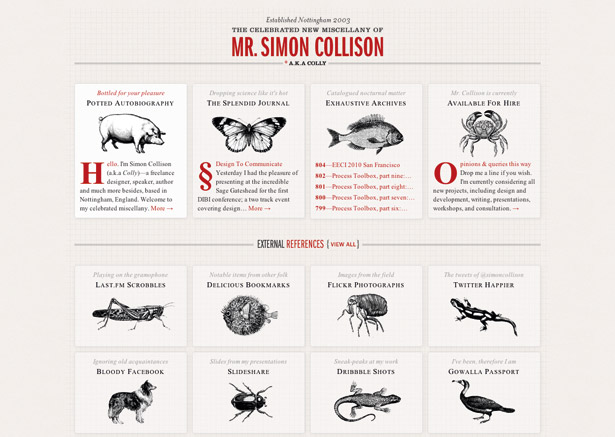
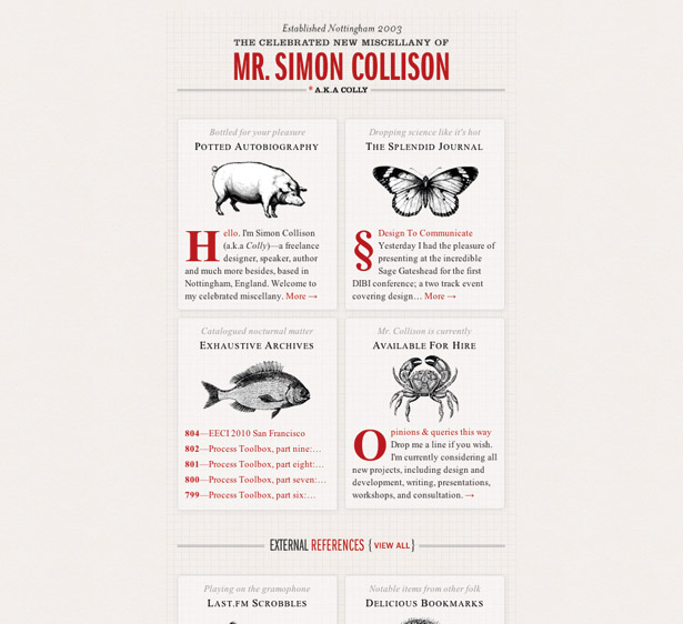
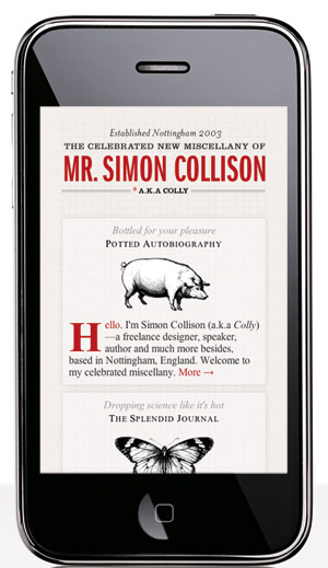
Media queries open up so many possibilities that it’s hard to know where to begin, so it’s best to start off slow. In this tutorial we’ll take an existing web page (the homepage of one Mr Simon Collison, seen at colly.com) and use media queries to create two alternate views of the site that make it look every bit as good at different screen widths. While we’re at it, we’ll make sure the appropriate view is triggered on the latest versions of the iPhone and iPad, both of which have decent support for media queries.
Media queries fit perfectly into the progressive enhancement toolbox because of the very nature of CSS: anything a browser doesn’t understand is ignored. By crafting our media queries carefully, we can create adaptive layouts that don’t cause problems for browsers that don’t understand them.
02. Application
Keeping all of that in mind, we’ll apply our adaptive layouts on top of Simon’s existing CSS, only altering his original code if absolutely necessary. To play along at home, fire up your favourite editor and open css/screen.css from the files on this issue’s CD.
We’ll sequester our alternate layouts at the very bottom of Colly’s CSS file inside two @media blocks. By setting things up this way, rules from the original four-column layout will cascade down to both alternate layouts and the changes we make to the two-column layout will cascade down to our one-column layout. That greatly simplifies things and cuts down on the number of rules we need to write/rewrite.
Let’s begin with the two-column layout. If you want to watch our progress, open index.html in a modern browser and reduce the window width to the point where a horizontal scrollbar appears (989px, as Colly’s design is fixed at 990px wide).
The width required for a two-column version of the site is 510px (to maintain his original margins, padding, etc for the page). So we’ll start by adjusting the width of div#page to 468px:
@media (max-width:989px) {
div#page { width:468px; }
}
That little bit does quite a lot, thanks to Colly’s use of float to create the columns. Now, we just need to add a few more rules to adjust the spacing
of the design:
.home ul#navigation_pri, .home ul#subnav-b { padding-bottom: 30px; }
ul#navigation_pri li, ul#subnav-a li, ul#subnav-b li { margin-bottom: 10px; }
ul#navigation_pri li:nth-child(even), ul#subnav-a li:nth-child(even),
ul#subnav-b li:nth-child(even) { margin-right: 0; }
#page ul[id^=subnav] { margin-bottom: 0; }
You’ll notice that we’re employing :nth-child() to select every other navigation item to adjust its right margin. Employing this selector helps us reduce the number of markup changes we might otherwise need to make. We can feel confident it will work because it’s being used inside of a media query, and support for :nth-child() predated support for media queries in pretty much every browser.
Another thing you’re likely to notice is that there are still a few issues with our design; namely, the External References heading is all the way on the right and slightly cut off. To correct that, we’ll make the first of a few subtle tweaks to the site’s original rules: under Headings in the style sheet, find the selector h2.ext-dests a and change 0 0 to center top in the background property to adjust the background image’s positioning.
Another subtle tweak worth making involves the background image used on div#page. With no background positioning set, the grid gets a little off at this smaller size, but by setting its background positioning to center top as well, we can correct that. You’ll find the background property set on div#page as part of the first declaration block in the Layout section of the style sheet, and you can add this tweak there.
Now sit back and admire your handiwork; you’ve just made an adaptive layout using media queries!
One-column view
Our job is not done, though; we still have a one-column view to create. Create a second @media block and have it query for a maximum width of 509px (since our two-column layout required 510px of width).
In this single column mode, we’ll optimise the layout for 320px wide, so set the width on dix#page to 310px and reduce its left and right padding to a mere 5px each:
@media (max-width:509px) {
div#page { padding:30px 5px 10px; width:310px; }
}
Resizing your browser to make it a bit narrower will trigger this layout. You should see just about everything fall into place, with a few remaining issues to address. The first one is the masthead: it’s not centred like it should be. That’s quickly resolved with:
h1 a { width: 310px; background-position: center top; }
h1 a:hover { background-position: center -90px; }
Next up are the navigation blocks. They look nice at this width, but to really take advantage of the layout, we should probably make them a bit wider. Unfortunately, however, the background images applied to each span.label in the blocks are set to repeat, so we’ll need to adjust that too.
While we’re at it, why don’t we bump the font size of the blocks up ever so slightly, to make them easier to read in the compressed space? This will keep the line lengths nicer in the wider blocks as well:
ul#navigation_pri li, ul#subnav-a li,
ul#subnav-b li { width: 290px; font-size: 1.25em; }
ul#navigation_pri li a span.label, ul#subnav-a li a span.label,
ul#subnav-b li a span.label { background-repeat: no-repeat; }
Finally, to tighten up the layout just a bit more, we’ll adjust the spacing around the navigation lists and align the footer text left to keep it from looking odd with such short lines:
.home ul#navigation_pri, .home ul#subnav-b { padding-bottom: 30px; }
div#siteinfo { text-align: left; }
Huzzah! Now we have an attractive single-column layout.
03. Wither the iPad?
As I mentioned, another key task in this exercise is going to be making these layouts apply on the iPhone and iPad. If you happened to view the current state of things on either of those devices, you’ll notice that the results aren’t optimal. Let’s fix that.
The first thing we need to do is make an adjustment to the way these devices handle the viewport. By introducing a new meta element to the page, we can get one step closer to achieving our goal:
<meta name="viewport" content="width=device-width"/>
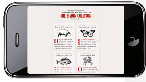
This instruction tells devices that support it to set the viewport width to the width of the device itself. Now we can begin our iPad and iPhone optimisations in earnest. But before we do, we should consider what layouts will look best on each device and, beyond that, what layouts would look best in each orientation (since media queries give us introspection into that as well). To me, what seems to make the most sense is giving the iPhone the single-column view when it’s held vertically and the two-column version when it’s held horizontally.
As for the iPad, its vertical orientation would probably best benefit from the two-column view, while the horizontal can probably handle the original four-column layout just fine.
To accomplish all of this with media queries, we can use the device measurements to guide us. The iPhone display measures 480px x 320px, while the iPad offers a much larger canvas of 1024px x 768px. Factoring these dimensions and support for orientation (which comes to the iPhone in iOS 4.0, but is already available on the iPad) into our media queries, we end up with the following:
@media (max-width:989px),
(max-device-width:480px) and (orientation:landscape),
(min-device-width:481px) and (orientation:portrait) {
/* 2-column */
}
@media (max-width:509px),
(max-device-width:480px) and (orientation:portrait) {
/* 1-column */
}
In theory, by using the 480px/481px cut-off on device-width, we should be able to get each device to operate properly. Unfortunately, those solitary max-width queries throw a spanner in the works. In order to minimise their impact, we’ll need to convert each into a compound query. Also, for the older iPhones (pre-iOS 4.0) we’ll still want an alternate view, so we’ll give them the two-column as middle ground:
@media (min-device-width:1024px) and (max-width:989px),
screen and (max-device-width:480px),
(max-device-width:480px) and (orientation:landscape),
(min-device-width:481px) and (orientation:portrait) {
/* 2-column */
}
@media (min-device-width:1024px) and (max-width:509px),
(max-device-width:480px) and (orientation:portrait) {
/* 1-column */
}
Lastly, if you’ve been following along in Safari or Chrome, I’ve got a special treat just for you. Add this line of code outside of the media blocks and then resize your browser:
* { -webkit-transition: width .5s; }
Nice. Okay, once you stop playing, apply what you’ve learned here to your own website. After all, Colly shouldn’t be the only one having all the fun!
Aaron Gustafson is the founder and principal consultant of Easy! Designs, a web development consultancy. He is also group manager of the Web Standards Project (WaSP), an invited expert to the W3C’s Open Web Education Alliance, a speaker, and an author.
Liked this? Read these!
- How to build an app: try these great tutorials (vary with "How to create an app" and "How to make an app")
- Free graphic design software available to you right now!
- Download the best free fonts
- Free graffiti font selection
- Illustrator tutorials: amazing ideas to try today!
- Great examples of doodle art
- Brilliant Wordpress tutorial selection
- Free tattoo fonts for designers
- Create a perfect mood board with these pro tips
- The ultimate guide to logo design
- Our favourite web fonts - and they don't cost a penny
- Useful and inspiring flyer templates
- The best 3D movies of 2013
- Discover what's next for Augmented Reality
- Download free textures: high resolution and ready to use now

The Creative Bloq team is made up of a group of art and design enthusiasts, and has changed and evolved since Creative Bloq began back in 2012. The current website team consists of eight full-time members of staff: Editor Georgia Coggan, Deputy Editor Rosie Hilder, Ecommerce Editor Beren Neale, Senior News Editor Daniel Piper, Editor, Digital Art and 3D Ian Dean, Tech Reviews Editor Erlingur Einarsson, Ecommerce Writer Beth Nicholls and Staff Writer Natalie Fear, as well as a roster of freelancers from around the world. The ImagineFX magazine team also pitch in, ensuring that content from leading digital art publication ImagineFX is represented on Creative Bloq.
