As we come thundering towards 2018's denouement, it's time to reflect upon the logo designs of the past 12 months with the additional wisdom of time passed; the renewed appreciation gained from distancing knee-jerk reactions (yes, we mean on Twitter). With that in mind, we've gathered the branding projects and identity redesigns that we feel merit further cogitation as we move into a new year, with its own as-yet unknown trends, shocks and delights.
Of course, we've spoken to industry big hitters to ascertain the logo trends for 2019, and it's certainly fascinating to get such adroit insight into the creative directions of the impending 12 months.
But let's not forget to look back for inspiration, too. We've looked back through our archives to find the best logo designs of 2018. Click on the subheads to read our original articles, and see the old versions of each logo – plus more pictures of the new look for each brand. Also check out Computer Arts UK Studio Rankings 2018.
01. Ogilvy
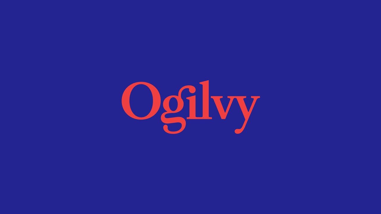
"Change is our lifeblood" is Ogilvy & Mather's mantra, and this year, the global advertising agency's logo revealed an eyebrow-raising change to its logo. The June rebrand took two years to complete and was notable for the dropping of "& Mather" from the logotype, harking back to a previous handwritten logo based on founder David Ogilvy's signature.
"We needed to greatly simplify the organisation around what I call an integrated enterprise agenda, not a holding company of all these different piece-parts," explained the company's chief executive John Siefert to the Wall Street Journal, and the refreshed identity is designed to reflect that. Despite the simplification, Ogilvy's new logo is deceptively challenging, with many interesting typographic design elements competing to draw the eye – and as such is an excellent reflection of the agency and its ethos.
02. John Lewis/Waitrose
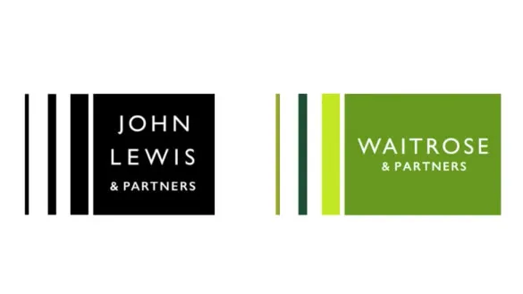
This year, John Lewis Partnership relaunched its two retail brands as Waitrose & Partners and John Lewis & Partners. Each arm of the rejigged business model got a new brand identity and logo design created by Pentagram, each emphasising the connection between the two firms.
Pentagram looked to the original work for the John Lewis Partnership logotype designed by Hans Schleger and Peter Hatch in the early '60s, which at the time was centred around a pattern motif. The same weight and thickness of lines found in this diamond symbol pattern was used to provide a link to the past in the new logos.
03. American Express
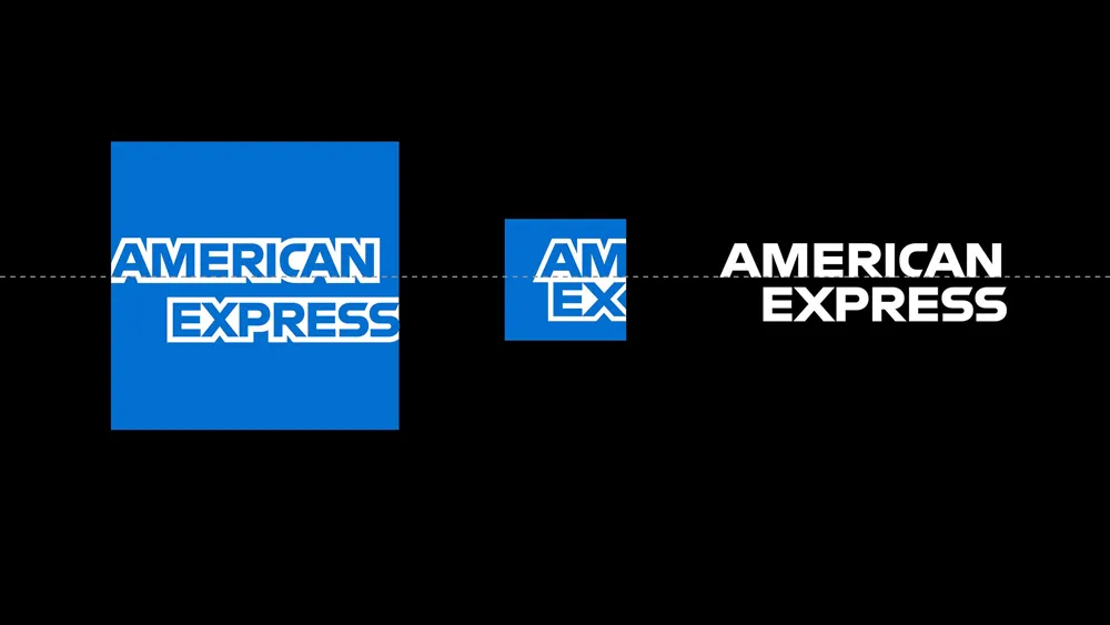
For the first time in 37 years, AMEX has refreshed its visual identity, the design coming from Pentagram's Abbott Miller. First introduced in 1975, AMEX's little blue symbol is instantly recognisable, so the aim was to preserve – but enhance – its design.
To do this, the radial gradient was removed and the letterforms that cross through the centre of the blue square were redrawn and finessed in order for it to render in a clean, concise way that functions at both a large and small scale.
04. Mailchimp

Popular email marketing service Mailchimp launched a new brand identity and design system this year. The rebrand came courtesy of COLLINS, working alongside Mailchimp's in-house design team. Notably, it saw the company doing away with its much-loved script logo design in favour of a sans-serif wordmark, and introducing a cheerful yellow as its brand colour. The new wordmark uses a custom typeface that is equally full of character.
Freddie, Mailchimp's simian mascot, also had a makeover. The hat and cheeky wink remain firmly in place, but he's now a simplified, single-colour silhouette. The shift also means Freddie can appear alongside the wordmark as part of a more unified system.
05. BBC Two
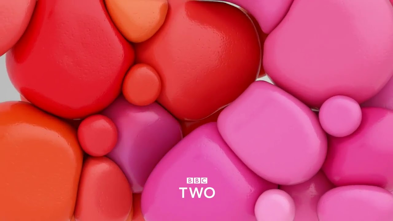
Created in partnership between the BBC’s in-house agency BBC Creative and brand agency Superunion, and involving collaboration with the likes of The Mill, Mainframe, and FutureDeluxe, BBC Two received the televisual equivalent of a redesigned logo: new channel identifiers.
Centred around a visual signifier whose curved shape suggests the number two, the new idents tackle the same brief in a range of creative ways, with animations including colourful blobs, furry scuttling creatures, and hypnotic swirling patterns, and elevated by audio created by award-winning British composer and sound designer Alex Baranowski.
06. Uber

On first sight, the new Uber logo looks like it's doggedly following the recent trend for wordmarks in bespoke fonts. It's the work of the ever-controversial Wolff Olins – who you'll remember for the 2012 Olympics logo and the similarly provocative Met rebrand – along with the Uber Brand Experience Team.
Of course, it includes a bespoke font, Uber Move – a sans serif by MCKL Type Foundry, which was inspired by typefaces usually associated with transportation, and designed to look friendlier than the previous, more aggressive typeface, Clan Pro.
07. Burberry

We're not going to go over this year's logo design controversy again here – yes, a number of brands went homogenised sans-serif in 2018. But Burberry's renewed identity is interesting for more reasons than typeface alone. The new logo was designed in collaboration with Burberry and Peter Saville, and replaces the famous Burberry Equestrian Knight Logo which in one form or another has been going strong since 1901.
Revealed simultaneously, a new Burberry monogram from Italian designer Riccardo Tisci exhibited a more playful side to the brand. Tisci has taken the initials of the fashion brand's founder, Thomas Burberry, and weaved them into an interlocking and colourful design decked out in orange, white, black and beige – the colours of the iconic Burberry check.
08. Battersea Dogs & Cats Home

Battersea is a much-loved British charity that cares for cats and dogs across the UK. This year, Battersea unveiled a new identity, created by Pentagram partners Marina Willer and Naresh Ramchandani, which drops the 'Dogs & Cats Home', instead opting for a new brand line: Here for every dog and cat.
The refresh includes a new logo made up of a family of hand-drawn, abstract watercolour images by Japanese illustrator Hiromi Suzuki, designed to emphasise the charity's commitment to every animal in its care. Retaining Battersea’s signature blue, the illustrations are complemented with a sharp Franklin Gothic wordmark.
09. Houses of Parliament

A new identity for UK Parliament was created in collaboration between the House of Commons and the House of Lords with brand and digital design studio SomeOne, and as part of this identity, new logos were created for digital optimisation.
At first glance, the new logos appear remarkably similar. The main differences seem to be a tidying up of an existing portcullis design, which includes the removal of a few dots and a uniform shape applied to the chain links. However this subtle smartening up was at the heart of the new identity for the digital age.
10. Wahaca
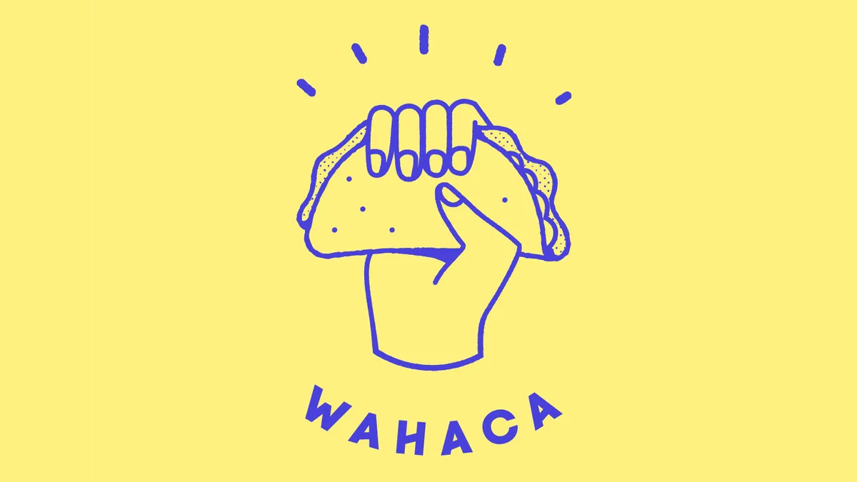
For Mexican restaurant Wahaca, going from a start-up to a chain meant refining its image without turning its back on its heritage, and defining its mission statement in a new logo design. Revealed this year, the new identity created by London studio Without sees Wahaca do away with its shabby chic aesthetic, which was once ahead of its time.
The new logo sees a taco raised defiantly in a fist. As well as looking polished, the design and reduced colour palette also identifies Wahaca's territory as a Mexican restaurant that offers fresh, flavoursome food.
11. FatFace

The new FatFace logo caused some disquiet on launch but a few months on, it has been reappraised. Such a radical change – from surfer aesthetic to a sophisticated high street look – was always going to divide opinions, and now that the froth has settled it can be seen that the more mature logo design perfectly reflects FatFace's progression to a respected outdoor clothing brand.
Some will mourn the end of FatFace's dreadlocked character motif, but moving to a lone wordmark is entirely consistent with 2018's trends.
12. Debenhams
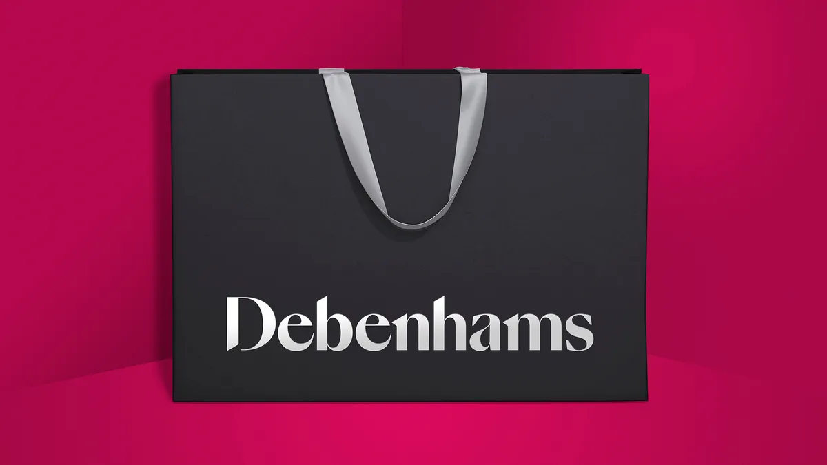
UK department store Debenhams was given an identity overhaul in 2018, courtesy of Mother Design, which included a new logo design that replaced that which had been in place since 1999. Mother worked closely with Swiss Typefaces on a new logo for the retail giant – the final design uses a custom typeface based on SangBleu, creating a more approachable, modern look that still contains echoes of Debenhams' 200-year heritage.
The logo is supported by a vibrant colour palette and fresh illustration style, which formed part of a marketing campaign tasked with injecting some of the joy back into the shopping experience.
Related articles:

