Book cover illustration is straight down the middle
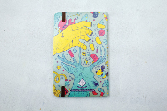
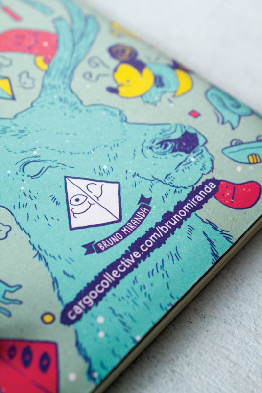
Inspired by cartoons, pop art and instrumental music, this book cover illustration splits elements to explain the concept of 'essence'.
Sign up to Creative Bloq's daily newsletter, which brings you the latest news and inspiration from the worlds of art, design and technology.
You are now subscribed
Your newsletter sign-up was successful
Want to add more newsletters?
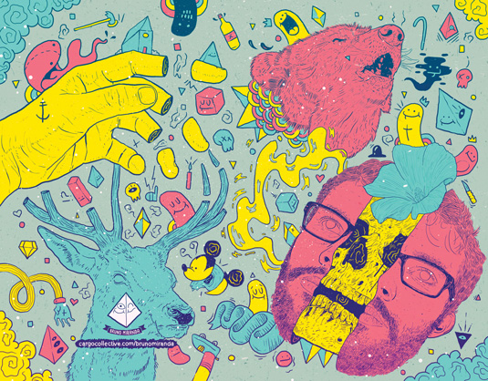
'Catchy' and 'attractive' - these were two of the key components of a recent cover illustration commission tackled by São Paulo-based creative Bruno Miranda for Brazilian stationery company SchizziBooks Papelaria.
Inspired by cartoons, pop art and instrumental music, the art director and illustrator contrasted a vivid foreground colour palette with a neutral background.
It's all about detailed traces combined with bright colours
"It's all about detailed traces combined with bright colours," says Miranda, who sketched over photographed elements in Photoshop before adding doodled details of his own. "The split elements explain the concept of 'essence' by showing what's inside the objects - like the face split in half revealing the skull," he says.
Article continues below 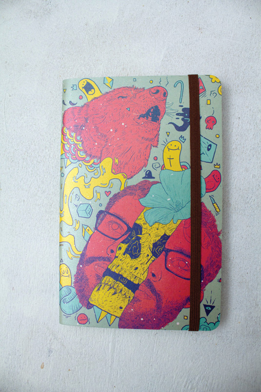
This article originally appeared in Computer Arts issue 218
Like this? Read these!
- Create a perfect mood board with these pro tips
- The ultimate guide to logo design
- Our favourite web fonts - and they don't cost a penny
Sign up to Creative Bloq's daily newsletter, which brings you the latest news and inspiration from the worlds of art, design and technology.

The Creative Bloq team is made up of a group of art and design enthusiasts, and has changed and evolved since Creative Bloq began back in 2012. The current website team consists of eight full-time members of staff: Editor Georgia Coggan, Deputy Editor Rosie Hilder, Ecommerce Editor Beren Neale, Senior News Editor Daniel Piper, Editor, Digital Art and 3D Ian Dean, Tech Reviews Editor Erlingur Einarsson, Ecommerce Writer Beth Nicholls and Staff Writer Natalie Fear, as well as a roster of freelancers from around the world. The ImagineFX magazine team also pitch in, ensuring that content from leading digital art publication ImagineFX is represented on Creative Bloq.
