How to get more from digital textures
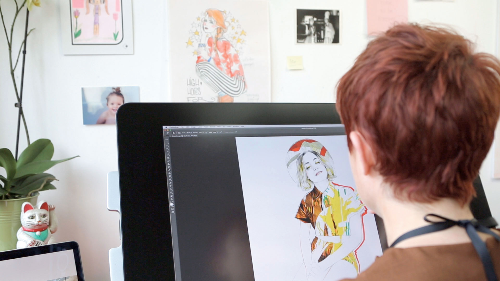
Digital working frees you to make as many mistakes as you like, in a workspace where the element of risk is taken away. These expressions (or 'mistakes') can be the best way of discovering new ways of communicating ideas.
As well as working as a commissioned illustrator, I create paintings and large-scale works which I exhibit globally, working in acrylics, inks and watercolour. I try to bring as much of this traditionally executed expression into my illustration work as possible, to give an organic finish to my artwork.
I love placing fresh textures and shapes randomly on top of my drawing work. Adding these elements without concern for scale issues, positioning, size or colour is a really great way to work for me.
Article continues belowMy Photoshop prowess has come a long way since my Paint Bucket and Lasso skill set (discussed in the previous workshop). But that's through experimenting and pretty much winging it over the years. I'll play with digitally cut-out shapes and layers for hours before getting the feel right. Then at other times, I'll drop in a new element without thought and it will work, and then inform the direction of the piece.
In this workshop, I'm going to impart a few tricks of how I do this, as a little preview to my whole process, which can be found in the Miss Led Illustration For Fashion Video Tutorial created by Train to Create.
Scanning your drawing work
To say that you should get a good quality scan of your artwork is pretty obvious, but to make sure it looks its best, always scan at 300dpi and don't scrimp on your kit. Go for good reputable brands such as Canon, Epson and Xerox.
I would also create a perfect scan of the image so that I would always have a copy of the original work. I will use the file to create quick prints, which are great for scrawling on and can help new ideas and narrative.
Sign up to Creative Bloq's daily newsletter, which brings you the latest news and inspiration from the worlds of art, design and technology.
A lot of drawing work can look dull and flat when complete. Playing with contrast and curves, adding light and dark areas, helps the overall image look less flat.
Digital collage
For my video tutorial I am working with a fashion styled image, but digital collage can be used in limitless ways.
Maybe your collage will have architectural elements, a landscape backdrop or interacting plant life. How could you use this technique within your practice?
Use a good quality image
It's important when using a reference in your work that your image is of a high quality. If you're working on a scan of 300dpi (which you should be), then your digital element will need to match this quality.
Make it pop
When scanning a photographic image, there are many simple actions in Photoshop CC to make it more vibrant and visibly portfolio-friendly. Using adjustments such as contrast, brightness and vibrancy, you can really bring out the colours.
For these sections I really want to 'hero' the yellow, and make sure it matches up to the acrylic ink in the painting.
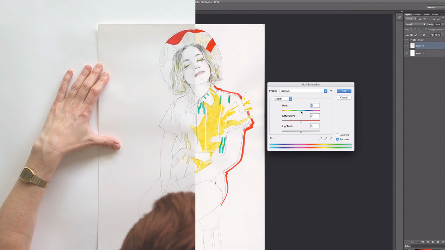
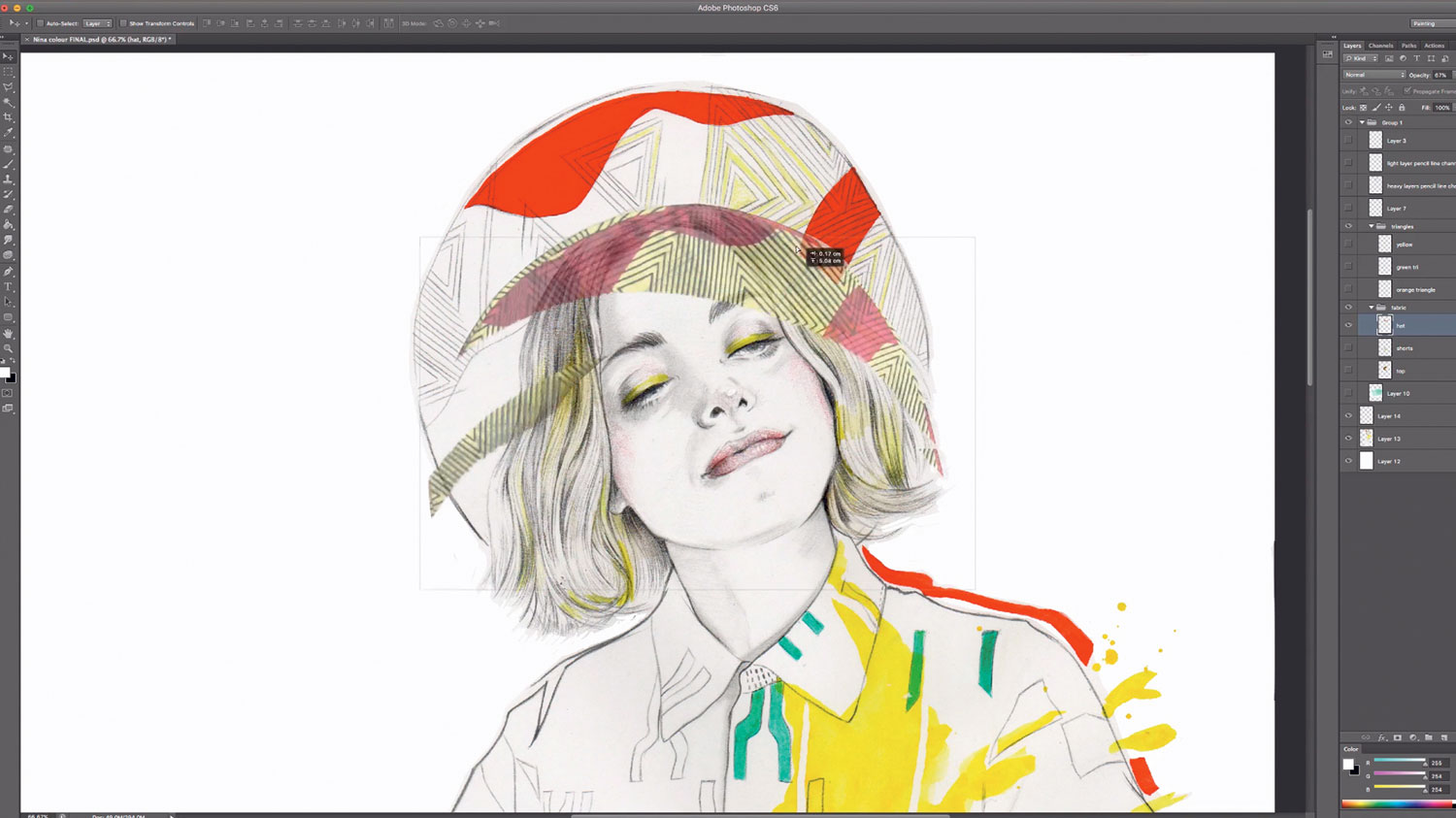
Using layers
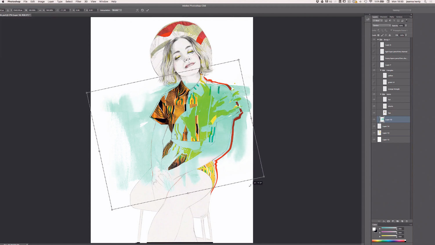
I've been using layers as a way of extending the lines of the drawing to acknowledge those in the fabric design. You can see this quite clearly in the hat detail.
I used this to reinforce the importance of the garments, as they were handmade by the model and it was worth spending time thinking about how to illustrate them creatively. So when creating the drawing work, I wanted the lines to be exactly in place.
Using a lightbox, tracing paper or a bright window, you can easily match the lines in your sourced reference. Then, using layers in Photoshop, connect the digital to the drawing lines. As a theme in my work is positive and negative space, I wanted to play with cutting shapes out from the photograph fabric areas to reveal the drawing work underneath.
Digital texturing
There's nothing better than making a total mess in the studio space. Most designers will tell you that's a rare activity, but for me to add drama and movement to my work, I have to be able to mirror it within the process.
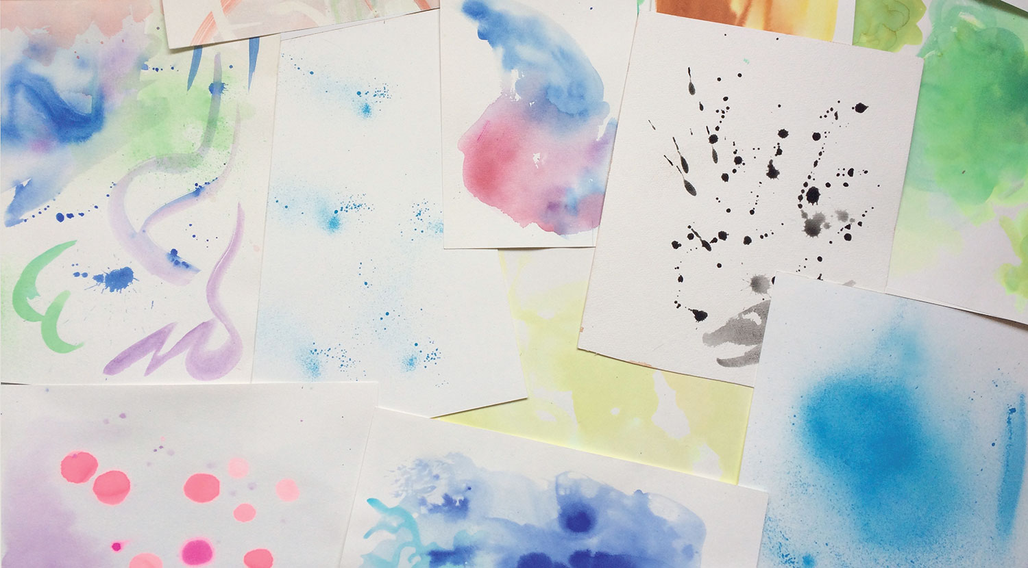
The tight, fine lines and considered balance of my drawing work really benefit from the bleed, run and chaos of loose paint work. Huge sloppy brush trails and ink splats thrown on from waist height to a floor lined with cold-pressed watercolour paper makes a great alternative to digital found watercolour marks.
I've been sourcing watercolour textures online for about eight years, and even though I've found some great papers and scanned watercolour, there's nothing like the real thing. And it's always nice to have complete ownership of your work, of course.
I really want to make the work as organic as possible; to keep up the vibrancy of running around a studio, finding more space for dripping sheets of ink paper, and having loads of fun.
Take a few hours off and make a mess. When your sheets are finally dry, get scanning. Don't discard any of the samples, as so much of the texture can be manipulated.
When I drop a texture into a fresh layer in Photoshop, I will play with settings such as Image Rotation, Hue and Saturation, Colour Balance and Opacity, and constantly shift and resize until it's right.
Again, as mentioned in our first workshop, you're adding another focus here, which will reinforce, enhance or disturb pre-existing composition and feel. Luckily you now have a huge amount of textural source material in your new reference library to use.
SAVE £10 on Miss Led's 2-hour video tutorial content
Miss Led's video tutorial, produced by the Train To Create team, takes you through this illustration project from the first pencil lines through to a range of traditional mixed media colour stages, including digital clean ups and dynamic photographic collage. The £59.99 tutorial includes full Photoshop layered artwork files and digital brushes, plus exclusive access to webinars and workshops as part of the I4F Creative Community, and you can save £10 by using this code: I4F_CA.
This article originally appeared in Computer Arts issue 261; buy it here!
Related articles:
