The World Economic Forum needed a report that could capture the complex challenges facing our planet and inspire the world's biggest brains to solve them. I'm a designer and illustrator at London-based creative agency Human After All and my role was to work with the art director, Victoria Talbot, on the tip-in data visualisations.
Expand your vector knowledge with 100 Illustrator tutorials
We discovered visual solutions to represent the data produced by survey questions such as: 'How great a problem does water pollution pose around the world?' and: 'Which region will be most affected by deepening income inequality in the next 12–18 months?'
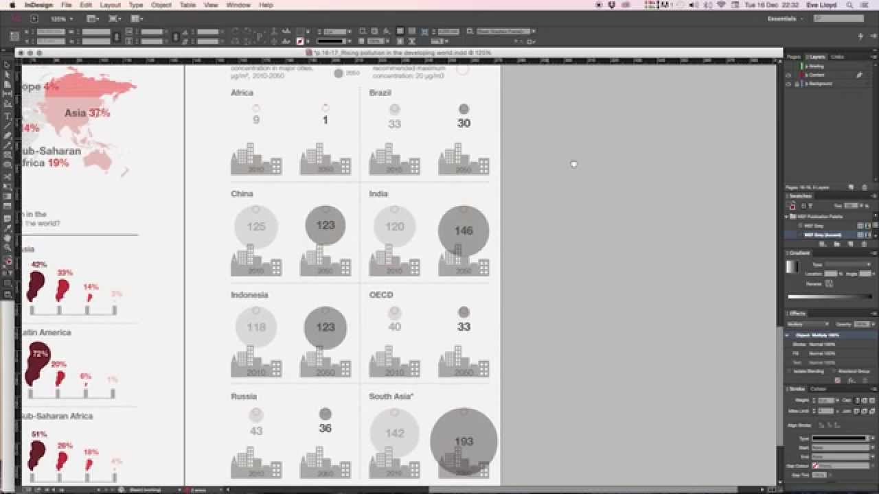
In this video walkthrough, I'll recreate a data visualisation using statistics from a survey entitled 'How will urban air pollution change over time around the world?'
I'll illustrate how the raw stats go from a Google Document through to Adobe Illustrator, and are then finished in Adobe InDesign.
You can watch the video, and follow the steps below...
01. Gathering data

First, I gathered the raw data provided by the client in a Google Document. I copied the relevant raw data from the table containing 'Projected PM10 (particles in air) concentration in major cities'. I extracted the results for each country in 2010 and then extracted the 2050 results in a separate action.
02. The first data graph

In Illustrator I used the column graph tool to create a graph which opens a dialog box. I pasted the 2010 data into the first column and the 2050 data in the second. Clicking the tick icon on the top right of the dialog box reveals the column graph. A right-click on the graph lets me add or edit data at any time.
03. Colouring countries

To extract the columns I ungrouped the graph, making sure to duplicate it first. I coloured the 2010 data a light grey and the 2050 a dark grey. I placed the columns next to labels indicating country. I arranged them in alphabetical order – this is how we planned to display the visualisations in the tip-in layouts.
Next page: three more steps to converting complex data into clear infographics

