The London Tube: celebrating an iconic logo
A new book delves beneath the surface of a symbol that's come to represent a whole city - the London Underground logo.
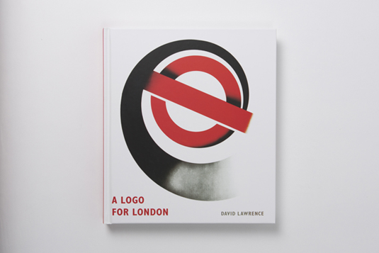
This year is the 150th anniversary of London's Underground system as well as the iconic Tube map's 80th birthday, and as such there has been a deluge of celebratory creations including a Google Doodle, a CSS recreation of the map, and the map's creator received a blue plaque. Now you can read about the famous London Transport logo design, the roundel, in a new book titled A Logo for London by David Lawrence.
A Logo for London celebrates the instantly-recognizable bar and circle, also known as the bullseye, which we reckon will particularly delight fans of design style guides.
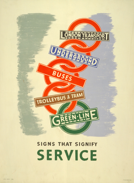
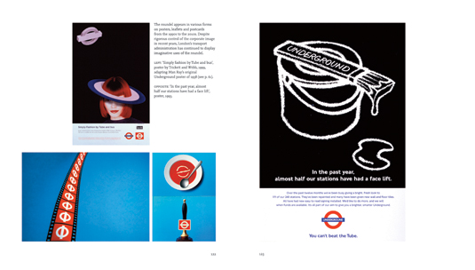
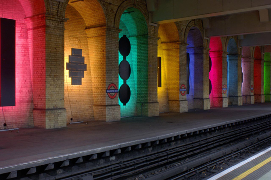
With 250 colour illustrations, a small sample of which you can see below, this charming and informative tome charts the history and development of the symbol from the early 20th century to the present day, as well as exploring its wide-ranging influence on areas including fashion, pop music and counter-culture.
Article continues below- Also read our Designer's Guide to London
Lawrence, research fellow at the London Transport Museum covers more than just the history of the logo. All London Transport branding from the 'UndergrounD' logotype to poster art is covered, plus photographs and other graphic material from the museum archives that in some places goes way beyond the assumed remit of the book (but is all the better for it) - it also features numerous inventive uses of the bar and circle, many of them previously unpublished.
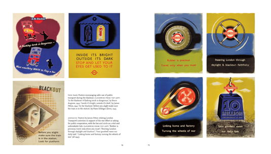
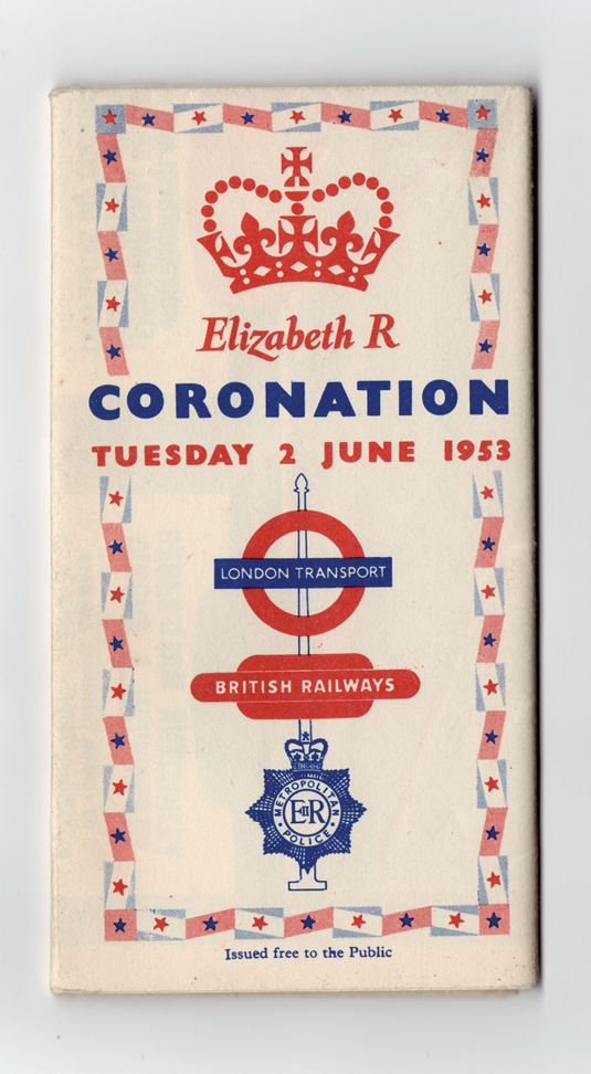
A Logo for London by David Lawrence is published by Laurence King, and goes on sale in October this year.
Also read:
- Our favourite web fonts - and they don't cost a penny
- Free graphic design software available to you right now!
- Create a perfect mood board with these pro tips
Tell us what you think in our comments.
Sign up to Creative Bloq's daily newsletter, which brings you the latest news and inspiration from the worlds of art, design and technology.

The Creative Bloq team is made up of a group of art and design enthusiasts, and has changed and evolved since Creative Bloq began back in 2012. The current website team consists of eight full-time members of staff: Editor Georgia Coggan, Deputy Editor Rosie Hilder, Ecommerce Editor Beren Neale, Senior News Editor Daniel Piper, Editor, Digital Art and 3D Ian Dean, Tech Reviews Editor Erlingur Einarsson, Ecommerce Writer Beth Nicholls and Staff Writer Natalie Fear, as well as a roster of freelancers from around the world. The ImagineFX magazine team also pitch in, ensuring that content from leading digital art publication ImagineFX is represented on Creative Bloq.
