These brilliant pencil posters are a huge hit online
Now that's what I call sharp design.
Sign up to Creative Bloq's daily newsletter, which brings you the latest news and inspiration from the worlds of art, design and technology.
You are now subscribed
Your newsletter sign-up was successful
Want to add more newsletters?
Brilliant print ads are often timeless, so it's no surprise that years-old designs have a habit of resurfacing online every now and again. Currently being appreciated anew is a campaign for art supplies brand Faber-Castell from way back in 2011.
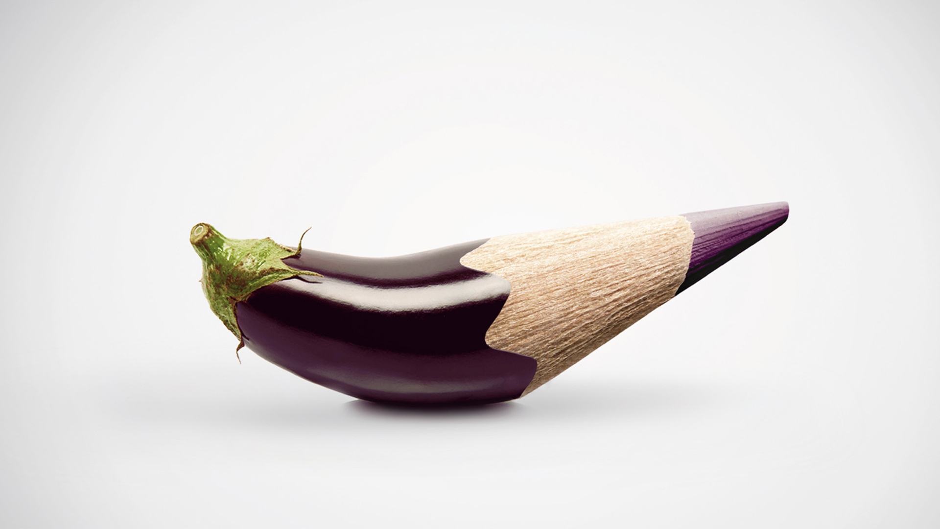
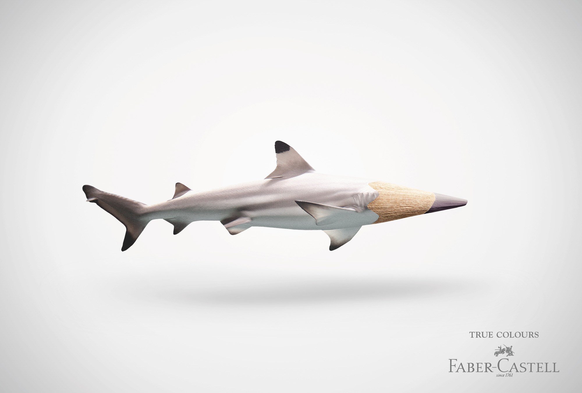
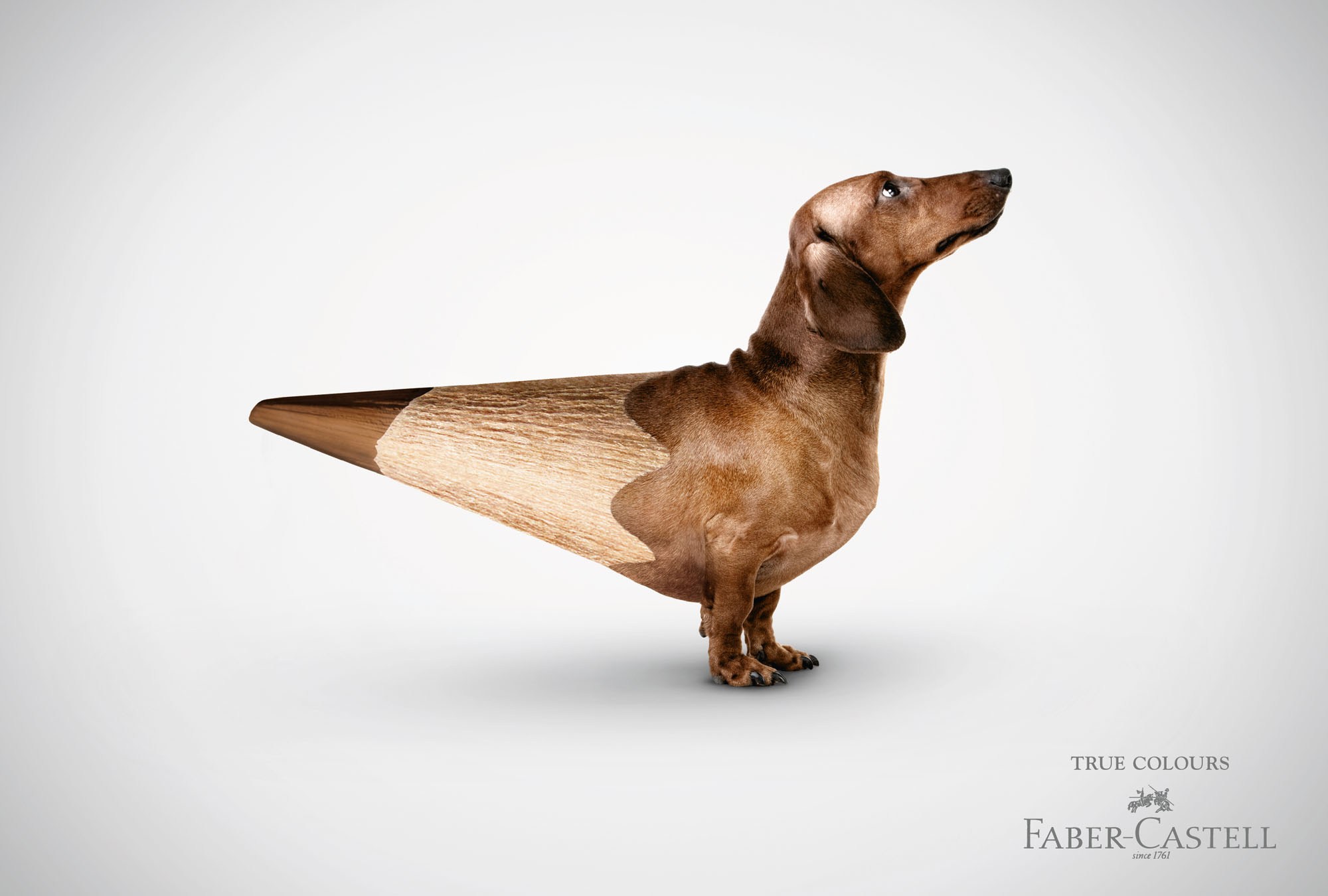
Like all the best print ads, the 'True Colours' campaign is just the right amount of smart, striking and witty. Demonstrating how the brand's coloured pencils are designed to be true to life, the ads depict a series of objects sharpened into, yep, coloured pencils.

From a fire engine to an aubergine (no jokes, please), the objects are seamlessly transformed into the nib of a colour-matched pencil. The posters were created by German ad agency Serviceplan, and are currently going down a storm on Reddit's r/DesignPorn page.
Article continues below 
Perhaps the most striking examples are those where the nib fits perfectly into the shape of the object, as is the case with the shark's head. But then again, those that disrupt the natural form are equally bizarre – how do you turn a dachshund into a duck? By sharpening it into a pencil, apparently. Inspired to get drawing? Check out the best pencils for artists (spoiler alert: they're all shaped like actual pencils).

I mean. Yeah! So much this. @FaberCastell Castell True Colours. Wonderful Campaign. pic.twitter.com/G3mKlsPPRZJanuary 28, 2020
From this brilliant lockdown-themed Kit-Kat poster to that genius Norwegian Airlines ad, we've seen some brilliant print design over the last few months. Want to create an ad of your own? Check out our guide on how to download Photoshop.
Read more:
- Should Disney bring back its hand-drawn animations?
- Nintendo's new Switch UI design is getting absolutely roasted
- How to design a logo
Sign up to Creative Bloq's daily newsletter, which brings you the latest news and inspiration from the worlds of art, design and technology.

Daniel John is Design Editor at Creative Bloq. He reports on the worlds of design, branding and lifestyle tech, and has covered several industry events including Milan Design Week, OFFF Barcelona and Adobe Max in Los Angeles. He has interviewed leaders and designers at brands including Apple, Microsoft and Adobe. Daniel's debut book of short stories and poems was published in 2018, and his comedy newsletter is a Substack Bestseller.
