The sentimental reason it's always 9:41 in Apple ads
It's not just blind continuity.

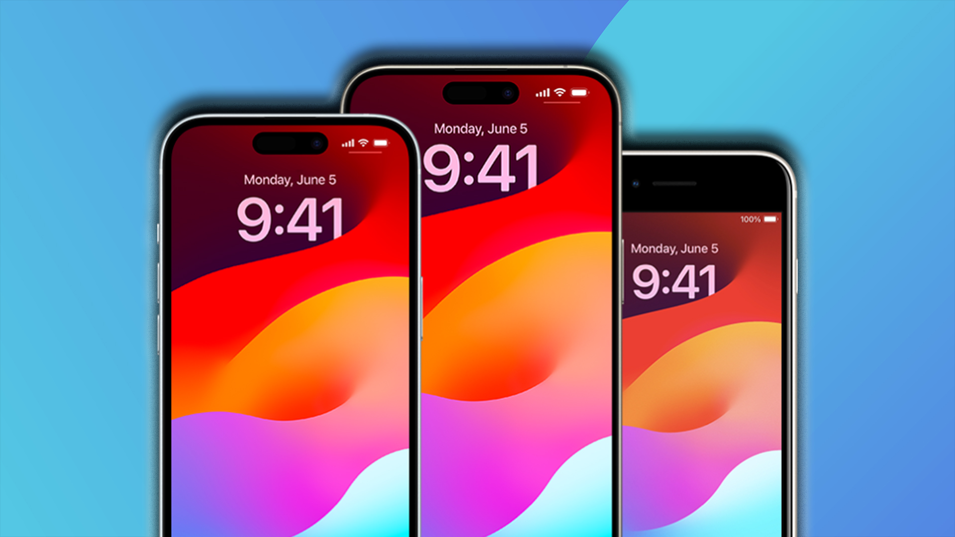
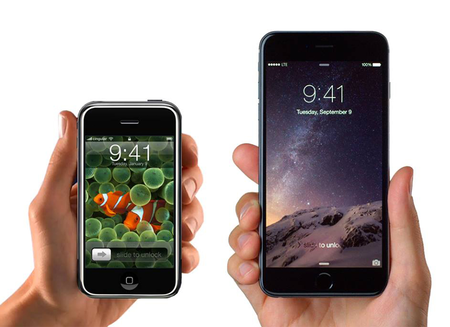
If you've been an Apple fan since the dawn of the iPhone back in 2007, you may have noticed one satisfying detail that's continued throughout its evolution. What's the time? It's 9:41, always. While it might seem like a random time, it turns out that this little detail dates way back to the iPhone's debut, and it's stuck ever since.
From the original model all the way to the iPhone 15, the strangely specific time has been displayed in presentations, billboards and posters across the Apple timeline. With a slice of tasteful continuity, each new Apple launch is a subtle homage to its humble beginnings.

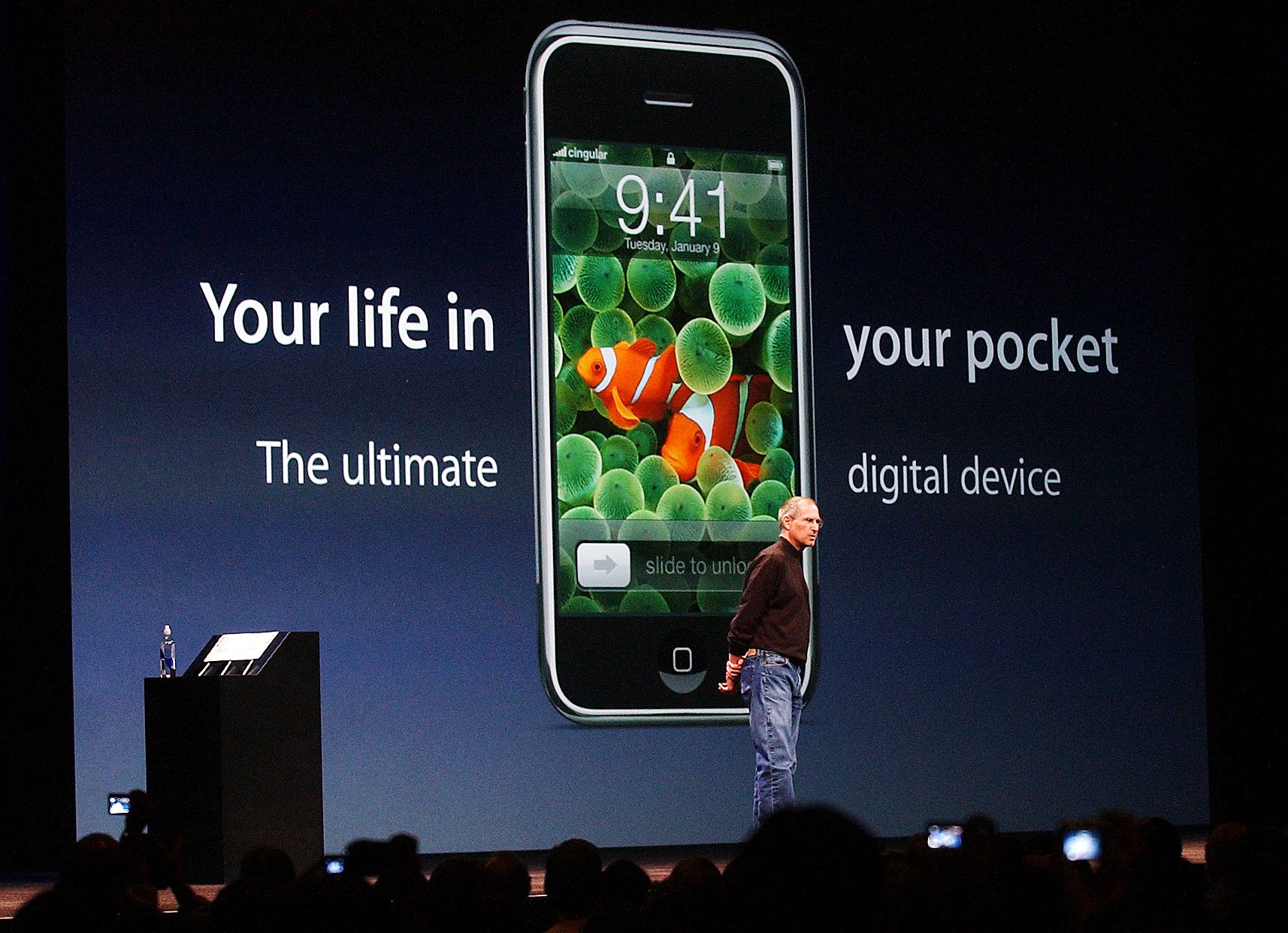
The story goes that before the 2007 iPhone debut, the team went through a test run of the presentation which saw the big reveal hitting around the 40-minute mark. Giving themselves some leeway, the team set the Keynote presentation to read 9:42 to align with the time the audience would see the first ever iPhone.
Article continues belowThe 9:42 AM trend carried throughout Apple's marketing for around three years until the iPad made its debut. It turns out that the 40-minute mark was pretty accurate, so when the iPad was announced, the team altered the presentation to read 9:41 AM. With the accuracy nailed, 9:41 became the official display time in Apple's marketing and it still continues to this day.

After Apple's recent Let Loose event, there's lots to be excited about in the Apple sphere like the new iPad Pro and Apple Pencil Pro (see our initial hands-on experience here). If you're still on the fence about upgrading your kit, check out our guide to the new iPad Pro M4 to see if you should take the preorder plunge.
Sign up to Creative Bloq's daily newsletter, which brings you the latest news and inspiration from the worlds of art, design and technology.

Natalie Fear is Creative Bloq's staff writer. With an eye for trending topics and a passion for internet culture, she brings you the latest in art and design news. Natalie also runs Creative Bloq’s 5 Questions series, spotlighting diverse talent across the creative industries. Outside of work, she loves all things literature and music (although she’s partial to a spot of TikTok brain rot).
