When the clock's ticking on a logo design project that you need to present to a client, sometimes you'd give anything to discover a workflow that could speed up the process. Well, one poster on Reddit would have us believe that designing a logo is actually a lot easier, and a great deal quicker, than almost any designer could imagine.
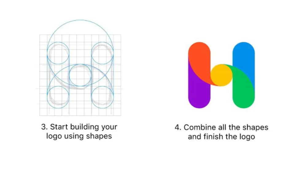
According to this post, there are no more than four simple steps to design a logo. All you need to do is import a sketch into your software of choice, add a pixel grid on top of it, build up the logo using shapes. Combine the shapes, and hey presto, you've got yourself a logo!
Not convinced? No, frankly, neither were we. The eyebrow-raising tip was first posted on Reddit way back in early 2020, and we still can't quite get over it. We'd recommend that any designers looking for more comprehensive advice take a gander at our logo design inspiration post or peruse our favourite monogram logos or 3-letter logos. If you do really want to design a logo more quickly with minimum hassle, then take a look at our selection of the best free logo designer software. But first, let's just look a little closer at this gem of logo design advice from Reddit.

Above, you can see the full process that's being proposed, and it really does make designing a logo look easier than falling off a bike. Import a sketch, add a pixel grid, apply shapes, combine the shapes. All very neat, but where does that sketch come from exactly? The process seems to overlook the most important – and most difficult part of logo design, as some of those commenting on the post were keen to point out.
"What comes before step one is the hardest part," one person observes, while others take issue with the proposal of using circles. "Pure geometric is often a bad idea," another person says. "See how great fonts are always off-geometry to take into account visual perception. Apple notch is also not on perfect circles. Android squircles. Google logo. etc."
Of course, we're being a little unfair, and as the original poster explains, the aim was to show how a sketch can be transformed into a finished logo using geometric shapes rather than to show the whole process from research and concept. We're not convinced that the finished result in the example really works for the "banking-related company" it was apparently designed for, though.

Some people offered more constructive feedback. "The sketch looks solid, but then the finished version feels loose and incomplete. I think a solid stroke would be the way to go," one person suggests. "The colors don't seem connected or mean anything. Exploring colors with some shades (hsb) could be cool. Perhaps capture a 3d look," another person adds.
Want to brush up on some of the gaps in this logo design process? Take a look at our logo design guide and our top typography tutorials post. And if you need the best software for designing logos, you'll find the best current prices on Adobe's Creative Cloud suite of apps below.
Read more:

