
Currently, there are three ways to design a great-looking chart. One: draw it from scratch using a program like Illustrator. Two: use a template tool. Three: learn how to code.
A new data visualisation tool code-named Lincoln is set to change all that – if it gains approval. Previewed at Adobe Max 2017, the tool flips the typical creative process for designing a chart or infographic on its head.
Rather than using data as the starting point to dictate the design, Lincoln puts the creative stage first, letting users craft their graphics and then bind the data to them. As the data populates the chart, the graphics automatically adjust to the information presented.
What does that mean? Well, by automating the design and production of infographics, Lincoln lets users focus on the creative side of the process and ensure the data is visualised in the most engaging way.
“Lincoln is new set of data-driven drawing tools that sit on top of your normal drawing tools,” explained Bernard Kerr, a senior experience designer at Adobe.
Kerr walked through the tool during this year’s highly anticipated ’sneaks’ session – in which new innovations are showcased (see our Sneaks highlights here) – using Lincoln to quickly bring to life data from open-water swimming marathon challenge Ocean’s Seven.
Watch the video below – and prepare to be amazed.
(And if you like it, let Adobe know using the hashtag #ProjectLincoln. If it receives enough support, it'll be incorporated into an Adobe app.)
#ProjectLincoln
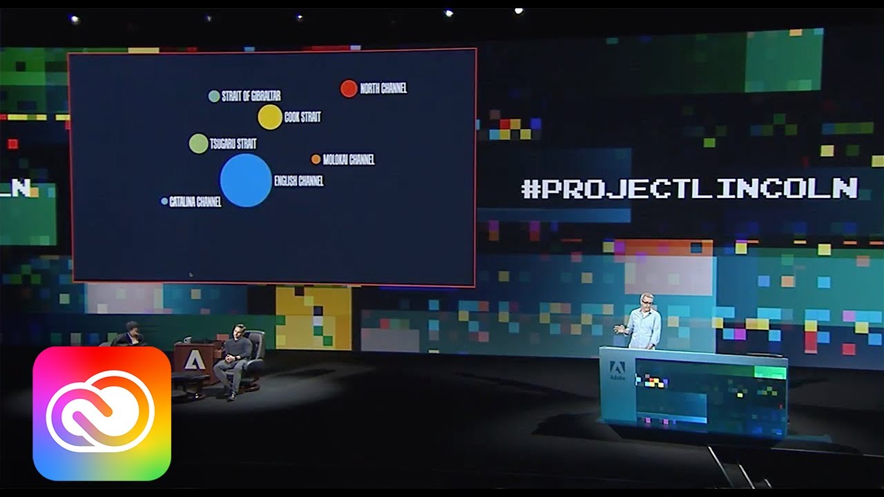
As you can see in the video, Kerr drew a custom bar shape to represent swim time, binding it to the relevant data in a spreadsheet in one click, and using Repeat Grid – borrowed from Adobe XD – to instantly create a series of bars that represented the time of each swimmer.
Kerr added text using the Text tool, binding the text box to the data column containing the swimmers’ names. He also added an icon of a swimmer from the Library Symbols panel, using “sticky anchor points” to anchor one foot to a specific location at the end of the bar – and this rule was instantly repeated throughout chart.
Once he was happy with the data bindings, Kerr then showed how Lincoln can instantly apply the same rules across different data sets – in this case visualising the data for each of the seven races in the marathon – and how functionality like a radial pattern tool can visualise complex sets of data, like weather patterns over a one-year period, in seconds.

So how much time could Lincoln save you? Kerr created 14 data visualisations in four minutes. It's impressive stuff and could revolutionise infographics – certainly it gets our vote.
Taking away the drudgery
Lincoln is just one of 15 ‘sneaks’ showcased this year at Adobe Max. Some will become official features built into selected software; others won’t make it past the presentation we saw today.
It’s all part of Adobe’s aim to “take away the drudgery” of routine tasks, as vice president and general manager of Creative Cloud Mala Sharma explained during an earlier press briefing. The aim is to help designers work faster, freeing up more time to focus on the bigger picture of being creative.
Why? Because no one wants to spend three hours doing something you can do in three minutes. This was a recurring theme at Adobe Max 2017 – the sentiment underpins all the latest announcements at this year’s conference, and we're likely to see it brought to life in increasingly impressive ways as Sensei continues to evolve Adobe's creative products.
Related articles:

