Why controversial UKIP logo falls on the branding sword
Questionable rebrand illustrates the gaffe that keeps on giving.

The political landscape today is somewhat unpredictable, and certainly surprising. Yet in turbulent times – where each daily news story is greeted in the majority with “what have they fucked up now?” – those ever-bundling folk at UKIP have proved again, that above all parties and characters of politics, they are the gift that keeps on giving. Or maybe more aptly ‘the gaffe...’
Last Friday, at their party conference (in a building part-funded with EU money. Just sayin') they didn’t just hold an election for the person to lead their party, but the logo to lead it too. And in the model of the referendum they’d been crusading for since the early 1990s, it was a 'this or that' demonstration of democracy in selection process.
The first choice depicted the party acronym strapped-in above the line “For the Nation”, complete with two swooshing sashes of yellow and purple respectively – the whole graphic boat-load ready to set sail out of Torquay harbour.
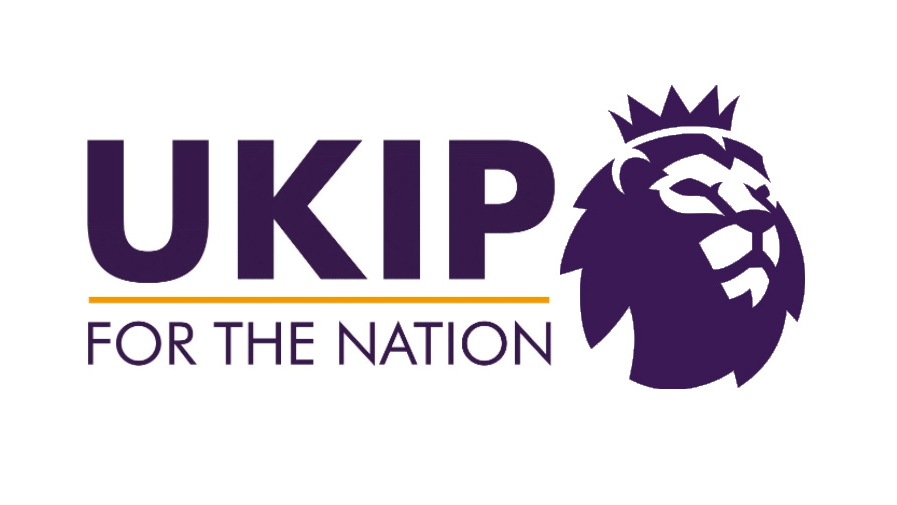
Article continues belowThe second option had all-but-the-same type and layout, but it swapped the seaside for the Serengeti, with the head of a lion mounted beside the text.
Roaring to victory?
The conceptual rigour in the two routes is clear for all to see. The first obviously represents UKIP’s primary contribution to politics: wind and hot air.
The second harks back to those halcyon days in British history that the party is assumedly so proud of. You know, the times where all we had to worry about was the Church, medieval poverty, famine and disease, whilst our royalty and elites looked after themselves at the expense of global stability. Exceptional brand strategy on both counts, we can all agree.
But it was the latter lion that roared to victory, winning the vote and sinking the sails to democracy. Cue pandemonium, furore and unrestrained mocking.
Sign up to Creative Bloq's daily newsletter, which brings you the latest news and inspiration from the worlds of art, design and technology.
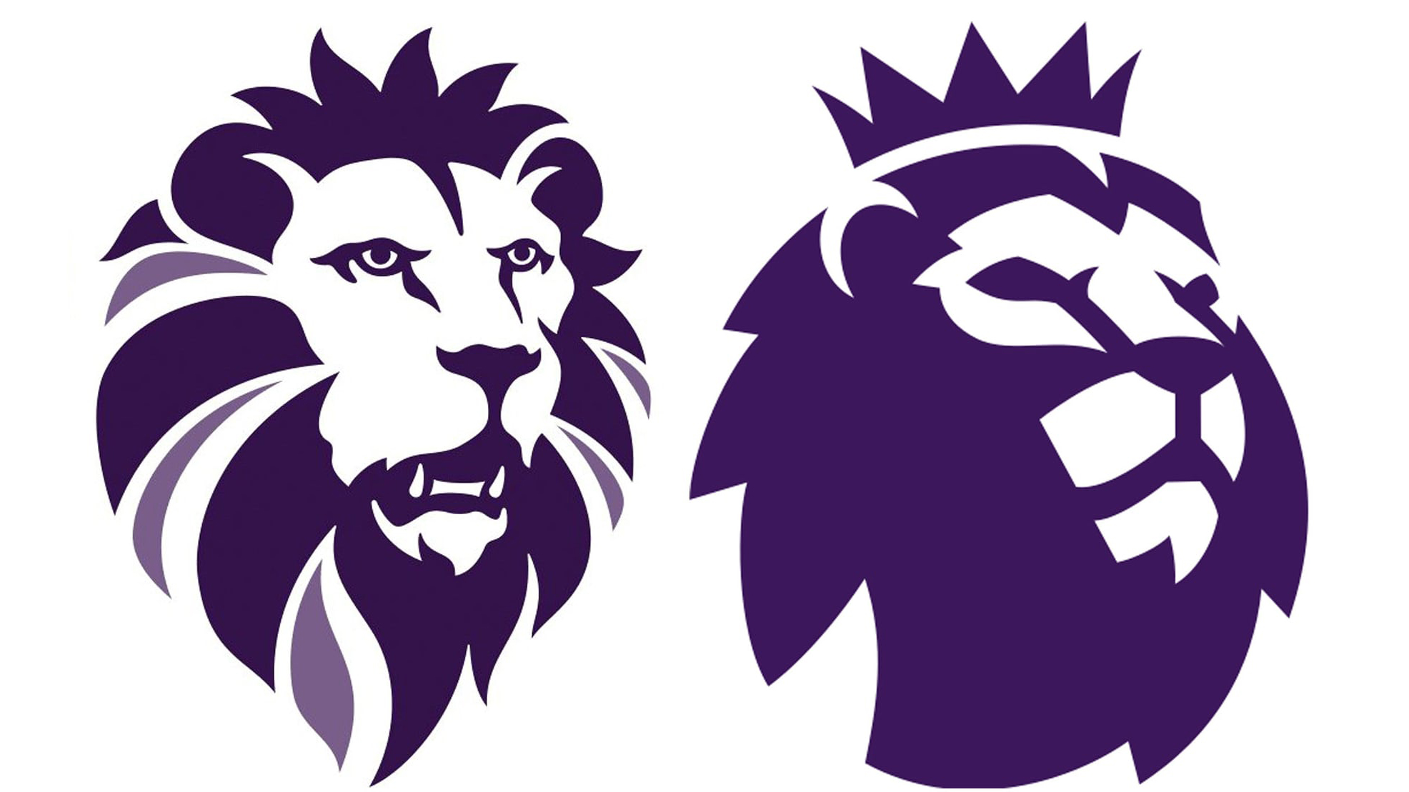
Many swapped the usual “my kid could've done that” for “you've just nicked that”, citing the startling similarities to the lion in the Premier League logo (which is also no stranger to Simba-based scoffing). Others questioned why an anti-immigration party felt an African / Asian animal an apt symbol.

But there are valid critiques that need to be debated here. If, in fact, a lion represents qualities of so-called ‘Britishness’ (pride, courage and so on) – qualities that UKIP is so desperate to align with – why, then, does it bear the resigned look of a lion staring down the barrel of a rifle of a rich US dentist? Or like it’s just got to the border and realised it’s forgotten its passport?
Creative logo amends
Social media wasn’t shy in offering some viable amends, replacing the lion render with the Cowardly Lion from the Wizard of Oz; Scar from the Lion King; a Lion from Crappy Taxidermy; and, of course, a treated version of the infamous image of a busted and bleeding Nigel Farage as he emerged from a plane accident in 2010.
UKIP, they're rrrrrrrrrrrrrrrrrrrrrrrrrrrrrracist pic.twitter.com/fySi2ArkwhSeptember 29, 2017
Others confirmed the resemblance of the lion with the protagonist of Japanese animé Dragon Ball Z (only upturned). And some just downright changed the lot.
Of course, all UK political parties fall to the branding sword at one point or another. Surely everyone can remember the ‘Tory Tree’ and its subsequent tale (not to mention that the party commandeered the bulldog association through the corpulent Churchill). Labour, too, has wilted its rose under the marketing and PR press over the past few decades.
However, with UKIP facing falling support and the label of redundant after seemingly achieving its one and only ambition of Britain withdrawing from the EU, a rebrand hardly feels like the most robust and defiant response to questions of its integrity and identity as a political party.
No, UKIP lumped for a lion and its connotations, leaving one to only assume that it thought no animal native to the British Isles had the necessary qualities to personify their party.
Whereas the weasel, surely, is a worthy consideration.
Craig Oldham has recently published ME & EU: Postcards from a Post-EU Britain by Nathan Smith and Sam Smith. The book is a limited-edition collection of postcards written and designed by UK-based creatives that were sent across Europe as a means to reconnect the UK with the EU in the wake of Brexit – available now.
Related articles:

The Creative Bloq team is made up of a group of art and design enthusiasts, and has changed and evolved since Creative Bloq began back in 2012. The current website team consists of eight full-time members of staff: Editor Georgia Coggan, Deputy Editor Rosie Hilder, Ecommerce Editor Beren Neale, Senior News Editor Daniel Piper, Editor, Digital Art and 3D Ian Dean, Tech Reviews Editor Erlingur Einarsson, Ecommerce Writer Beth Nicholls and Staff Writer Natalie Fear, as well as a roster of freelancers from around the world. The ImagineFX magazine team also pitch in, ensuring that content from leading digital art publication ImagineFX is represented on Creative Bloq.
