Get started with web typography
We explain the basic concepts and terminology of web typography, including how it differs from print typography, in words you can understand.
Sign up to Creative Bloq's daily newsletter, which brings you the latest news and inspiration from the worlds of art, design and technology.
You are now subscribed
Your newsletter sign-up was successful
Want to add more newsletters?
Typography is the art of arranging type into a legible, aesthetically pleasing and design-appropriate layout. In print this is set in stone; the reader can't change the way the text appears once it's been printed.
On the web, however, users can adapt their browser settings to increase or decrease the default font size, overwrite font-size choices the designer has made, or change colours to increase contrast. Consequently, you might think that effective typography isn't possible on the web.
But not only is it possible; in many ways the web offers superior options to traditional typography (though these free script fonts are brilliant, too). Not because as a designer you have finer control over how type is arranged or positioned, but because the web allows users to control the appearance of type to suit their own particular needs.
Article continues below- Check out our favourite web fonts - and they don't cost a penny
That doesn't mean, of course that as a designer you can abscond your responsibility to present beautiful type with carefully considered positioning and properties - many of the rules from print apply to the web. If you need a refresher in that, then you'll find a rundown of the basics of typography in our article What is typography, but here we're going to look at the specifics of what web typography (as opposed to print typography) demands...
01. What are web fonts?
It used to be that if you wanted to render type on the web so that it appeared in the same font across different computers, you had to stick to a paltry handful of fonts common to all browsers and computers. Your choices were Helvetica (or Arial on a PC), Georgia, Times, Verdana or some version of Courier. Oh, and Comic Sans - but let's not go there!
This strictly limited palette of fonts led to a depressing homogenization of typography on the web, depriving web designers from the joys (or horrors) of a full set of fonts to choose from.
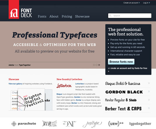
Thankfully this has all changed in recent years with the arrival of services such as Typekit, Google Web Fonts, and FontDeck. For the first time, a wide range of fonts is available for use on the web, and web design is evolving to take full advantage.
Sign up to Creative Bloq's daily newsletter, which brings you the latest news and inspiration from the worlds of art, design and technology.
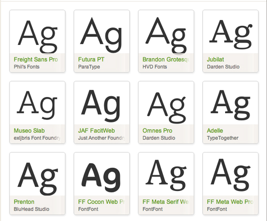
So given that there's the huge new range of web fonts available, how do you choose? Here are a few pointers...
Less is more: Choose one base font, and one display font, and try to stick to that. Just because there are thousands of fonts available, it doesn't mean you have to use them all in your design
Stick to fonts designed for purpose : There's no point using a display font for your paragraph copy as display fonts have been designed to be used in small bursts: they're ideal as headlines, but not optimized for reading large passages.
Choose appropriate fonts : Make sure you choose fonts that are appropriate for your subject matter. A script font might work well to represent a hand-written letter, but it's not going to give a professional impression if you're using it on a corporate website.
02. Leading, tracking and kerning
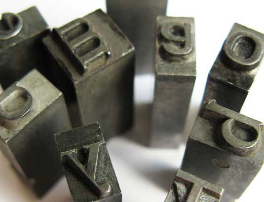
A good bit of typography should melt away, being almost imperceptible as it facilitates easy reading, showcasing the content. In print there are many ways to control type, and the way individual lines, words and characters interact with each other.
These options include the ability to set the leading (the space between lines), tracking (the uniform space between letters across a passage of text) and kerning (the spacing between two specific characters). All typographical properties are best set in relative units such as ems to allow for scenarios where text is resized by the reader.
On the web, there are similar controls for both tracking and leading, but kerning isn't directly controllable using CSS. To set your leading, use the CSS property line-height. To control tracking, use letter-spacing. You can also control the space between words using the word-spacing property, allowing you to open up your text without increasing the tracking to an uncomfortable degree.
Span a lot
If you want to kern between individual characters, the only practical way to do so is to wrap the affected characters in their own <span> tags. You can then apply CSS properties to the span, controlling the kerning. This can become a big job very quickly, so use sparingly!
All the same best-practice rules apply to spacing on the web as in print, so it's well worth reading up on how to choose an effective level of leading, tracking etc. Consider using a grid to help you align the baselines of your type into a clear structure to aid both legibility and improve design coherence. This tutorial on our Computer Arts channel should come in handy.
03. Column width
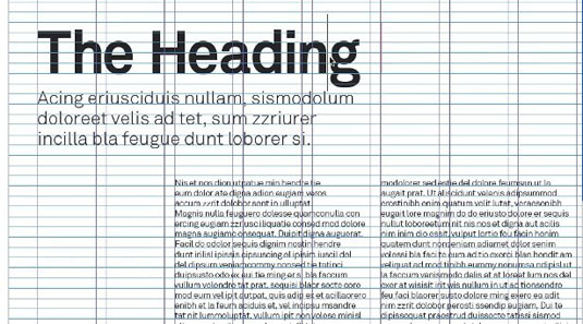
The width of a text column can strongly impact on its readability. In print, columns are typically set to contain anything between 45 and 75 characters (which is approximately 9 to 15 words wide). This is considered to be the ideal width for text, allowing the reader to easily move between lines without losing their place.
The same general rules apply on the web, so aim to set your type in columns no more than around 80 characters wide. Remember that you can set your column width in ems; use the CSS code: width:80em;
04. Typographic alignment
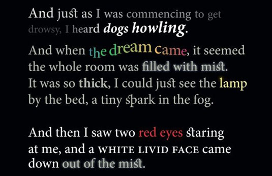
Just as in print, on the web you can set your type using either ragged line endings, or justified. Use the text-align property, and choose either left for ragged right, right for ragged left, or justify for fully justified text without the ragged line endings.
New to CSS3 is the text-justify property, which allows fine control over how justified text is spaced to fill the line. Unfortunately, browser support is still very sketchy at present.
05. Further reading
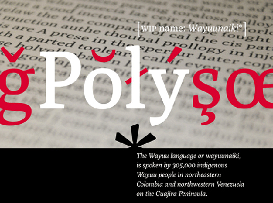
- Now we've explained the basics of web typography, check out our article Better web typography in 13 simple steps.
- To find out how to choose the right web fonts, read Choosing web fonts: 15 top tips and check out our round-ups of free web fonts and open source web fonts
- To go further with typography in general, check out this collection of top typography tutorials and keep up with the latest developments in this area by following these great typography Twitter accounts.
Words: Sam Hampton-Smith
Like this? Read these!
- The ultimate guide to designing the best logos
- Free graphic design software available to you right now!
- Useful and inspiring flyer templates
Do you struggle with web typography? Share your experiences in the comments below!

The Creative Bloq team is made up of a group of art and design enthusiasts, and has changed and evolved since Creative Bloq began back in 2012. The current website team consists of eight full-time members of staff: Editor Georgia Coggan, Deputy Editor Rosie Hilder, Ecommerce Editor Beren Neale, Senior News Editor Daniel Piper, Editor, Digital Art and 3D Ian Dean, Tech Reviews Editor Erlingur Einarsson, Ecommerce Writer Beth Nicholls and Staff Writer Natalie Fear, as well as a roster of freelancers from around the world. The ImagineFX magazine team also pitch in, ensuring that content from leading digital art publication ImagineFX is represented on Creative Bloq.
