



In this tutorial, I will guide you on my thought process and steps I take when approaching illustrations for clients such as Blizzard Entertainment, Games Workshop, Wizards of the Coast and others.
I'll go over the tools I use, brushes, layer types and much more, and the principles that I think about at each step to move me towards the finish piece. (Note that you might want one of the best drawing tablets to work on, along with the best digital art software).
01. The art brief
This is the very first step when working for a client professionally. You will be given an art brief with the goals of the piece, reference images you might need, and the mood that the art director or team is going for.
From this, my mind tries to think of any and all things I can do to reinforce the mood and tone they want to sell before I even touch the paper. This brief called for ‘Thalnos looking powerful’. A pretty nice broad description that gives us a lot of room to explore.
02. Thumbnailing

This step took me a long time to learn. Early on, I never gave thumbnails much thought: why do that when I can get right into the painting? I quickly learned don’t do that. I paid the price later by having to rework entire backgrounds, or elements that should have been solved in the thumbnail.
So for this stage, the main goal isn’t to make a good drawing; it’s to figure out major things such as big value groups, expression and tone, and to sell the story of the image. I think the first round of thumbs really just for me, they can look terrible, and like a bunch of scribbles.
Remember the goal is problem-solving, not making a finished drawing here, so as long as you figured out you want a big dark scribble in front or behind the tree, and the tilt of the sword going left and up, that’s the goal. Just make sure at the end, it is legible enough for the director to tell what the image will be.
03. Different options
When thumbnailing, (depending on the art brief) I like to give different moods or feelings while still selling the tone or goal of the piece. For this one it was pretty much make Thalnos look cool.
There are so many ways to do that. So, to help the client, I like to give them one that’s an action shot, shooting magic at the viewer, or another of him looking down at you ominously, or a distant shot, floating above the land as a dark god.
Try to not just have different angles with the same exact mood. Guy standing on cliff, guy standing on cliff three-quarter angle, and guy standing on cliff side-view. This will help the director decide much quicker because they will identify with the right mood, not so much ‘do I like this angle more?’.
04. Rough sketch

Here I take the thumbnail and start to figure out what areas of my subject are in light, which are in shadow, and fix major drawing issues such as proportion or perspective. I do this in Krita, Clip Studio, or Photoshop, whatever you’re most comfortable drawing in.
In this stage we’re just trying to make sure anatomy is looking correct, and things are placed in the right spot
05. Rough value underpainting

I like to handle things with just value a lot of the time first, much like a grisaille underpainting. So here I start to render up my light and shadow shapes gradually. From my thumbnail, I know I want the skull and the hand to be my brightest points.
So I need to make sure I drop the values down in the rest of the piece for that reason. I think about light direction, but I also don’t care at the same time. If a cast shadow that ‘would’ be there gives me a shape I don’t like, I leave it out. Remember, you’re in control here.
06. Colour roughs

After I get major values down, I sometimes do a very quick colour rough for the client. Honestly, I try to avoid colour roughs for clients because colour is so subjective, and I want the idea and mood approved without colour, and then add it after the value sketch approvals.
But for colour roughs I try to just get the big three to five colours of the piece down. Not what every colour will be, just the big elements. Is this a big red dragon? And a blue wizard fighting in a dark grey cave? Yes, you can have some nice tiny hints of green algae on the rocks, and some subtle browns here and there, but my goal at this stage is to make sure the big, overall colours and values play nice with one another.
07. Value push

I keep rendering and pushing my darks and lights, careful to leave myself room at both ends of the value scale to come up and down as I continue to render. Here I really start thinking of that visual path I want the viewer to take, having areas of rest and areas of detail as they move through.
Think of it as a small road trip: people need to stop and pee sometimes. Here, that rest stop is the inside of his cape, and the background behind him.
08. Gradient map
I then make a new gradient map layer. This is to get the underpainting away from just grey and black. This way, when I come in with colour layers, and soft light layers, it stays more vibrant and still has some colour information.
This can be so many different combinations of colours. If you choose your complementary colour, it will have a neutralising effect on the glaze you apply. But with digital, you can cover completely, like it’s oil that has already dried.

09. Colour, and soft light layers
Now I make a soft light layer and start to bring in my major colours. I know I wanted his cloak and bones to really stand out, so I went for two warm tones with the purple and neutral browns and yellow, making the rest of the image very cool. Try to think of colours as warms and cools, not reds and blues.
Technically purple might be a cool, but when surrounded by blues it’s quite warm. It’s all about relationships with values and colours. Something is only light because it’s next to something dark; something is cool only because it’s next to something warm.
10. Overpainting

Now my major colours and values are figured out, it’s time to start rendering. I usually try to focus on my focal area first, getting that to feel interesting and detailed as I want it, then move into the rest, still leaving room in my values to add those highlights and dark darks at the end.
I try to introduce a pretty good amount of finish there so I can translate that to the rest of the piece.
11. Touch base

When I have the painting looking pretty decent, I like to send it back over to the client for mid-painting thoughts before taking it all the way to final. This way if they want a colour change, or things aren’t matching the way they want, they have a chance to get in front of it, and less chance of being surprised towards deadline when they are typically getting a lot of other work coming in along with yours.
If you are working for card games, they usually send things out in waves, so they will be more slammed closer to the deadline when all the other artists are turning in their work, and it might take them longer to get to your feedback. So it’s always good to send things early if possible.
12. Detailing and story

Here I glaze the background down more into the value I need so that the bright blue magic skull shines with a low opacity multiply layer. I start to indicate cobwebs and skulls in the cellar in which this boss resides, figure out what kind of runes I want on the staff, etc…
I try not to add too many big-contrast shapes in the background to avoid bringing too much attention there. You can add contrast, but just keep it on the small side; if you add a big light, or shadow shape you did not plan for, it may throw off that far read of your work.
13. Final details
Towards the home stretch I start bringing in my darkest darks and my lightest lights. I use some dodge tool on his glowing head and hand, along with Lucas Peinador’s amazing LP Traditionalizer textures and brushes. This really helps give it the feeling of a little more of a traditional classic fantasy painting.
This stage is all about making sure my edges are the way I want them. I use a hue saturation layer just to push and pull some of my colours to make them pop, and a contrast layer to make sure I am vibrant enough for the card to read. Think of this as a nice coat of varnish, like at the end of a traditional painting.
14. Final send-off thoughts

They usually will have some subtle notes about maybe saturating some colours more, or increasing/ decreasing darks depending on the print or what have you. After that, you just make those adjustments and get that sweet, sweet ‘cheddah’, or ‘the bag’ as the kids say nowadays.
I hope this tutorial helps you with your future commissions and thank you for taking the time to read through. If you like tutorials like this and would like more of my brushes, and also behind-the-scenes of the art I make for clients, and personal work, please feel free to stop by my Patreon: patreon.com/cw/ColeEastburn.
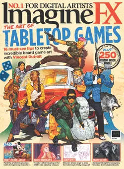
This article originally appeared in ImagineFX. Subscribe to ImagineFX to never miss an issue. Print and digital subscriptions are available.
Creative Bloq is now easier to access than ever before with our on-the-go app, which brings you all the content you know and love from our website, but in a super-streamlined design.
Download the Creative Bloq app for iOS
Download the Creative Bloq app for Android
