Become an award-winning illustrator: 6 top tips
Get your artwork noticed with these expert illustration tips.
Sign up to Creative Bloq's daily newsletter, which brings you the latest news and inspiration from the worlds of art, design and technology.
You are now subscribed
Your newsletter sign-up was successful
Want to add more newsletters?
I spent my early, bohemian years in fashion design amidst the best pencils, watercolours, markers and pens. I kind of miss those days, but once I made the choice to move to the Wacom Cintiq 13HD, there was no going back.
My education started in an art institute, we’re talking ‘90s when all the internet was geek stuff, so my training was analogue. Also, after having obtained my fashion design degree in the early 2000s, I got my first job in the fashion industry without knowing anything about computer arts. Imagine a primitive woman looking at fire, that was me all those years looking at you Photoshop CC wizards.
The truth is that anybody can handle a major change if they have the will to do so. In early 2016, I began shifting my career from fashion design to visual storytelling for advertising and editorial purposes, becoming a digital artist at the same time. Once I learned Photoshop basics such as layers, swatches and brushes, transitioning to digital was just a case of applying the number one rule for illustrators: just draw, draw, draw.
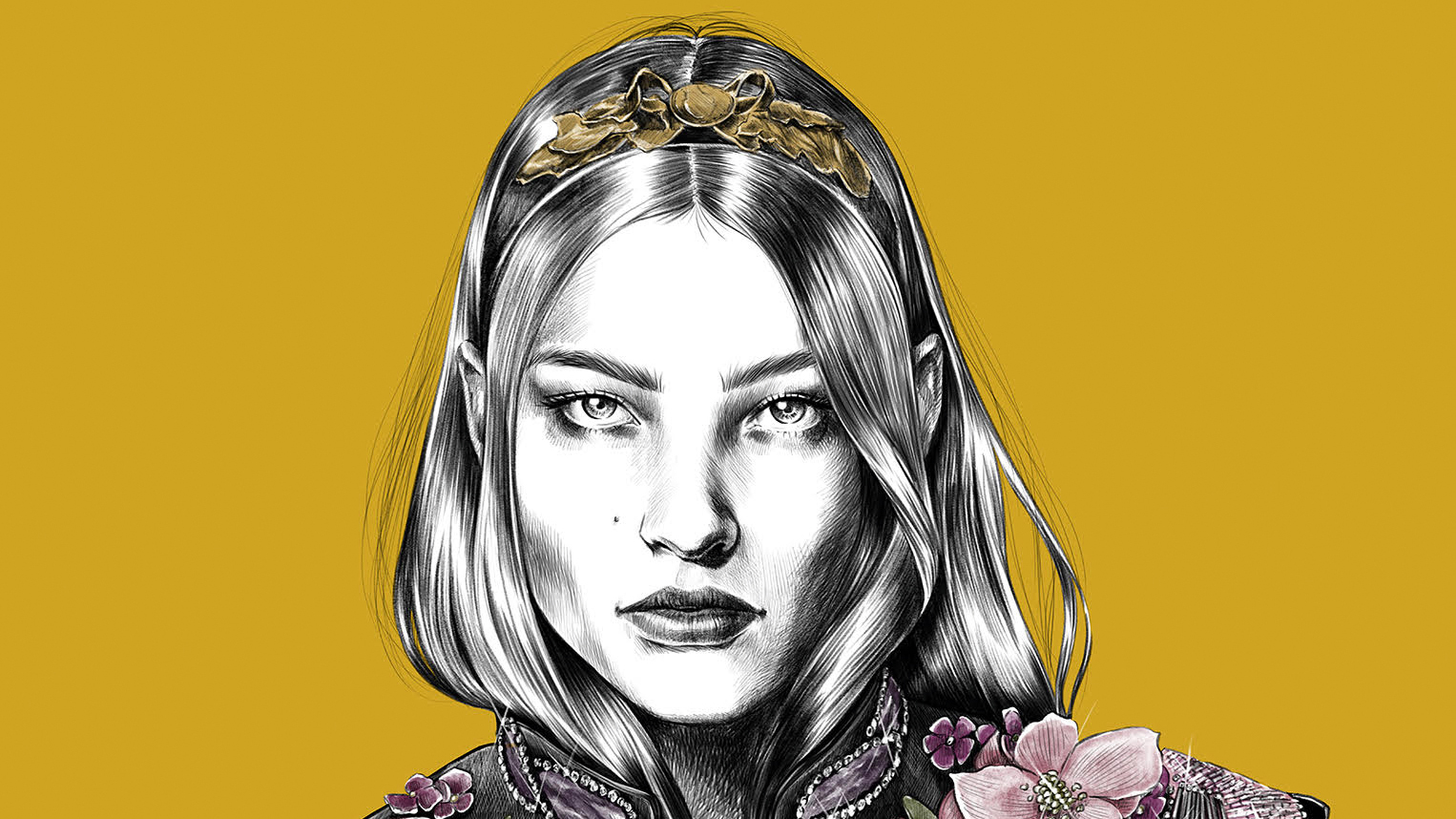
Article continues belowHere's how I create my work, which won a World Illustration Award in 2017, in the Self-Initiated New Talent Category.
01. Do your research
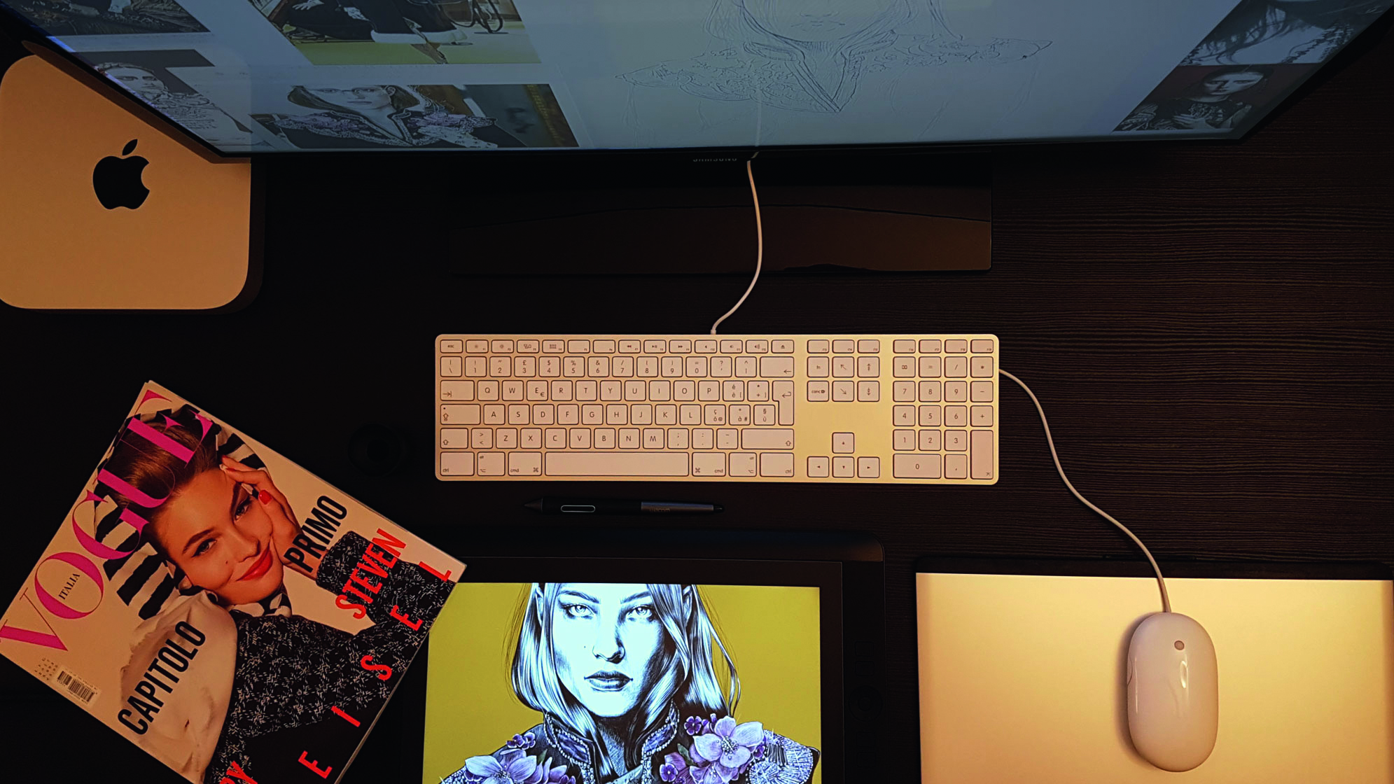
Without an idea, preferably a good one, no digital nor analogue brush will help. My process is inextricably linked to research. This research usually generates a moodboard in the form of filling my working space with pictures from runways and Post-it notes, then the creation of one or more characters that I try to give a soul to, even before creating their physical features.
I always try to tell an entire story in the single frame I have at my disposal, leaving the rest to the imagination of the viewer. Once I have my research and idea sorted, I get started on the more technical aspects of digital illustration.
02. Set up for online and print use
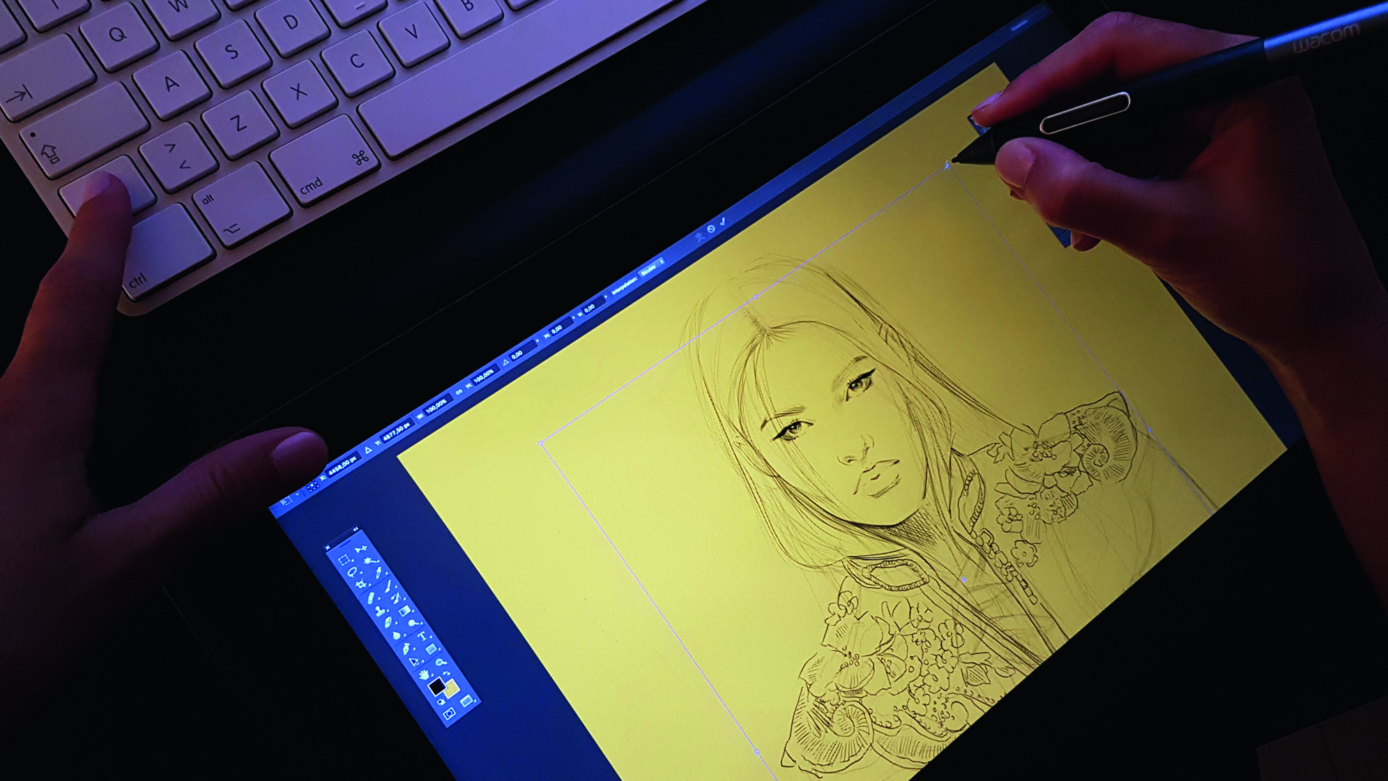
Unless otherwise specified by the client, I usually start my projects by creating an A1 canvas at 300dpi, which means 7016 x 9933 pixels. In terms of colour management, sRGB colour profile is a good starting point for all purposes: your work will be web/monitor ready and giclée/lithography adaptable.
Sign up to Creative Bloq's daily newsletter, which brings you the latest news and inspiration from the worlds of art, design and technology.
That’s because an illustration may have several lives that cannot be foreseen, as in the case of my award-winning piece Alice in Wonderland. Born for Instagram, it was subsequently lithographed on a number of magazines and on an art catalogue, fine art printed for a signed edition, reproduced on lenticular panels, and so on.
03. Build up a strong composition
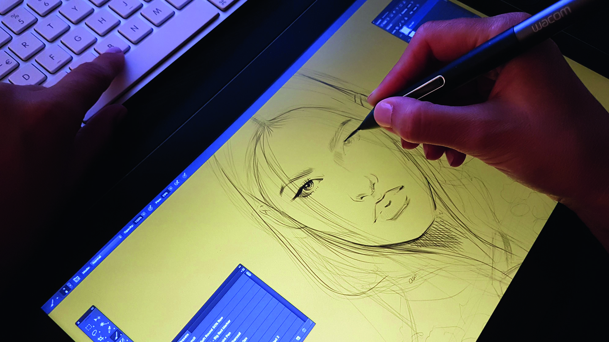
The first thing to do is avoid ‘white sheet panic’. How? I fill the background layer with colour, usually one picked out from the fashion palette of the season I’m working on. That coloured background will better bring out the black and white of my character’s complexion.
After that, I select my favourite tools – the pressure and tilt sensitive tools of Wacom’s pens and Kyle T. Webster’s Photoshop brushes are simply incredible working together – then start to pencil sketch what I’ve got in mind, cutting and adjusting it to best fit the shooting angle.
One of the first huge advantages of digital sketching directly on your Cintiq with the help of layers is repositioning at will. When I’m happy with the composition, I can give the client a first visualisation of what is going to be later highly refined. In minutes. And this also leaves me a lot of room to manoeuvre in case of disagreement, without having to start from scratch.
04. Use layers effectively
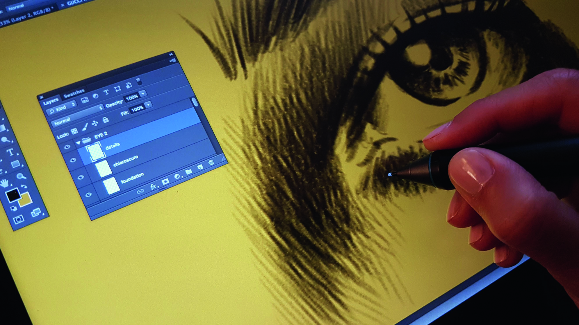
You might think an illustration seems like a big job, but actually it’s just hundreds of small jobs. Each of my illustrations can contain several hundred layers, depending on its complexity. The only limit is the hardware used. In my experience, working at high-resolution, a basic Apple Mac Mini can easily manage a couple of hundred layers without slowing down.
My illustrations have a group of layers for each element of the illustration. The face, hair, arms, hands, eyes, neck, mouth, dress, accessories, and so on, are all folders containing a bunch of layers for the foundation, chiaroscuro (light and shade), and details. Working like this will allow you to go in to your image surgically on demand. This is important because small modifications are always around the corner and a happy client is a regular client.
05. Use 50 shades of everything
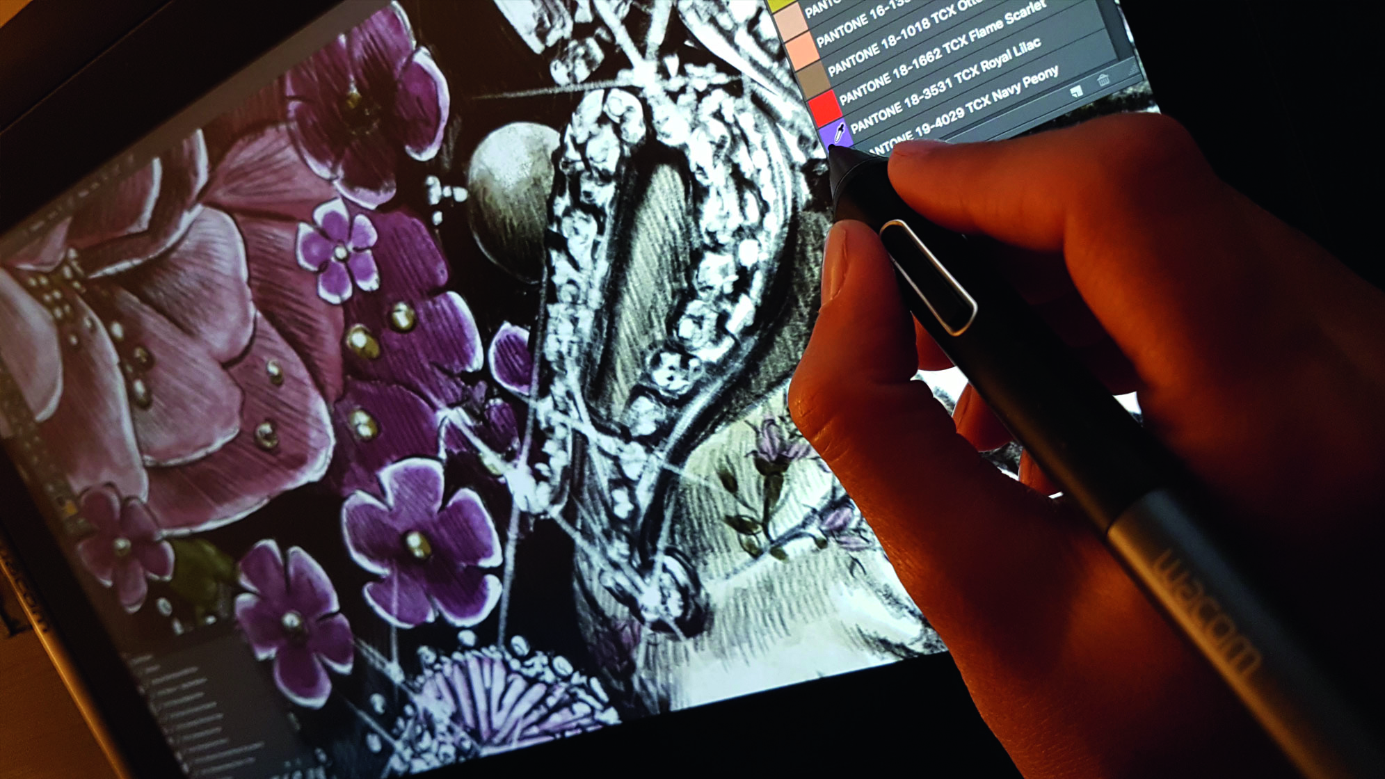
Experience in fashion makes you realise how important understanding, and possibly forecasting, colour trends is. You might want to learn about how colour fidelity matters for a commercial artist, and will ideally become good at visualising products that customers will want.
It’s really fun to mix analogue watercolours and other pigments, and this can be a good way to learn about colour. On the other hand, Pantone palettes, regularly published in .ASE format, are universally recognised as standard colour reproduction systems.
In terms of rules about using colour, remember that nothing is set in stone. We live in the real world, not in a giant colour control cabinet that is ISO 3664 compliant. We are doing visual storytelling here, not designing a logo, and we’re not talking to machines after all. Learn the way, then find your own way.
I start with Pantone colours as a foundation, then add chiaroscuro and details, generally with Kyle T. Webster’s watercolours. But in the final stages of the project, some global colour fine-tuning to add my vision of the narrative is required.
06. Resist shortcuts
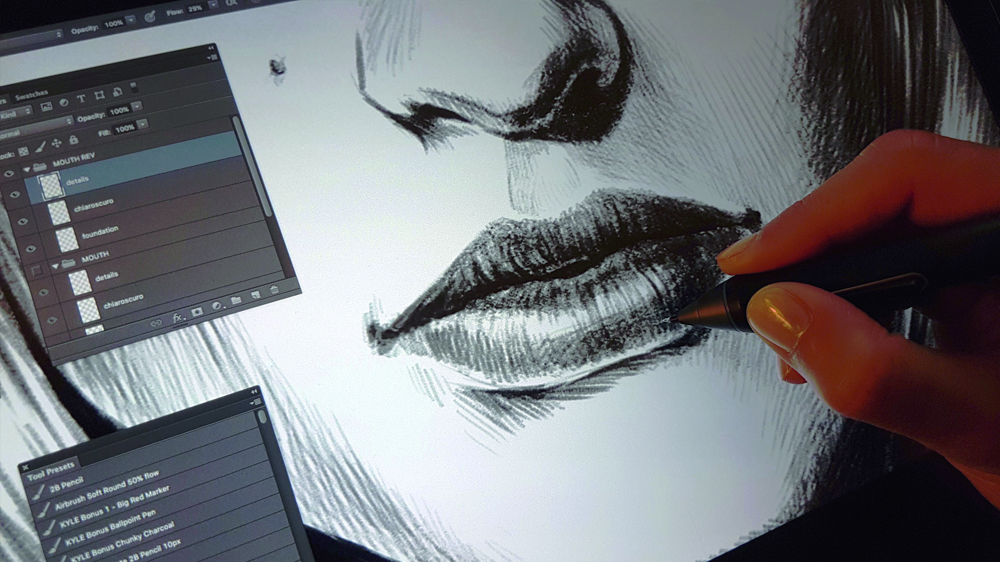
Now that I’m done, I’ll probably want to make some small changes. For example, I don’t like the mouth because it’s looking a little crooked. But I don’t use the Liquify Filter, I hide the mouth Layers and draw it again. If I need to add shine to some jewels, I don’t even think of using Actions. I draw sparkles.
There is nothing wrong with trying some Photoshop shortcuts, especially when dealing with tight deadlines, but it is essential to resist the temptation of Photoshop omnipotence.
Here’s the thing: getting lazy and cutting corners won’t help you become the next Sergio Toppi. And this world already has enough Photoshop gurus. Just remember the first rule for illustrators: draw, draw, draw.
This article originally appeared in Computer Arts, the global design magazine – helping you solve daily design challenges with insights, advice and inspiration. Subscribe here.
Related articles:
