How to prototype an app design
Designers and UX professionals use design techniques like sketches, wireframes and mockups to visualise a website during the design process. Can these web design techniques also be used for mobile app design - or is it time for change?
Sign up to Creative Bloq's daily newsletter, which brings you the latest news and inspiration from the worlds of art, design and technology.
You are now subscribed
Your newsletter sign-up was successful
Want to add more newsletters?
Emerging mobile devices place new challenges in front of UX designers that cause significant shifts to traditional methods of work. For more than a decade, wireframes and mockups have perhaps been the most predominant ways of simulating and validating the user interface, layout, navigation, structure, content and design elements of a website.
Can wireframes and mockups sufficiently simulate mobile apps as they do websites? Should designers and UX pros continue to work with the same processes and tools they use for websites when they do mobile app design?
In this article we will compare website design and mobile app design side-by-side in order to identify the fundamental differences of the two disciplines. We will also examine the techniques used to prototype a website (e.g. sketches, mockups, wireframes) and investigate if these techniques are adequate for mobile app prototyping.
Article continues below01. Who do we prototype for and why?
Considering the short history of the world wide web, it could be argued that web design and especially mobile design are still at their infancy. Trying to cope with this ever-changing industry, we, designers and coders, often have to invent and discover new ways to craft websites and mobile applications. An important step in the web and mobile design process is prototyping.
Since the birth of the industrial revolution, prototyping has been one of the initial steps in the building process of any product. A prototype is an early sample or model built to test a concept or process, or to act as an object to be replicated or learned from. The prototyping step is often skipped due to the extra cost and effort it adds to the lifecycle of a project.
However, today it is widely accepted in the development world that undervaluing this vital part of the design and build process may lead to: miscommunication between developers and clients; pitfalls; over budgeting; and poor quality products. Therefore, we can reasonably argue that prototyping is a must.
There are several reasons why most professionals have made prototyping a basic step in the development process. The following are the most important:
Sign up to Creative Bloq's daily newsletter, which brings you the latest news and inspiration from the worlds of art, design and technology.
- To test the general idea of the proposed solution
- To test the navigation and overall content structure
- To test the user interface (UI), content and context, and core functionality
- To test the look and feel, and visual aesthetics
- To perform user trials to improve usability and user experience
- To investigate possible pitfalls well in advance
02. And who do we prototype for?
- Stakeholders: the client or business executives, decision makers who need to approve the design, layout, content and functionality before coding and implementation
- Developers and coders who need to clearly understand, to the finest detail possible, what to build before they jump into coding
The underlying value of prototyping first, instead of getting to the construction of the real thing right away, is to test, correct mistakes and validate the key design decisions with users without incurring development costs. Prototypes cost. But the cost of a prototype is minimal compared to the cost of re-engineering when halfway through or done with the coding part. Consequently, the most valid argument to make as to why we need to prototype is to minimize both cost and risk while at the same time achieve maximum efficiency and quality.
03. Website prototyping techniques
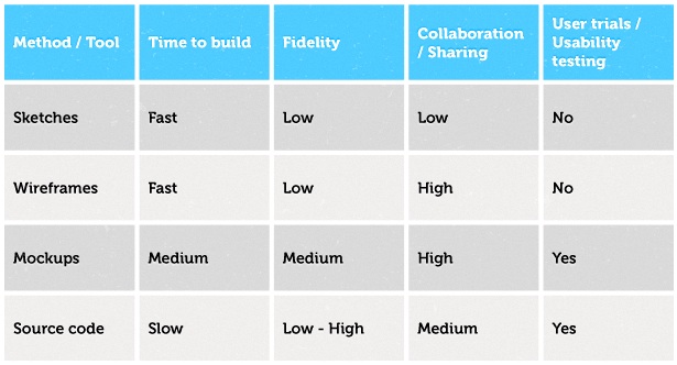
There are various techniques and tools to adopt and use. The most popular ones are sketches, wireframes, mockups and coding.
The decision of which prototyping method we should use when we want to visualise a website isn’t always a matter of choice or preference. It usually depends on the size and nature of the project as well as time and budget constraints that may mandate one method or another.
Choosing a technique for a particular project is determined by the following criteria:
- Time
- Fidelity, which can range from low-fidelity (hand-drawn lines and boxes) to high-fidelity (pixel perfect design)
- Whether you need to share the prototype with team members and stakeholders
- Whether it needs to be used for user trials and usability testing

Each method serves a purpose and it may be the best option for a certain type of website. Sometimes a combination of techniques is necessary to produce an optimum result.
04. Web vs. mobile: so similar, yet so different
The above techniques are great for web design and can really speed up and improve the development process significantly, which is why it’s reasonable to consider using the same techniques for mobile apps. After all, are mobile apps that different from websites? They both: are digital, require user interaction, present content and serve a purpose. So are they really that different? Well, yes!
Mobile applications are very different from websites in many ways. Consider the following, very basic properties: web applications run on different devices that have different operating systems, are different sizes and have different characteristics. Websites run in a web browser of any operating system on usually large high-resolution screens. Mobile applications receive input from a touchscreen. Websites receive input from a keyboard and a mouse. And the list goes on.

05. Mobile prototyping: a new paradigm
So, going back to the initial question, do the same principles apply for mobile prototyping as they do for web prototyping? Should the techniques used to prototype be the same? No. Mobile prototyping is a completely new paradigm. We simply cannot produce realistic prototypes for mobile applications with sketches, wireframes and mockups for three simple yet fundamental reasons: interactions, animations and device testing.
06. Interactions
Interactions are the key factor that make this change necessary. When building a website wireframe or mockup, interactions are minimal. Most of the time we just have one event: the click, clicking results to a page change with no transitions. Animations (at least until recently) were non-existent. Therefore, visualising or prototyping a website is possible even with hand-drawn sketches with one sheet of paper for each page and one word or simple explanation for each interaction.
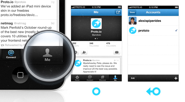
However, mobile apps introduce a whole new different world of interactions by enabling users to interact with multiple touch events like tap, tap hold, swipe, pinch, zoom. The same screen (or page) may react differently to different interactions. More than one interaction can be applied to one UI element.Take for example the latest version of the Twitter app. If we click on the ‘Me’ tab icon, it takes us to the account overview screen. But if we swipe our finger on that same icon, it takes you to the switch accounts page. And that’s just one simple example out of millions. How would we simulate and present that to stakeholders with a sketch, wireframe or mockup? How would we simulate one and two finger touches, swipes, and all other touch events?

07. Animations
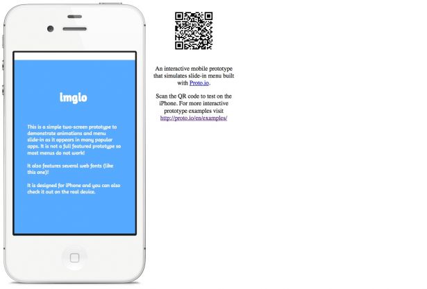
Animations as a factor considerably contribute to a better user experience. Mobile apps with limited display real estate rely heavily on animations to create engaging user responses and take advantage of the limited space. Menus that slide into the screen, UI elements that appear and disappear and transitions between screens, are just some animations that we come across in almost all apps. Think of the now common Facebook app slide-in menu. How would we simulate that with a sketch, wireframe or mockup? What about menu scrolling, swipe actions on menu items?
Click the image below to see an interactive mobile prototype that simulates slide-in menu built with Proto.io:

See more interactive prototype examples.
08. Device testing
One important aspect of prototyping is testing. Regardless of the fidelity of wireframes and mockups, they can easily be tested on the actual device, which is the computer browser. The same must apply for mobile prototypes. UX designers should be able to test mobile prototypes on the actual device they are built for. By testing I don’t mean just viewing some clickable images on the actual device, but instead running a full interactive prototype of the mobile app. Actual device testing is the best way for stakeholders to conceptualise the final product while allowing for in-depth and valuable user trials. Mobile prototyping is one of those things that gives us the advantage to experience a prototype in the real environment as if it was actually real.
09. Mobile prototyping techniques and tools
I believe prototyping usually begins with sketching. It’s the most intuitive thing to do. Sketching can be found in almost all disciplines - from craftsmen to spacecraft designers. It's the fastest way to express our idea visually, all we need is pencil and paper and it’s a great way to start. However, unless we can progress the sketches to an interactive prototyping state that can be tested on the real device, we won’t be able to simulate how an interactive app works.
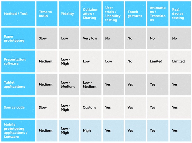
So, how do we put our sketches, wireframes and mockups to action? There are several techniques used within the mobile industry: paper prototyping, traditional presentation softwares, mobile apps designed for prototyping, source code, and specialised web and desktop prototyping applications.
Paper prototyping takes time and skill, and prototypes are hard to build and modify. It may give us a good degree of understanding about how the app works, but it certainly cannot be tested on a real device.
Presentation softwares like Apple's Keynote and Microsoft's Powerpoint support some animations and transitions. However, they are tools built for an entirely different purpose. Device testing is not possible here either.
Mobile apps for Apple iPad and Google Android tablets designed for mobile prototyping allow real device testing, which is their main advantage. They are limited however to single device prototyping and usually lack sharing and collaboration tools. Moreover, working on an iPad or iPhone to build a prototype is still not as fast and efficient as it is on a computer.
Source code offers a powerful way to prototype since there are virtually no limitations as to how far we can go. We can create a mobile prototype with HTML5 or with the actual programming language that we are going to use, like Objective C or Java. Prototyping with source code though is definitely time consuming and we can easily get carried away with small details, ending up spending more time on it that we should.
Mobile prototyping applications are web applications or software designed specifically for mobile prototyping. These applications go beyond traditional wireframe or mockup applications to provide functionality for mobile touch events and gestures, interactions, screen transitions and, most importantly, provide the ability to preview a prototype on the actual device.

An example of such a mobile prototyping application is Proto.io. Proto.io is a prototyping tool built specifically for mobile app prototyping. It provides an easy and fast way to prototype mobile applications that can be tested on the actual device, while supporting all the new unique mobile features like touch gestures, animations, multiple interactions. It also provides built-in collaboration tools to facilitate the communication, collaboration and sharing between the development team and the client.
10. (Wireframes || Mockups) != Prototypes
In conclusion, mobile prototyping is a completely new paradigm. Traditional techniques and tools like sketches, wireframes and mockups can only present mobile apps in a static way. Static presentation of a mobile app is not enough. Mobile app prototypes must provide a simulation of the final interaction between the user and the interface. When developing mobile apps, we need to create fully interactive, sharable prototypes that support multi-touch gestures, allow user trials and usability testing, and can be previewed on real mobile devices.
To achieve that we need to break away from the traditional web prototyping techniques we are accustomed to. We need to start using new mobile app prototyping techniques and tools that can satisfy our mobile app prototyping needs and allow us to focus on creativity and ingenuity. We'll then be free to build mobile apps that offer unique user experiences.
Alexis is the product architect and CEO of Proto.io, the mobile app prototyping platform.
Liked this? Read these!
- How to make an app
- Free graphic design software available to you right now!
- Brilliant Wordpress tutorial selection
- Download free textures: high resolution and ready to use now

The Creative Bloq team is made up of a group of art and design enthusiasts, and has changed and evolved since Creative Bloq began back in 2012. The current website team consists of eight full-time members of staff: Editor Georgia Coggan, Deputy Editor Rosie Hilder, Ecommerce Editor Beren Neale, Senior News Editor Daniel Piper, Editor, Digital Art and 3D Ian Dean, Tech Reviews Editor Erlingur Einarsson, Ecommerce Writer Beth Nicholls and Staff Writer Natalie Fear, as well as a roster of freelancers from around the world. The ImagineFX magazine team also pitch in, ensuring that content from leading digital art publication ImagineFX is represented on Creative Bloq.
