4 steps to the perfect package
Achieving the right blend of branding elements and information on the Mintlet card's packaging was a careful balancing act for Radim Malinic of Brand Nu.
Sign up to Creative Bloq's daily newsletter, which brings you the latest news and inspiration from the worlds of art, design and technology.
You are now subscribed
Your newsletter sign-up was successful
Want to add more newsletters?
Mintlet approached Brand Nu's Radim Malinic with an open brief to create the logo, branding and packaging designs for its new multi-currency pre-payment card. Here Radim recounts the four steps towards getting the packaging absolutely right; you can read more about the project as a whole here.
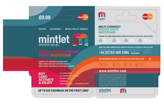
01. The templates

The client supplied the die-cut templates, so I knew the packaging was around twice the size of the actual card. At first, I tried to use a rainbow as the background and weave the different elements into it, but it just didn't look right.
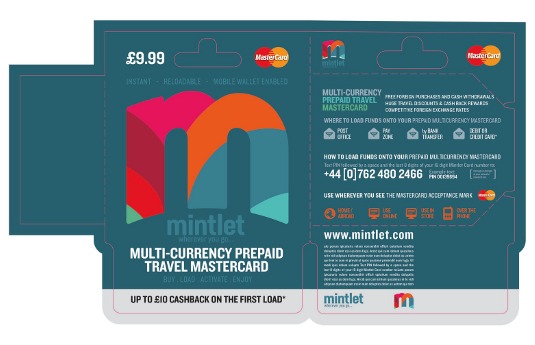
02. Getting the balance right

I knew I didn't want the packaging to look cheesy or dumbed down. I experimented with sizing in order to find the right balance between the branding and other elements and information that needed to be included.
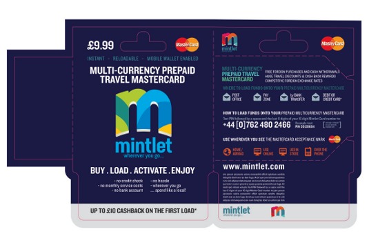
Article continues below03. Rip it up and start again

I ended up deleting everything and starting again from the ground up. I didn't want to diminish the brand's personality just because it needed to be readable on the shelf.
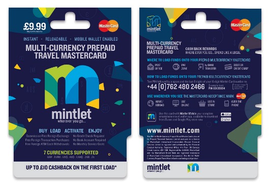
04. Particle system

At this point I remembered the T-shirt mock-up from my initial proposal. In this, I had used small particles taken from the logo, taken apart like pieces in Jenga. This worked perfectly - it's playful and subtle, and it's a way of making the visual system tie in with the logo.
Words: Radim Malinic
This article originally appeared in Computer Arts issue 222.
Sign up to Creative Bloq's daily newsletter, which brings you the latest news and inspiration from the worlds of art, design and technology.
Liked this? Read these!
- Create a perfect mood board with these pro tips
- The ultimate guide to logo design
- Free graphic design software available to you right now!

The Creative Bloq team is made up of a group of art and design enthusiasts, and has changed and evolved since Creative Bloq began back in 2012. The current website team consists of eight full-time members of staff: Editor Georgia Coggan, Deputy Editor Rosie Hilder, Ecommerce Editor Beren Neale, Senior News Editor Daniel Piper, Editor, Digital Art and 3D Ian Dean, Tech Reviews Editor Erlingur Einarsson, Ecommerce Writer Beth Nicholls and Staff Writer Natalie Fear, as well as a roster of freelancers from around the world. The ImagineFX magazine team also pitch in, ensuring that content from leading digital art publication ImagineFX is represented on Creative Bloq.
