Expert typography tips
Designing a hot new typeface requires a lot of hard work and imagination, but what else? We investigate the skill and effort needed to achieve terrific type
Sign up to Creative Bloq's daily newsletter, which brings you the latest news and inspiration from the worlds of art, design and technology.
You are now subscribed
Your newsletter sign-up was successful
Want to add more newsletters?
From developing legible body fonts to creating custom lettering for logotypes, great type design requires a rather interesting – and somewhat conflicting – mix of qualities. It’s a craft that relies in equal parts on knowledge and instinct, on method and experimentation, and on creative flair and painstaking attention to detail.

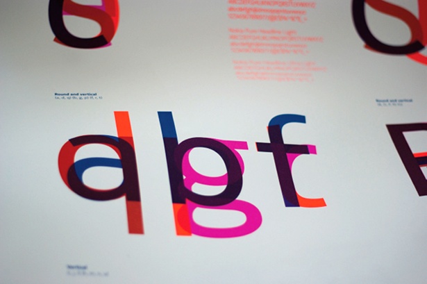
“It’s quite instinctive, but ultimately comes with practice and research into what fonts do,” says Bruno Maag, creative and managing director at font foundry Dalton Maag. “Overlay lots of fonts and you’ll see they’re very collaborative in terms of their proportions. That’s because it all comes out of roundhand calligraphy, which defines the rhythms and proportions of a typeface.” Habit plays a big part, he adds: “It’s about what we’re used to seeing.”
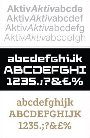
While display fonts provide scope for artistic flair, legibility is paramount if you’re designing a body font – the last thing you want to do is distract the reader. “Look at Frutiger, for example,” continues Maag. “It’s actually quite boring.” If you’re designing a text face, you’ll need to pay careful attention to conventions and standards, from deciding between a one- or two-storey ‘g’ to optical considerations like increasing the size of round characters, which otherwise appear smaller, and making horizontal lines slightly thinner.
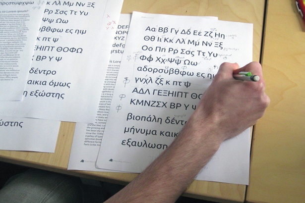
To start the process of nailing down a typeface, you first need to define a few initial control characters – the choice of which varies between designers. Icelandic type designer Gumundur lfarsson, for instance, is in the process of setting up the country’s first type foundry – provisionally named Or – and reveals he begins with ‘O’, ‘o’, ‘a’ and ‘e’. “It’s a moulding process,” he says. “Sketching out the basic idea, then getting the right shape and width of the letters.”
Bruno Maag starts by defining ‘n’, ‘o’, ‘H’ and ‘O’. “There’s a huge amount of information in those control characters,” he explains. “They define the majority of the features and basic proportions: height to width, x-height to cap-height (which is crucial in terms of legibility), weight, if it’s serif or sans serif, and also the type of serif style.”
Article continues below 
Meanwhile Peter Bil’ak, a Slovakian-born graphic and type designer based in The Hague, believes that the letters ‘a’, ‘n’ and ‘o’ contain most of the design decisions for a future typeface. “I start with ‘a’ not because it’s the first letter of the alphabet, but because it’s one of the most frequently-used letters,” he explains.
Whatever your chosen control characters, it’s important to take the right approach, insists Bil’ak, who’s keen to emphasise that typeface design is a craft, not a conceptual discipline. “The process that transforms a pure idea into a functional font is critical,” he adds. “A typeface is simply an idea until it is executed.”
It’s also important to treat a typeface as one design, rather than viewing it as a collection of individual characters. “Don’t pay too much attention to individual shapes at the expense of the whole set,” warns Bil’ak. “It’s easy to design a beautiful shape, but it’s a challenge to make it work with all of the other letters.” That, he says, is the difference between designing letters and designing text. Drawing outlines can prove tricky at first, but it’s simply a question of practice. “Try not to pay attention to the outlines, but to the ‘mass’ of a letter – that’s why it’s easier to use broad tools, such as a brush or broad-nib pen, where you create both edges of the shapes at the same time.”

Sign up to Creative Bloq's daily newsletter, which brings you the latest news and inspiration from the worlds of art, design and technology.

The Creative Bloq team is made up of a group of art and design enthusiasts, and has changed and evolved since Creative Bloq began back in 2012. The current website team consists of eight full-time members of staff: Editor Georgia Coggan, Deputy Editor Rosie Hilder, Ecommerce Editor Beren Neale, Senior News Editor Daniel Piper, Editor, Digital Art and 3D Ian Dean, Tech Reviews Editor Erlingur Einarsson, Ecommerce Writer Beth Nicholls and Staff Writer Natalie Fear, as well as a roster of freelancers from around the world. The ImagineFX magazine team also pitch in, ensuring that content from leading digital art publication ImagineFX is represented on Creative Bloq.
