Expert typography tips
Designing a hot new typeface requires a lot of hard work and imagination, but what else? We investigate the skill and effort needed to achieve terrific type
Sign up to Creative Bloq's daily newsletter, which brings you the latest news and inspiration from the worlds of art, design and technology.
You are now subscribed
Your newsletter sign-up was successful
Want to add more newsletters?
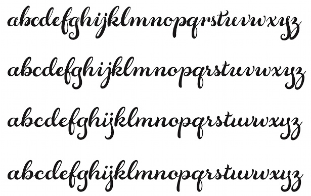
Seattle-based type and lettering designer Laura Worthington specialises in designing script and decorative faces. “There’s never going to be a neat, tidy, perfectly straight line,” she points out. “With these kinds of typefaces, you really need to fight the natural inclination to use straight lines and match everything up perfectly – that may be fine for a serif or sans serif, but script typefaces simply don’t work like that.”
Worthington’s design process starts with “a lot of messing around” with pens or brushes, while also trying to define the purpose and personality of the typeface. “Maybe it will work for food packaging, for a product such as ice-cream. So, what kind of ice-cream is it? I’ll start to define that in my head and write down adjectives and descriptions. I might compare it to a person and think about the personality traits they would have.”
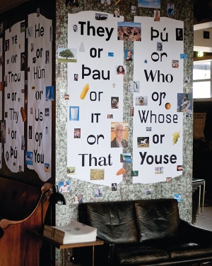
After initial sketches on paper, the next stage is to move to the computer and begin fine-tuning. “Print samples of your work, look at them upside down and show them to other people – they’ll usually point out something really obvious,” she admits. “And don’t jump the gun and start making foreign characters while you’re still tweaking your basic letter forms.”
A Mac isn’t a must – indeed Dalton Maag’s designers work exclusively on PCs. “All of the same drawing tools are available,” reasons Bruno Maag. “It’s partly a question of economy, but Microsoft is also pretty good at supporting type design, in terms of the engineering and the technical side. They still have a reasonably active typography department, and they provide some tools, as well as a lot of background information. Of course, they still have the bulk of the computer market – the PC market is our primary market.”
While there are multiple software options available, from open-source FontForge to high-end editing tool FontMaster, FontLab Studio is the go-to program. “Don’t buy it straightaway though,” suggests Worthington, who advises playing around with some free or inexpensive software – such as FontLab TypeTool, which is aimed more at beginners – to get to grips with the basics, and ensure that you actually enjoy the painstaking process of designing and testing type. “It takes hundreds of hours to design a typeface; sometimes even thousands,” she adds. “You might spend 20 hours creating one letter, so it’s incredibly intense.”
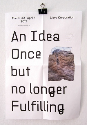
With some basic characters in place, moving to the computer kicks off a gradual process of testing and tweaking. “We’ll first come up with a certain number of test words and characters – maybe four or five capitals with straights, rounds and diagonals, and also a number of lowercase letters with ascenders, descenders, rounds and diagonals – then create dummy copy with them,” explains Maag. Test documents provide a neutral environment (“because you can never control how your font ends up being used”) and, once any initial issues are fixed, the next stage is to expand into a basic working character set that includes numbers and punctuation. “Then test it again at a range of sizes and spaces,” Maag goes on.
To perfect your type system, you’ll need to hone your spacing. Get this right and you make designers’ lives much easier, while excessively tight spacing can render a body font almost totally unusable. You’ll also need to decide how many weights to produce. The available software means you can create a huge range of weights, but that doesn’t necessarily mean you should do so. “A lot of foundries go from really thin or light through to extra bold, with lots of weights in between, the argument being that this gives the customer as much variation as possible. But I think that’s the wrong way to go about it,” argues Maag, who believes that this approach can simply overwhelm.
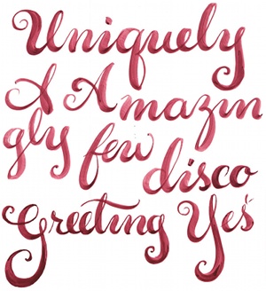
“As a type designer, you need to take control, take charge and make recommendations about which weights look best,” he suggests. That means determining where the key weights should be, and ensuring that there’s sufficient contrast between them: “People tend to buy Light, Regular, Bold and maybe Extra Bold,” reveals Maag. Other designers disagree, however, providing multiple weights and styles – Peter Bil’ak’s Greta Sans comes in 10 weights and four widths, for example. And when should you stop designing? “When you’re changing it, but not improving it,” says Maag. “When you’re essentially just faffing about, it’s time to leave it, although you might do some minor updates later on.”
As Bil’ak points out, it’s easier to know when to stop work on a commissioned typeface, as you’ll simply run out of time. “With self-initiated projects, it’s more complicated,” he reasons. “You spend hundreds of hours working on some shapes, and you need to take time out to see the type as a reader. That’s only possible when you don’t look at those shapes for a while.”
For more info on type terms, check out the What is Typography post on our sister site Creative Bloq.
Sign up to Creative Bloq's daily newsletter, which brings you the latest news and inspiration from the worlds of art, design and technology.

The Creative Bloq team is made up of a group of art and design enthusiasts, and has changed and evolved since Creative Bloq began back in 2012. The current website team consists of eight full-time members of staff: Editor Georgia Coggan, Deputy Editor Rosie Hilder, Ecommerce Editor Beren Neale, Senior News Editor Daniel Piper, Editor, Digital Art and 3D Ian Dean, Tech Reviews Editor Erlingur Einarsson, Ecommerce Writer Beth Nicholls and Staff Writer Natalie Fear, as well as a roster of freelancers from around the world. The ImagineFX magazine team also pitch in, ensuring that content from leading digital art publication ImagineFX is represented on Creative Bloq.
