How we refreshed the German national football league identity... 5 times
The visual zeitgeist is captured in the brand's 15-year evolution.
Sign up to Creative Bloq's daily newsletter, which brings you the latest news and inspiration from the worlds of art, design and technology.
You are now subscribed
Your newsletter sign-up was successful
Want to add more newsletters?
When Mutabor emerged victorious from the pitch for the Bundesliga's corporate design in 2010, two things were clear. First: the goal of then-CEO Christian Seifert to turn the Bundesliga into a genuine sports brand. And second, the realisation that this would be a marathon, not a sprint.
A total of five brand refreshes later, Thomas Markert, VP Brand Design at DFL, and Heinrich Paravicini, founder and CCO of Mutabor, take stock.
Since we are talking about an agency/client relationship today, let's briefly explain who the DFL actually is. The DFL organises and operates professional football in Germany, managing the Bundesliga (national league) and Bundesliga 2 (second-tier national league) across operations, media, and commercial activities. It sets regulatory and operational standards for clubs, including licensing, financial regulations, and match day requirements, ensuring the integrity of the competitions.
Commercial success is driven through licensing, media rights, sponsorships and partnerships, while innovation in digital and broadcast experiences is advanced through live production, data platforms, and content delivery. The DFL also develops and safeguards the league brand, ensuring a consistent identity and strong brand governance across all touchpoints with their in-house creative team.
Thomas Markert has been leading this team since 2014 – that's 12 years now. The former MTV man is responsible for achieving the big goal of creating an authentic sports brand – overseeing a complex system of global touchpoints, media channels, and requirements.
From on-air design for live broadcast, on-air packaging and motion toolkits to trailer and promo production, he steers the UX/UI design for all the digital platforms, develops creative ideation for campaigns and oversees brand governance and quality control.
His sidekick has always been Heinrich Paravicini from the Mutabor branding agency. They are responsible for the ongoing development of the branding, brand architecture and lighthouse projects, which are designed to regularly push the brand forward.
Sign up to Creative Bloq's daily newsletter, which brings you the latest news and inspiration from the worlds of art, design and technology.
Every three years, it's showdown time, when the big brand refresh takes place and whenever the new media contract comes into force, the Bundesliga brand also takes a step forward. Let's take a look back at where it all began...
It began in 2010
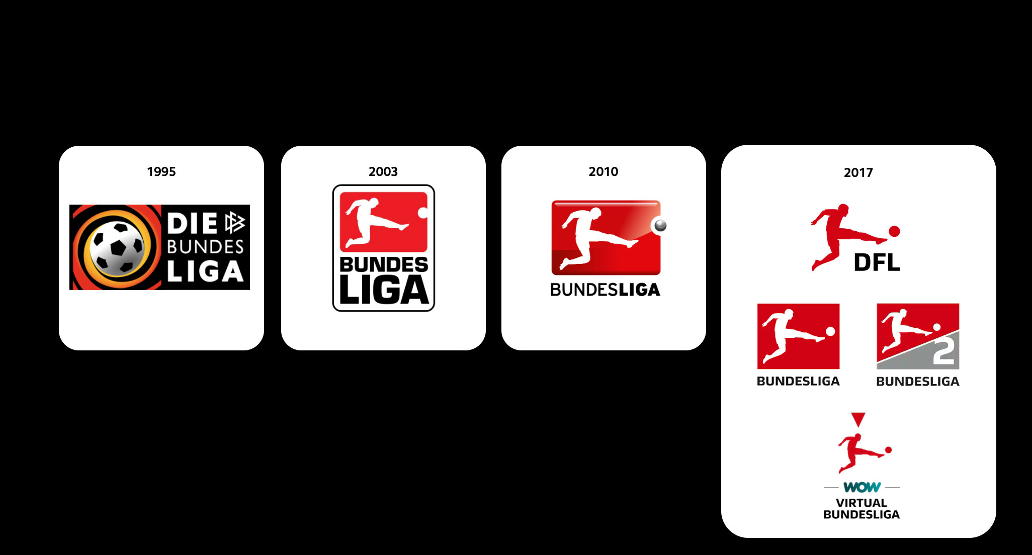
It was the era of 3D icons on the iPhone, which had been on the market since 2007 – that's how brands wanted to be back then: shiny and three-dimensional – and iconic.
The first step in this direction was to focus on the Bundesliga logo – the player. It was highlighted and upgraded in favour of the old sticker design.
A complete visual design system with the brand colour code red, white, and silver – inspired by the championship trophy – formed the creative framework for the Bundesliga's future appearance, made to raise its international profile – in other words, to be more clearly recognisable and distinguishable.
In contrast to the shiny iPhone look, however, the visual language became much more authentic and unpolished – this was intended to celebrate the down-to-earth diversity of the 36 German professional clubs. This principle still applies today, even though the look and feel has been significantly modernised: football as it's meant to be.
That's what makes the Bundesliga unique. A league without sheikhs or billionaires as club owners, but characterised by a lively fan culture with full stadiums, even in the second division.
In 2013/14, the Bundesliga's 50th anniversary marked the next milestone: audio branding. Together with Supreme Music, not only was the audio brand and a sound construction kit developed, but an entire anthem was composed – recorded by a real symphony orchestra. To this day, this music shapes the Bundesliga's image worldwide.
From flat design to a dynamic brand engine
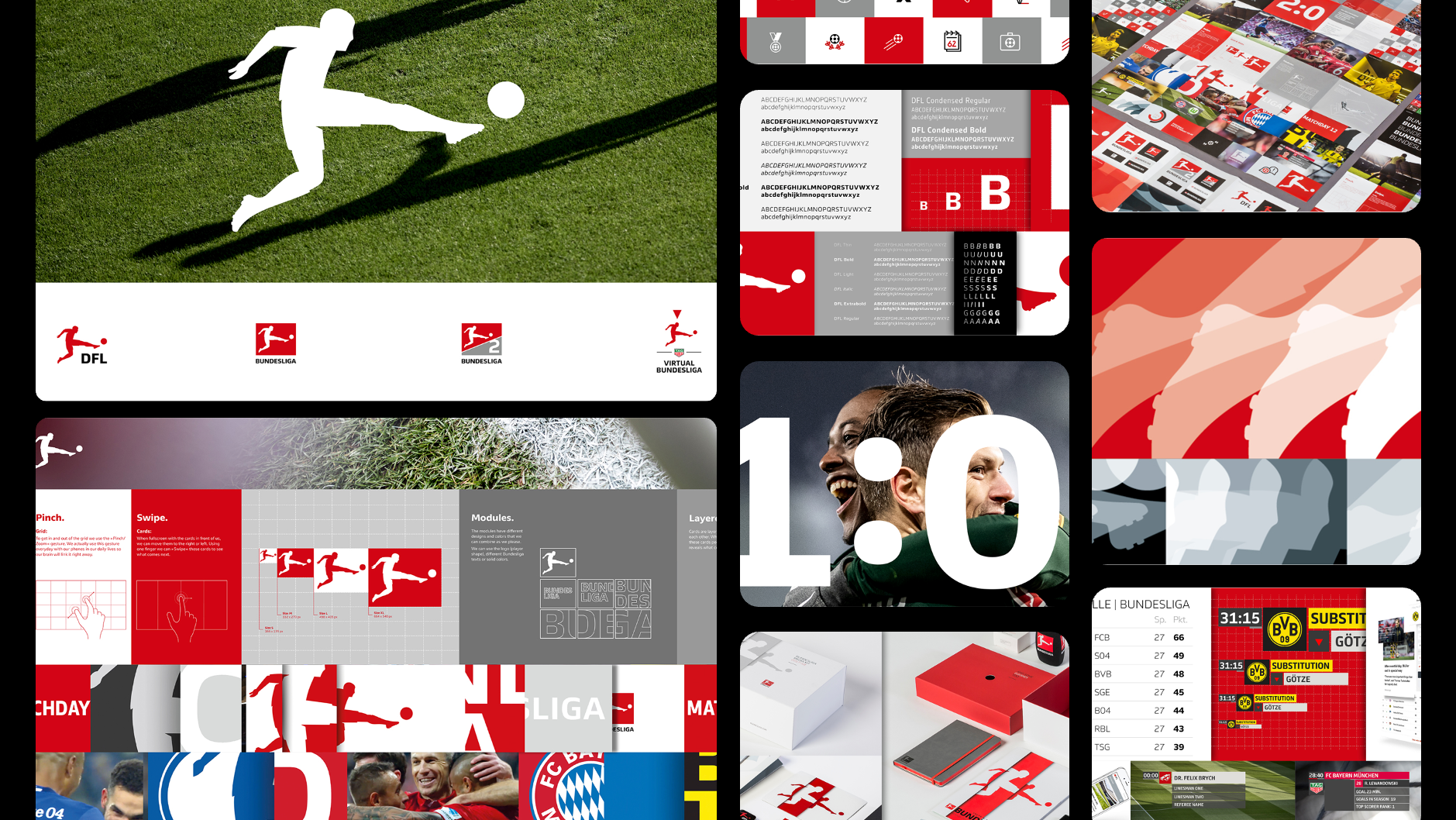
In 2017/18, Bundesliga branding took the biggest step in its development. The entire corporate design was redesigned.
In the mid-2010s, glossy was replaced by flat design. This digital DNA also gave rise to a dynamic design system for the Bundesliga – naturally 'motion first,' since the Bundesliga's core product is always in motion.
We began by redesigning the player, which from then on took centre stage in a sporty, dynamic, streamlined form. To this end, we created a digital, dynamic, integrated design system along with our own corporate typeface (with William Montrose), an expanded colour palette, and a unique visual language. The completely independent flat-on-air design, developed with RCS (Reality Check Systems), also stands out. In addition, the second Bundesliga had its own logo for the first time.
The new look enabled partners worldwide to create their own assets using a design kit. As a result, the Bundesliga was named Digital Brand of the Year by the German Design Council, among various other awards in 2018.
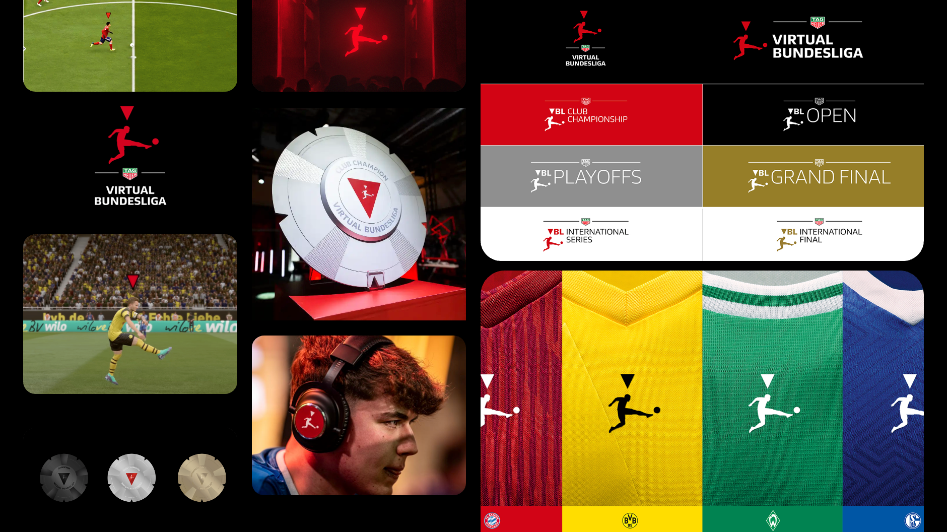
Another highlight was the new look of the eSports league Virtual Bundesliga: we found inspiration in EA Sports' FIFA game, where a triangle follows the player with the ball. Several years later, EA FC adopted this idea for their own branding.
Motion design dominated the further development of the brand identity in the 2021 refresh. A segmented tile look, set in motion by rotation, made the identity more media-friendly, digital, and tangible.
Textures were also introduced into the flat design. However, the DFL made its biggest leap forward with its first digital brand portal, which significantly simplified the global rollout of assets. With the Argentine studio NXTiD, another partner for motion design came on board.
Making football tangible again
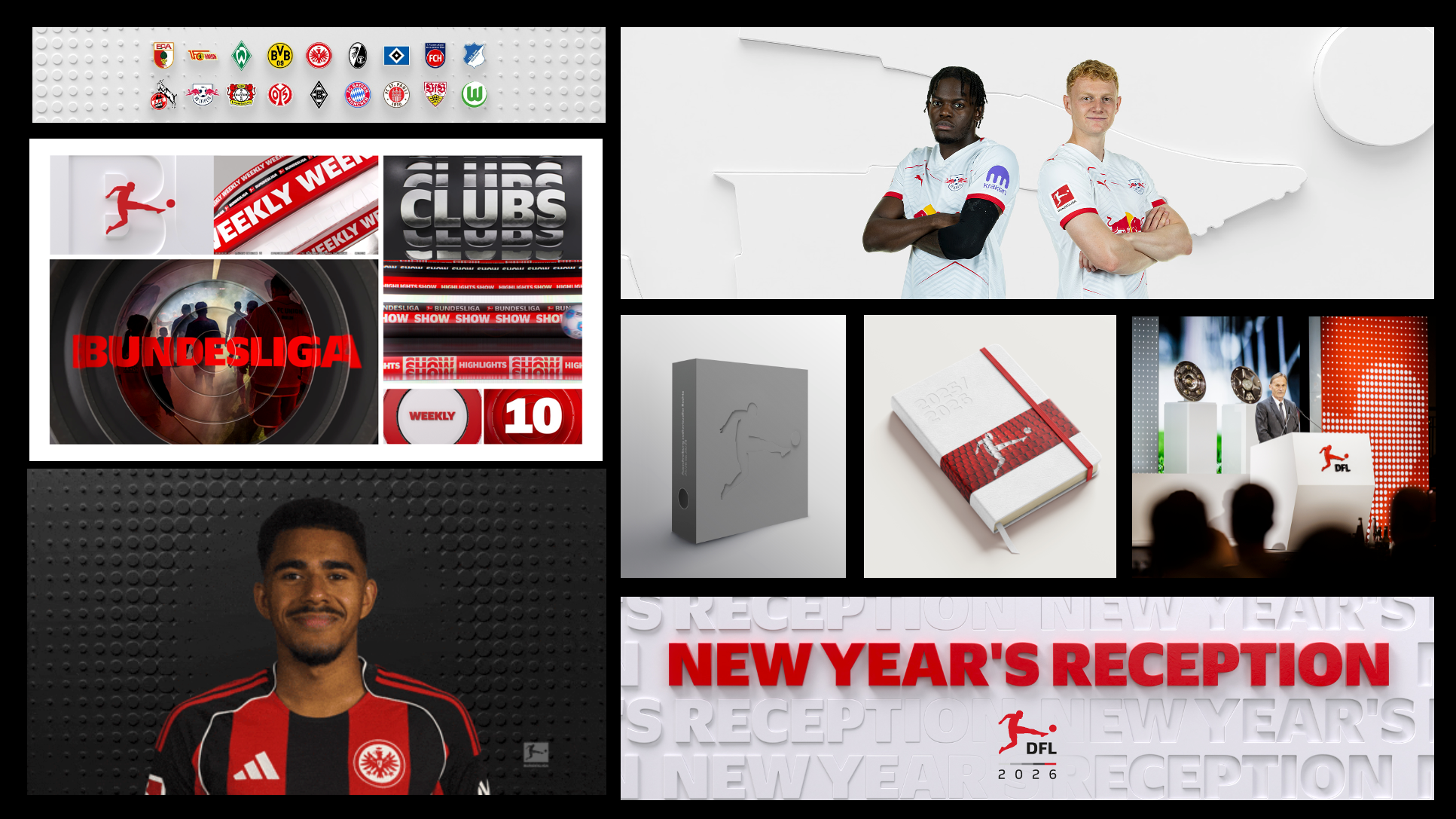
The latest brand refresh took place just a few months ago. In the 2020s, the era of flat design was coming to an end, and assets were becoming more tactile again across the board. For the Bundesliga, this means textures and spatiality. Nevertheless, everything is once again inspired by the game itself.We made the essence of football visible. Players, ball, and stadium are presented in a graphically striking and more emotional way.
The ball is the connecting link in communication. 3D elements and stadium-inspired shapes add a new dimension to the design. Maximum flexibility is created for lively communication. The new graphics package with 3D elements and textures creates depth, tactility, and movement. The system can play different tonalities stringently and offers great potential for all channels.
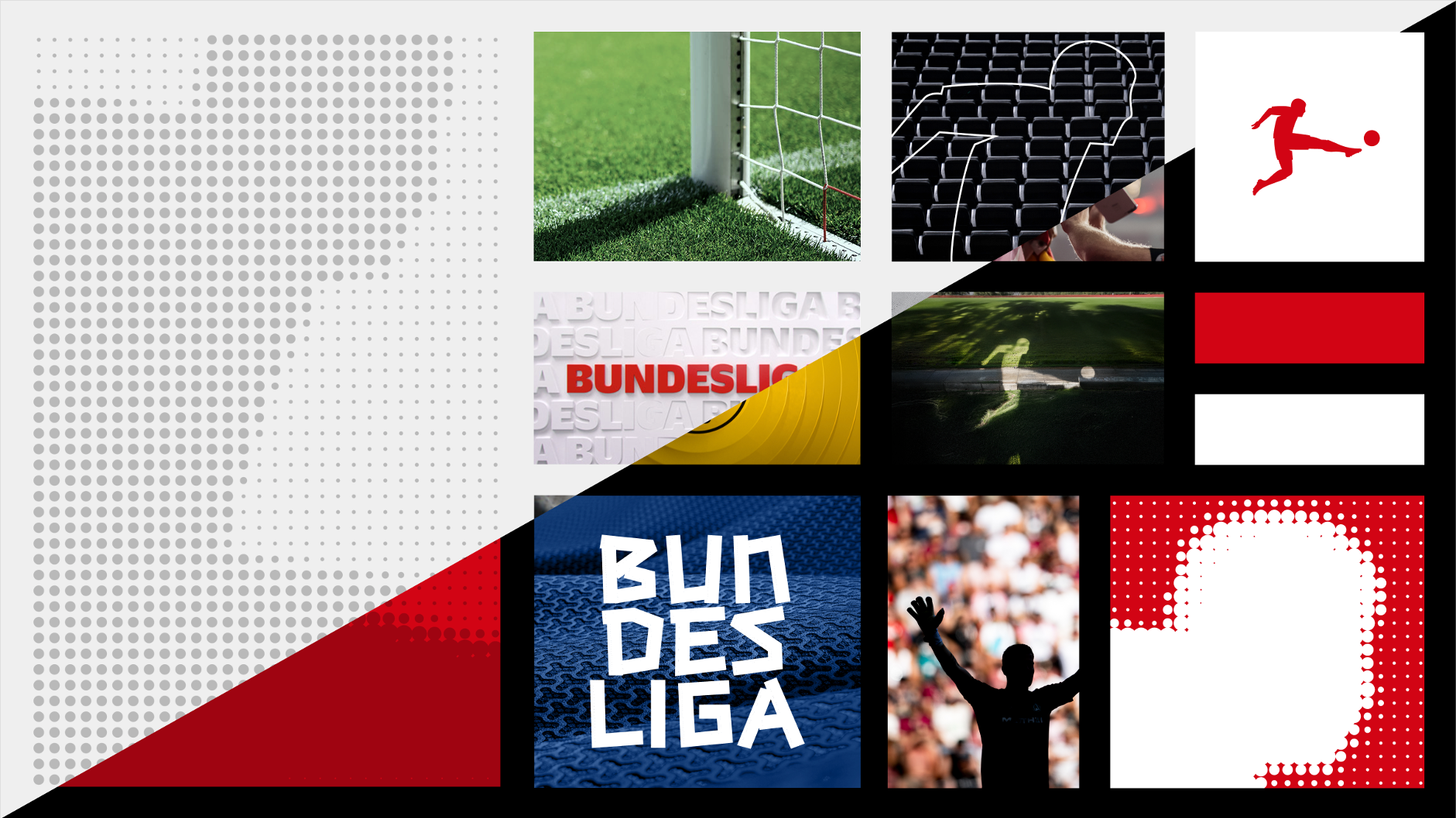
The flexibly scalable system adapts to different project requirements. Using a slider principle, you can switch between the two main categories 'Official' and 'Dynamic'.
The player as an icon becomes emotionalised.
AI was also used to create a specific key visual setting. Real snapshots are mixed with slightly exaggerated motifs that add emotional charge to the icon.
And the DFL is expanding its typographic program for the 2025/26 season. A new expressive special font with a tape-like character will be used selectively to further illustrate the energy in the stadiums.
One icon, many evolutions
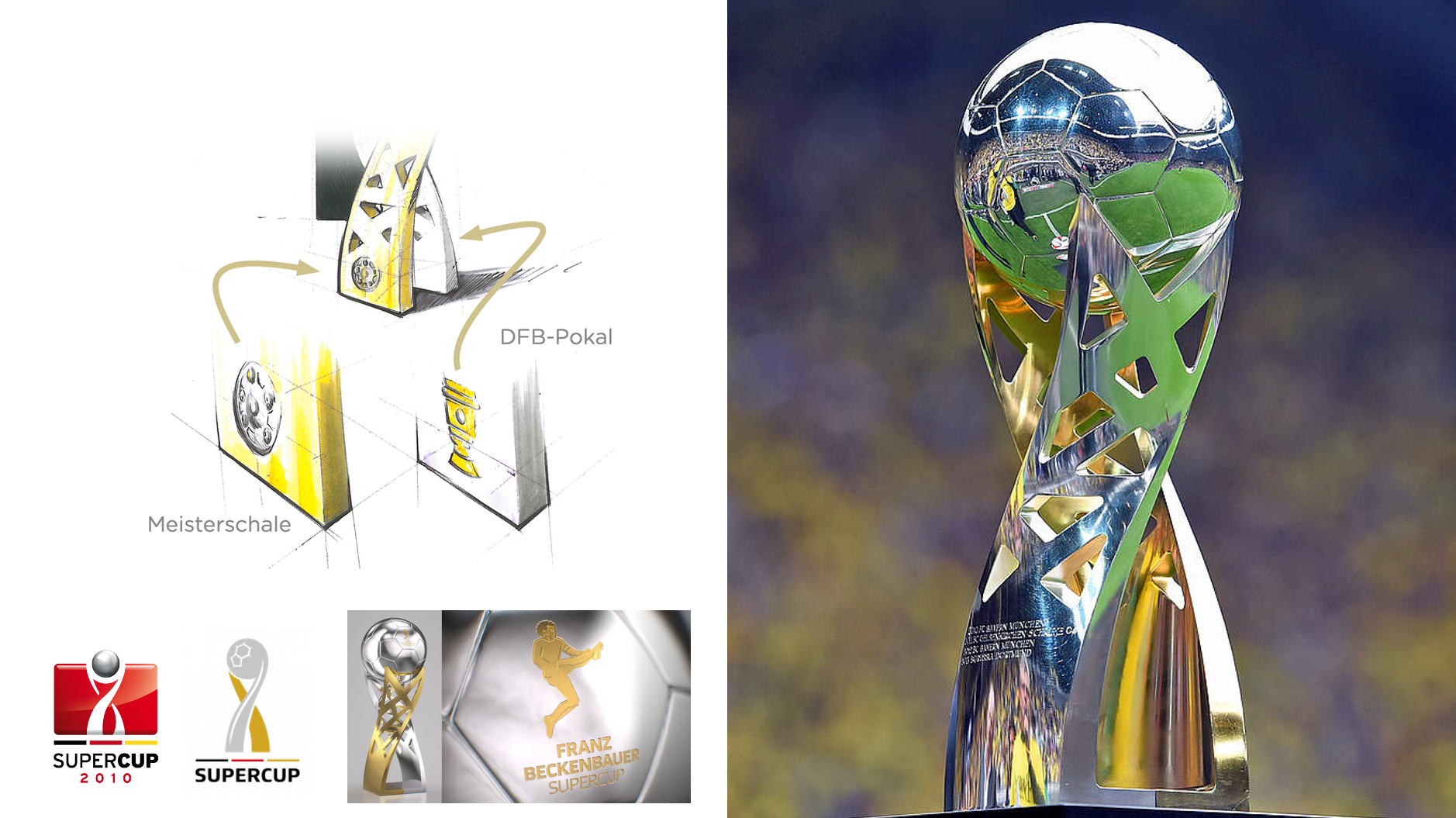
With five design refreshes in 15 years, the brand has continuously evolved – towards emotionality, modularity, and iconic clarity. At the heart of it all is the agile player, symbolising dynamism and recognisability.
It is also particularly exciting to see how the visual zeitgeist can be read in the brand's evolution. The art lies in remaining true to oneself while doing so. According to Thomas Markert, Vice President Brand Design at DFL Deutsche Fußball Liga, this lies in the unique interaction between the in-house team and external partners:“A hybrid model that combines a strong in-house creative team with leading branding agencies enables us to build a unified global brand while evolving it over the long term. It ensures authentic cultural connection, fast and high-quality output, and scalable systems – resulting in a modern, recognisable league identity.
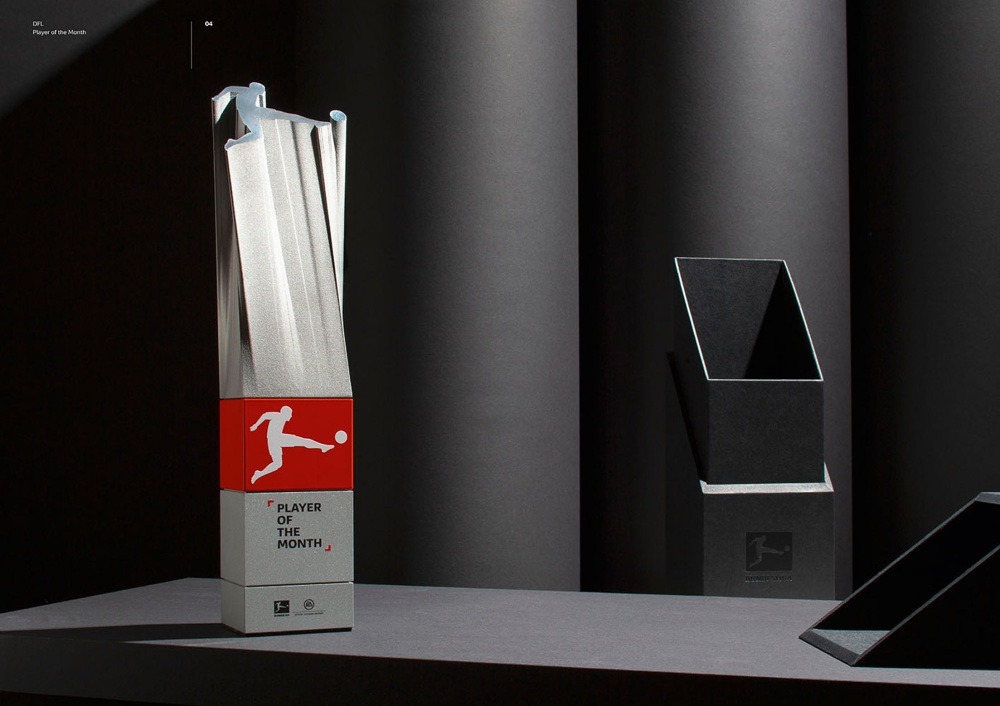
Heinrich Paravicini highlights his personal favourites: "What fascinated me most during our 15 years of work for the Bundesliga, apart from various brand refreshes, events, and projects, was the design of the trophies. In addition to the historic championship trophy, various new trophies were created, such as the championship medals, the Player & Rookie of the Month statues, the trophy for the E-Sports Division Virtual Bundesliga, and, above all, the Franz Beckenbauer Supercup trophy. As a brand designer, you don't often have the opportunity to develop a piece of branding that the top stars of the sport proudly hold aloft into the night sky.
Today, the Bundesliga is a global brand icon of soccer culture. It has a flexible, emotionally charged, and internationally connectable identity and is now a brand with a signal effect far beyond the world of sports. One could say: mission accomplished.
Find out more about the Bundesliga's brand evolution.
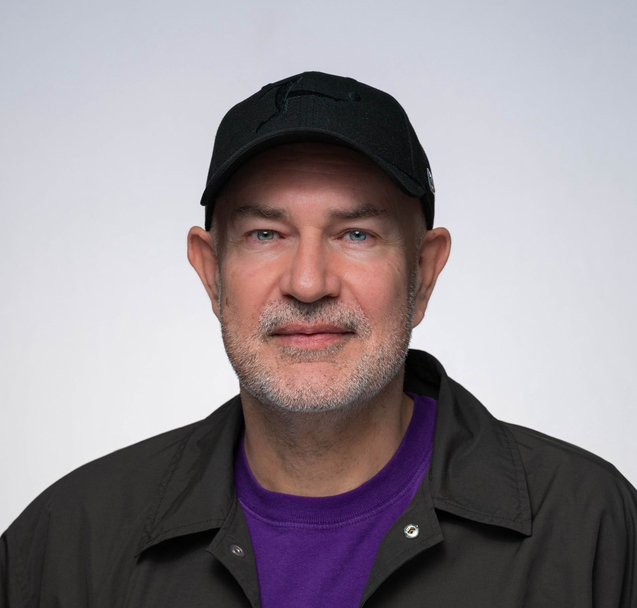
Thomas Markert is Vice president brand design at DFL Deutsche Fußball Liga. An award-winning creative director with more than 20 years of experience, he has led the development of innovative and high-impact creative solutions for leading sports, entertainment, and consumer brands including the Bundesliga, Amazon, Nokia, Microsoft, MTV, and Nickelodeon.

Heinrich was raised in Paris, studied and graduated at Muthesius University in Kiel and is the co-founder, chief creative officer, and managing partner of MUTABOR. MUTABOR grew from a design magazine to become the largest owner-managed design agency in Germany. As CCO, he is responsible for the agency's creative output. To date, MUTABOR has won over 700 design awards, including the Design Award of the Federal Republic of Germany in gold, the Red Dot Agency of the Year Award, and medals of all colors at competitions such as Cannes Lions, ADC, Red Dot, etc. Heinrich Paravicini has served on national and international expert juries and was on the board of the Art Directors Club of Germany for eight years, including two years as president.
You must confirm your public display name before commenting
Please logout and then login again, you will then be prompted to enter your display name.
