This tech rebrand is making me feel manipulated
It feels like dystopia masquerading as a utopia.

Sign up to Creative Bloq's daily newsletter, which brings you the latest news and inspiration from the worlds of art, design and technology.
You are now subscribed
Your newsletter sign-up was successful
Want to add more newsletters?
Tech branding is notoriously sterile, which is why I was surprised when I first saw MachineX. Built for the "autonomous economy", the brand is a decentralised exchange where humans and machines trade everything from DePIN utility tokens to space, time, and energy.
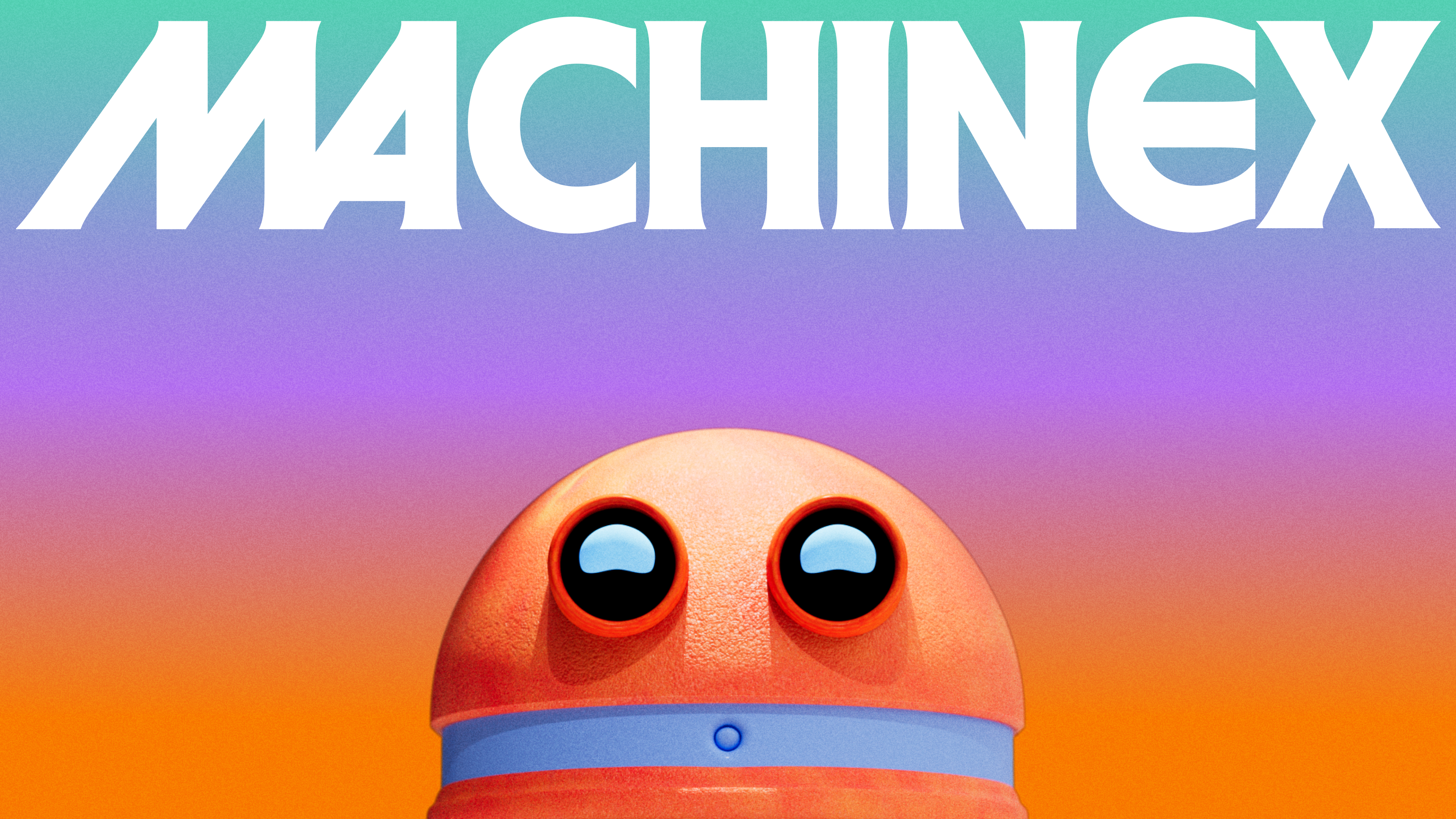
Warm, friendly and colourful, MachineX's rebrand is the antithesis of its slightly dystopian business model. While the best rebrands speak for the brand itself, MachineX's new identity makes me feel slightly torn as I wonder what lies beneath the cute mascot and playful design.
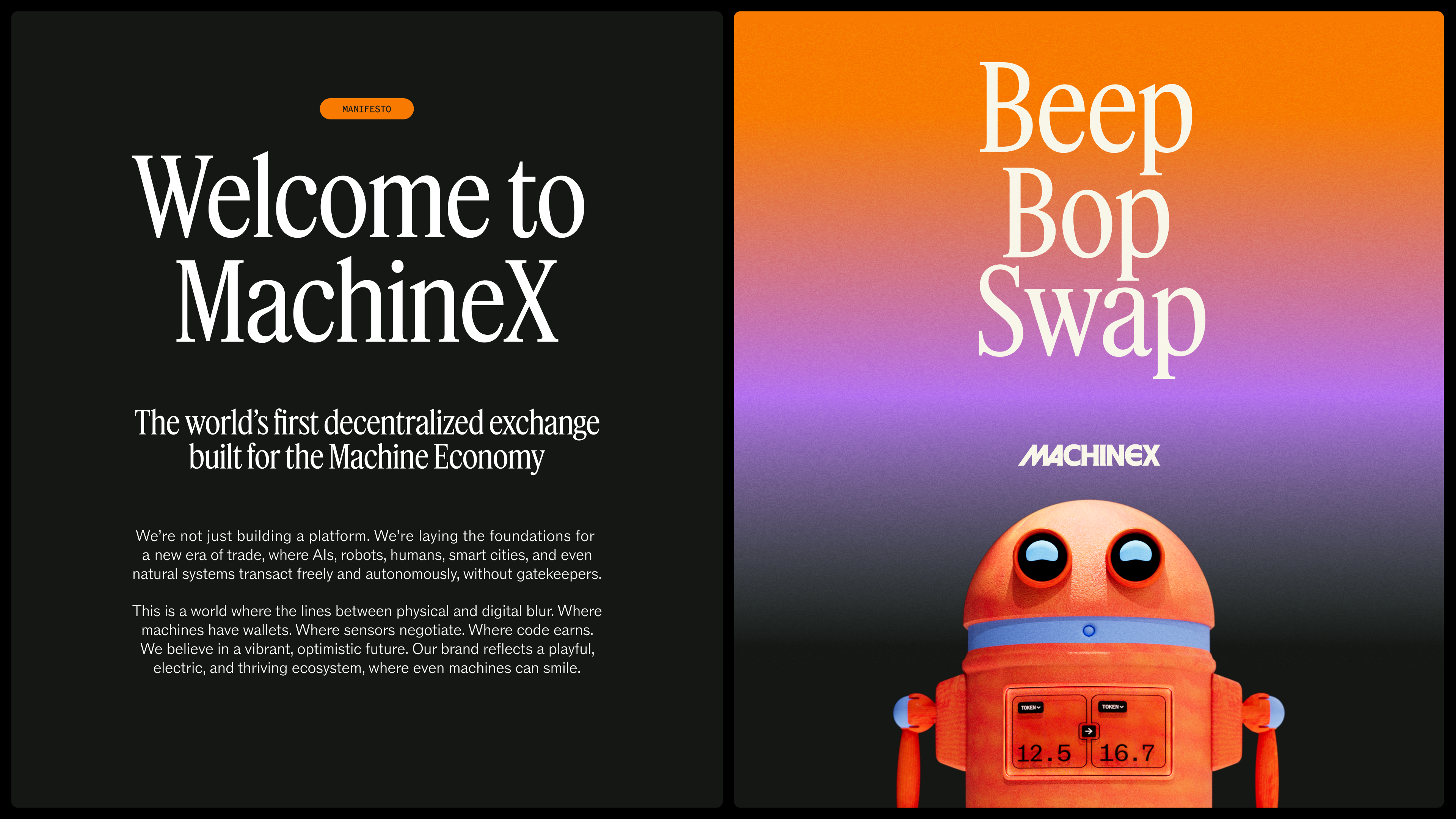
Created by Koto’s Berlin studio, MachineX's rebrand is shaped by the concept of 'Human x Machine'. Imagining a future where the physical and digital blur without a middleman, MachineX's manifesto calls for "AIs, AI agents, robots, humans, smart cities and natural systems transact freely and autonomously."
Article continues below 
World-building is a key element of the brand identity, keeping the design familiar and distinctly human aesthetic inspiration from Star Wars’ Mos Eisley and the worlds of Isaac Asimov. The result is a playful, almost nostalgic brand identity that borrows from pop culture, creating a world "where even machines can smile." (A slightly creepy detail from the press release that I'm choosing to ignore.)
Building on the synthesised friendliness of the brand, MachineX's mascot Dexter roots the design in warmth and personality against its abstract concept. Illustrations add a narrative aspect to the brand, elevating it from flat design to a dynamic system leveraging full-bleed hero moments to layered collages and focused spot illustrations.
The MachineX logo is rooted in intention and confidence, with clean lines that feel "sculpted rather than drawn." Shaped by weight, proportion, and tension, the all-caps custom serif wordmark leverages sharp, asymmetric serifs that create a dynamic attitude.
A bold, digital-first colour palette makes use of vivid primaries and strong neutrals that bring a sense of authority. The typography, consisting of Feature Deck Condensed for headlines and ABC Rom and ABC Rom Mono, brings a balance of immediacy and readability that strengthens MachineX's bold brand voice.
Sign up to Creative Bloq's daily newsletter, which brings you the latest news and inspiration from the worlds of art, design and technology.
“Human x Machine is a powerful brand idea because it operates as a worldview, not a slogan,” says Fred North, creative director at Koto. “The system had to feel like a real place where autonomy is expected, trade is constant, and machines have presence, not just utility. That is why the identity leans hard into worldbuilding: an unapologetic wordmark with bite, colour engineered for screens, illustration with real emotional weight, and Dexter, a robot mascot who embodies the economy itself and pulls the future out of abstraction and into view.”
While MachineX's rebrand is visually appealing, I find myself feeling slightly manipulated by the design. In an uncertain future where AI and humans learn to coexist, the brand identity feels like a utopian band-aid, patched over a dystopian brand of the future.
For more branding news, check out this painfully Gen Z finance brand or take a look at Koto’s new website that reveals the recipe for branding success.

Natalie Fear is Creative Bloq's staff writer. With an eye for trending topics and a passion for internet culture, she brings you the latest in art and design news. Natalie also runs Creative Bloq’s 5 Questions series, spotlighting diverse talent across the creative industries. Outside of work, she loves all things literature and music (although she’s partial to a spot of TikTok brain rot).
You must confirm your public display name before commenting
Please logout and then login again, you will then be prompted to enter your display name.
