BMW’s new Alpina logo oozes luxury
It’s a perfect blend of heritage and modern design.

Sign up to Creative Bloq's daily newsletter, which brings you the latest news and inspiration from the worlds of art, design and technology.
You are now subscribed
Your newsletter sign-up was successful
Want to add more newsletters?
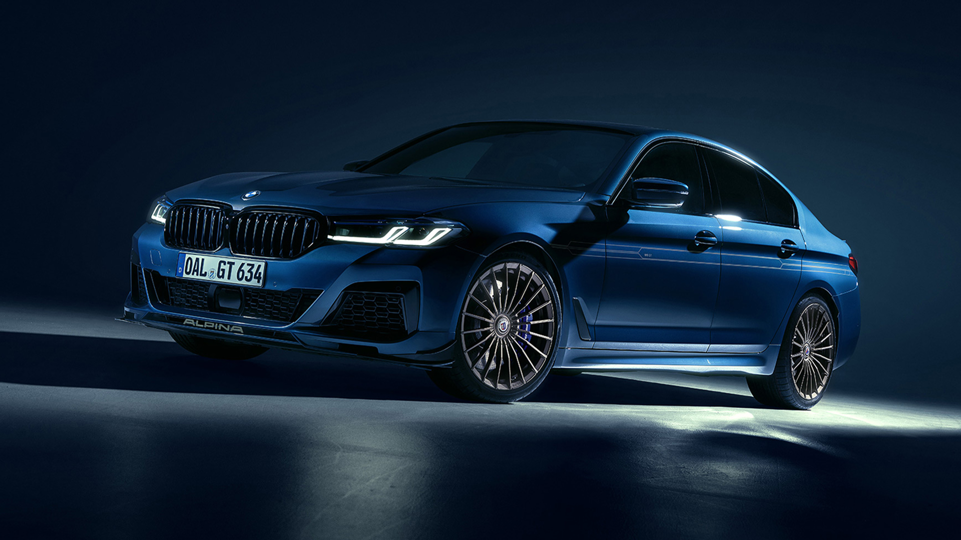
At the start of the year, automotive titan BMW officially launched its new standalone brand, BMW Alpina, with a slick wordmark logo. Today, the brand has further teased its latest sub-brand with a stylish new emblem that links Alpina's rich heritage to its united future with BMW.
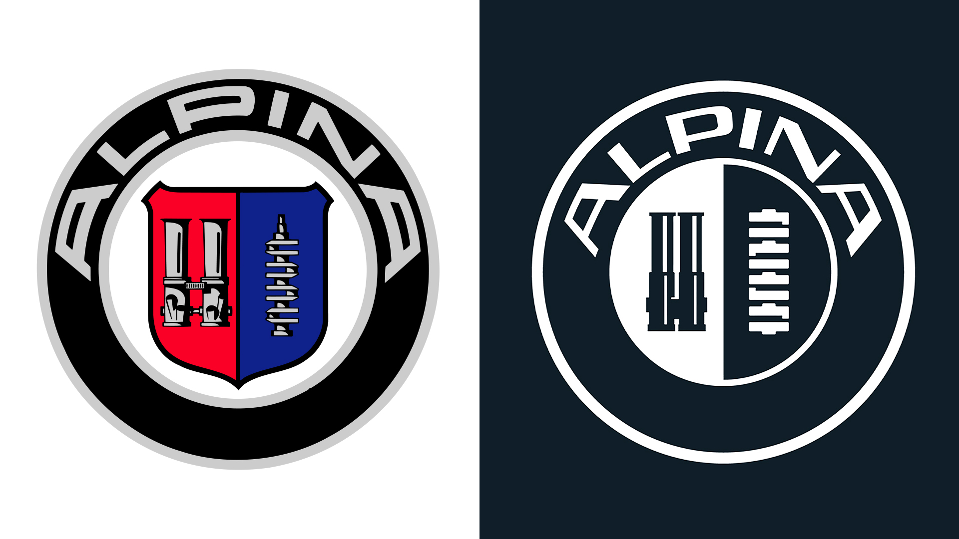
As one of the most recognisable car logos of all time, it's no surprise that BMW's new Alpina logo is just as iconic. A refined reimagining of Alpina's heritage logo, the new design is a perfect example of how refinements can be just as impactful as an all-out redesign.

Maintaining key elements of Alpina's original logo, the new design features the same throttle body and crankshaft icons in the centre of the emblem. Refining the old look, Alpina's new logo features a stripped-back palette and transparent design, giving the identity a cleaner appeal compared to its predecessor.
Article continues belowFraming the symbols, the slick wordmark takes inspiration from the asymmetrical design of Alpina's 1970s typeface. A sophisticated refinement of Alpina's heritage identity, the new workmark's clean linework gives the old look a fresh, contemporary feel that oozes luxury.

For more design news, check out the BMW Alpina workmark logo, or take a look at the most iconic car designs of all time.
Sign up to Creative Bloq's daily newsletter, which brings you the latest news and inspiration from the worlds of art, design and technology.

Natalie Fear is Creative Bloq's staff writer. With an eye for trending topics and a passion for internet culture, she brings you the latest in art and design news. Natalie also runs Creative Bloq’s 5 Questions series, spotlighting diverse talent across the creative industries. Outside of work, she loves all things literature and music (although she’s partial to a spot of TikTok brain rot).
You must confirm your public display name before commenting
Please logout and then login again, you will then be prompted to enter your display name.
