How to create a dashboard app with React
Build a highly flexible data visualisation screen with React.

In this tutorial, we'll walk through how to create an app using React – a JavaScript library for building user interfaces. This web design tool is especially useful when it comes to component creation, offering significant benefits over something like jQuery.
The ability to create self-contained, reusable components means you can keep code smaller and more organised. If components are set up well enough, they can be dropped in where necessary with no additional setup required at all.
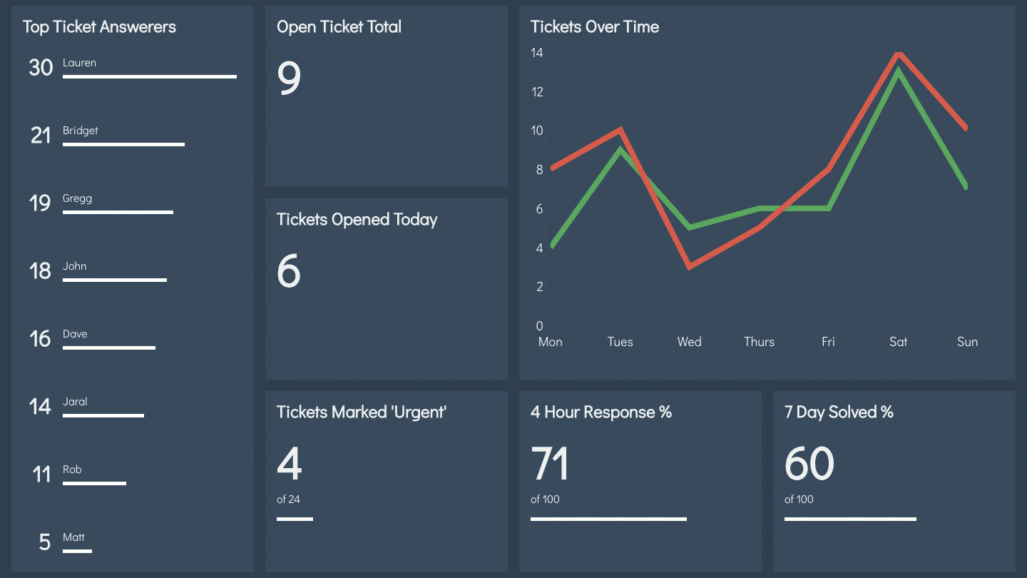
In this tutorial, we will be making a dashboard application that keeps an eye on important support metrics. The screen is split up into a grid, which can be customised to show different visuals depending on the data it needs to show.
Article continues belowWant to create a site, rather than an app? You need our guides to the best website builder and web hosting service.
By making a generic widget component, we can chop and change the display without affecting any of the underlying code. Wrapping these in a container component allows us to control the source of that data separate from its display.
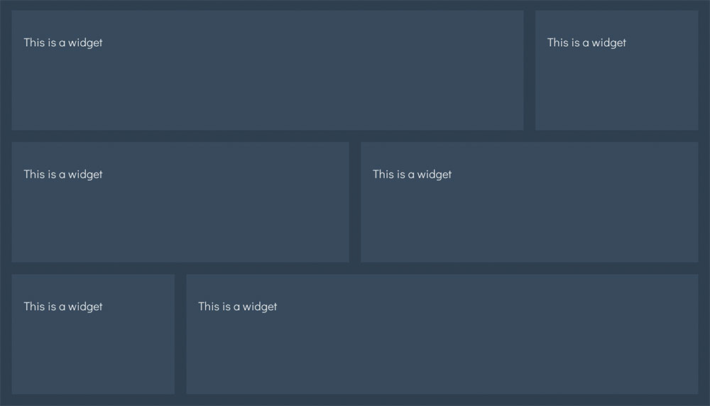
We will be making use of CSS Grid to display content in defined blocks. Browsers that do not support it will display in a single column, much like when using a smaller screen.
Download the files for this tutorial here.
Sign up to Creative Bloq's daily newsletter, which brings you the latest news and inspiration from the worlds of art, design and technology.
01. Download the dependencies
After getting the project files (and saving them in cloud storage), we need to pull down all the required packages we need for the project. These include files from 'create-react-app', which deals with the build process for us.
We also need to run two servers – one that provides hot reloading for the page and another that provides some fake data to test with.
Enter the following on the command line while inside the project directory:
/* in one window */
> yarn install
> yarn start
/* in another window */
> yarn serve
02. Add the first widget

To start things off, we will render a simple component on the page. With Babel set up, we can write components using ES2015 classes. All we need to do is import them when we need to and Babel with Webpack will do the rest.
Open up /src/components/App.js and add the import to the top of the page. Then, inside the render function, place the component inside the container <div>.
import Widget from
  '../components/Widget';
[…]
<div className="App">
  <Widget />
</div>
03. Style a widget box

On this project, Webpack is set up to pick up CSS imports. This means we can import CSS files like we did with JavaScript in the previous step, which allows us to create separate files for each component. Add the following import to the top of Widget.js. This will link up with the 'Widget' className and will scope the styles to that component.
import '../styles/Widget.css';04. Add heading and content
Each widget will need a short description of what data it is showing. To keep things customisable, we will pass this in as a property – or 'prop' – to the component when we use it.
As for the content, React supplies a special 'children' prop, which will contain the content entered between a component's opening and closing tags.
Replace the placeholder <p> in the render function with the following. The Loading component will come into play later on.
<div className="header">
  <h2>{this.props.heading}</h2>
  {this.props.loading ? <Loading />:""}
</div>
<div className="content">
  {this.props.children}
</div>
05. Let the widget span the grid

In addition to the stylesheets we import, we can also create React styles dynamically based on the props passed through.
To span columns and rows with CSS Grid use the grid-column and grid-row properties. We can pass through 'colspan' and 'rowspan' props to alter this per component in a similar way to how table cells work in HTML.
Apply styles in the Widget constructor and link them to the container <div>.
if (props.colspan !== 1) {
  this.spanStyles.gridColumn
  = `span ${props.colspan}`;
}
if (props.rowspan !== 1) {
  this.spanStyles.gridRow
  = `span ${props.rowspan}`;
}
[…]
<div style={ this.spanStyles }
  className="Widget">
06. Supply default props
Right now our Widget is blank as we do not supply any props as yet. In these cases, we can supply default props to use instead.
Unless told otherwise, CSS Grids will default to taking up the smallest unit it can, which in this case is a 1x1 square. Just before we export the Widget, supply some default props to that effect.
Widget.defaultProps = {
  heading: "Unnamed Widget",
  colspan: 1,
  rowspan: 1
}
07. Enforce specific props

Components can provide hints as to what type of values should be sent as props. While developing an application, any incorrectly passed props will show up in the console as warnings to help avoid bugs further down the line.
Just underneath the default props, define what props should or need to be passed in, and what type they should be.
Widget.propTypes = {
  heading: React.PropTypes.string,
  colspan: React.PropTypes.number,
  rowspan: React.PropTypes.number,
  children:
    React.PropTypes.element.isRequired
}
08. Add props to the app
By defining the 'children' prop as required, you may notice the browser complaining it's currently undefined. While this will not break the app, it will keep bugging us until it's sorted.
Head back over to App.js and add a heading prop to the widget we created earlier. Instead of making the tag self-closing, open it up and add some placeholder content to show it's working.
<Widget heading="Open Ticket Total">
  <p>This is some content</p>
</Widget>
09. Display some data

The NumberDisplay component works much like the widget we just created – it renders some text based purely on the props we pass into it. We can drop it in where we need to and have a consistent display of numerical data.
Import the NumberDisplay component at the top and use it to replace the placeholder content you just added within Widget.
import NumberDisplay from '../components/NumberDisplay';
[…]
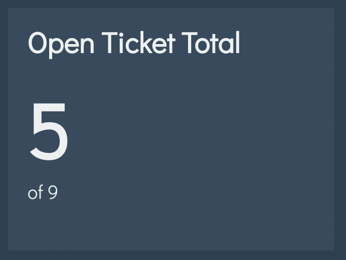
<NumberDisplay max={9} value={5} />
10. Convert to NumberWidget
At the moment, there is quite a lot of code used to show something that will not change across widgets. We can make a special component to encapsulate all of it. That way we only need to import NumberWidget.
Replace the Widget and NumberDisplay imports at the top of App.js with NumberWidget. Make sure to also replace them in the render method.
import NumberWidget from
  '../components/NumberWidget';
[…]
<NumberWidget
  heading="Open Ticket Total"
max={9} value={5} />
Next page: Complete your dashboard app in React
- 1
- 2
Current page: Make a dashboard app in React – steps 1-10
Next Page Make a dashboard app in React – steps 11-21
Matt Crouch is a front end developer who uses his knowledge of React, GraphQL and Styled Components to build online platforms for award-winning startups across the UK. He has written a range of articles and tutorials for net and Web Designer magazines covering the latest and greatest web development tools and technologies.
