How to make an Apple Watch app
Designing an Apple Watch app? Here's what to include.
Sign up to Creative Bloq's daily newsletter, which brings you the latest news and inspiration from the worlds of art, design and technology.
You are now subscribed
Your newsletter sign-up was successful
Want to add more newsletters?
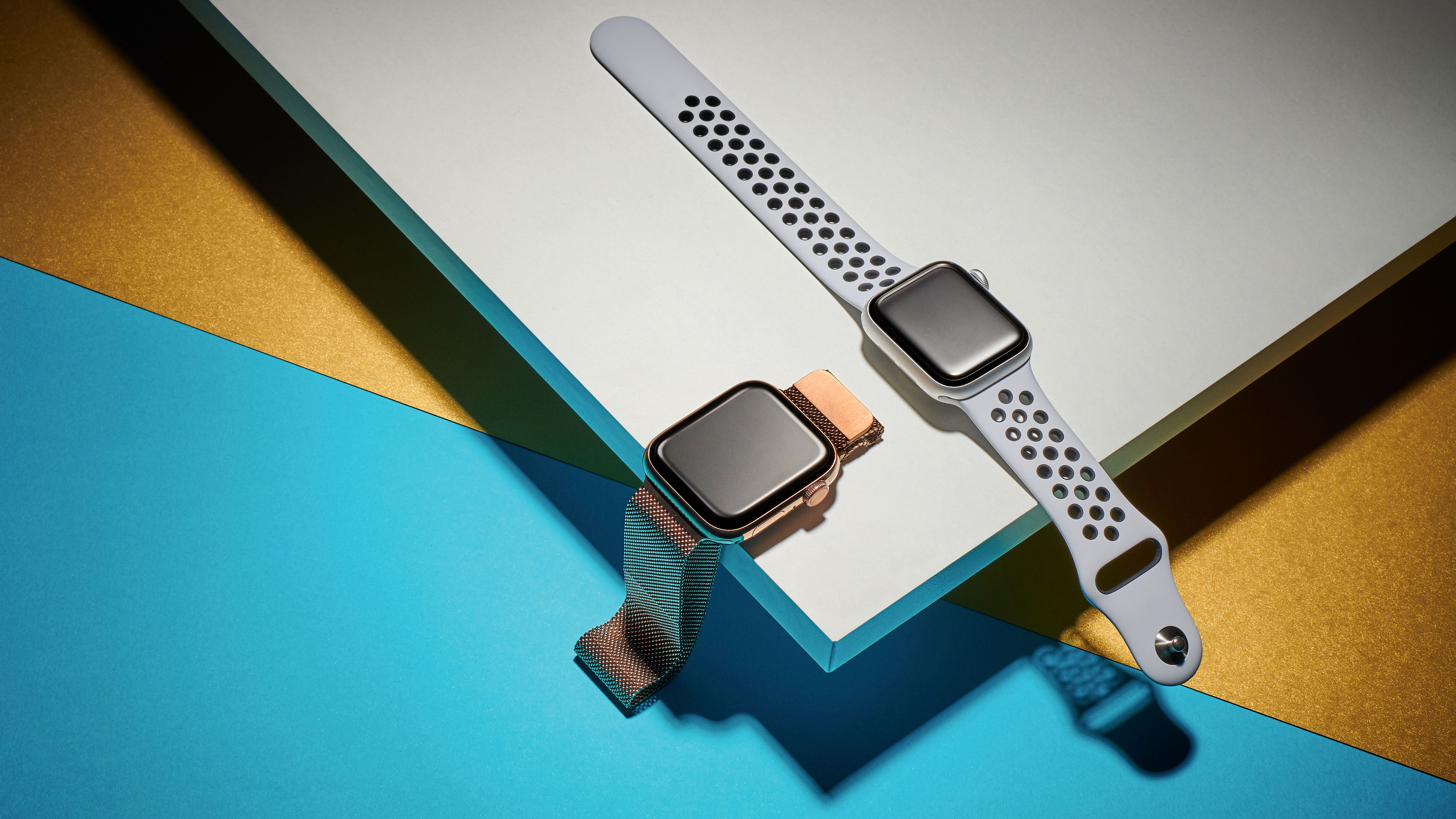
When Apple first launched its smartwatch to the public, everyone felt that the incredible hardware was lacking features because of software hurdles. Since then, the hardware capabilities of the watch have improved so much that the latest Apple Watch is the best smartwatch ever made. Don't have one? Check out our guide to the best Apple Watch deals, or this month's hot Apple Watch deal to save some money.
Not only does the navigation and UX feel intuitive but all the apps launch super quickly and the overall smartwatch experience has become more mature. This is especially true of those we've picked as the best Apple Watch apps available, so do check them out as inspiration.
This tutorial will create an Apple Watch app for an Uber Eats-style service. You will be learning about the design principles to consider when designing a wearable app for a watch. We will also be looking into designing a sample application on Adobe XD. For the purpose of this tutorial, we are just going to look at a few screens of the app instead of all the screens in the flow.
Article continues belowWhy is it important to design differently for the Apple Watch?
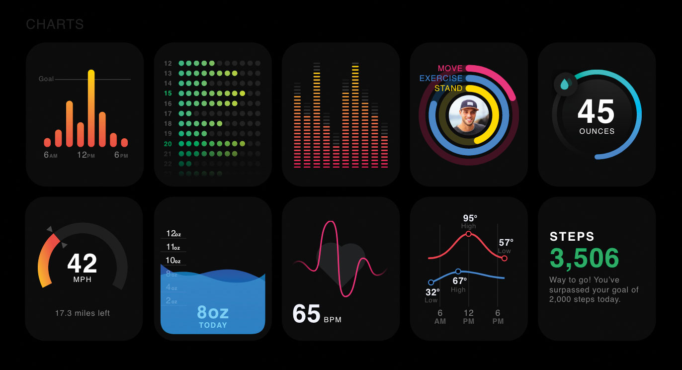
There are a lot of features that set the Apple Watch apart from competitors' wearables. These include shortcuts to all your recent and favourite apps, the ability to track your heart rate and see the changes, customisable Apple Watch faces, activity goal tracking, and using the watch to control your MacBook and TV
Apple also released watchOS 6 for the developer community with revolutionary improvements. The best part about the new development kit is that the apps need not have an iPhone component anymore. This makes it easier for the dev community to create standalone watch applications for the first time ever. These are called watch-only apps. In addition to this, applications can now take advantage of new APIs to connect your JavaScript apps to the Apple Watch seamlessly. That is why there is a need for developers to understand how Apple Watch apps can be designed in a way that is more enjoyable and intuitive.
Any kind of app design needs to follow an approach that is well focused. Wearable interactions are measured in seconds because users do not spend a lot of time on the device. Here are some of the themes we can look at when considering the various design principles.
Layout guidelines
01. Include minimal content
Avoid displaying a lot of content on the screen at once. The users want to access the most useful information. Since there is not a lot of real estate on the watch screen, you don't want to clutter the interface with details that are secondary or not needed. This kind of information can always be presented by scrolling or via an additional click.
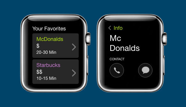
For a food delivery app, let's create a page where we have the favourite restaurants stored in the form of cards. Since this is a page with a lot of content, we should try to show just two cards at once to improve the visibility.
02. Maintain visual hierarchy
Always design in such a way that a visual hierarchy is maintained. This helps the users find the information they are looking for easily. For instance, you can make use of negative space or separator lines to ensure that the elements related to the same group are presented intuitively. This aids the glanceability and readability of your app. To maintain a visual hierarchy in the contact page of the restaurants, spacing is maintained between the two icons on the page and also negative space is used.
03. Remember space is valuable
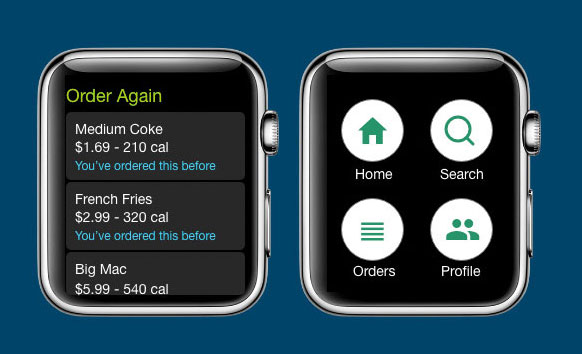
As previously discussed, not a lot of space is available on wearables. Make use of all the width on the screen and design your app in a way so the content goes from one edge to the other. Don't worry about the padding because the wearables provide natural padding around the content of the app. You must also make sure to reduce the spacing between internal elements. For example, on the Order Again page within the app, you may want to use cards representing the items that are ordered previously: make sure the cards have been designed in such a way that they span across the interface of the watch so absolutely no space is wasted.
Menus must be used to replace buttons whenever possible. They are more effective in providing a dedicated place for the actions. Make sure you don't have more than four actions in a menu. This will also free up space in the interface by getting rid of buttons.
Always align your elements to the left of the wearable interface. According to usability principles, left-aligned text is much easier for reading. Also, when there are lots of vertical stacks of buttons with text labels, left aligning makes it easier to scan the information quickly.
Navigation guidelines
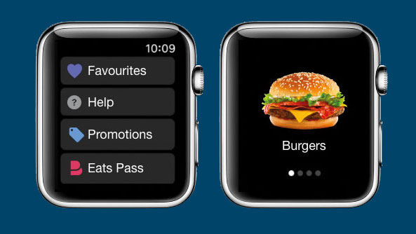
Just like any interface, wearable apps have more than one screen. There are two navigation patterns you can use when designing one: page-based and hierarchical. You can mix both, depending on the need.
Sign up to Creative Bloq's daily newsletter, which brings you the latest news and inspiration from the worlds of art, design and technology.
The hierarchical navigation is well suited for interfaces or a section of the app where you need to present a list of options that can be scrolled and clicked. One such example is Settings, which is present in almost any application. When the user clicks on any item in the list, a new screen is presented that contains more details about the particular item. Also, this kind of navigation makes it easier to navigate swiftly using the swipe interaction or the Digital Crown.
Page-based navigation can be used when there is a smaller list of pages to be presented. This makes it simple for the user to swipe through these pages and view the content. The dots at the bottom of the page indicate its place in the set of pages.
One important thing to remember when designing a wearable app is that it should always complement the iPhone/Android app but not mimic it. Phone apps tend to include a number of pages but wearable apps must be designed for quick interactions.
Interaction guidelines
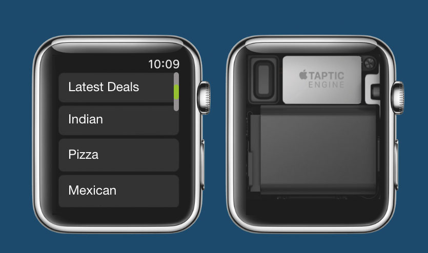
04. Provide feedback when interacting with the Digital Crown
This is one of the most essential aspects of wearable interfaces and it enables the users to scroll through without any distraction to their content. Whenever the app is being designed, make sure you provide visual feedback to the user when they interact with the Digital Crown. One example of this would be showing the location of the scroll when the Crown is rotated to scroll.
05. Customise haptics
A haptics engine in a wearable device uses force upon the skin to create real-time tactile feedback. This is essential in creating an intuitive experience for the user whenever something significant happens in the app. You can customise the available haptics for an Apple Watch to make the app experience more meaningful. Always use each haptic only for its intended purpose. For example, notifications, confirmation and error scenarios can each be linked to a specific haptic.
06. Create recognisable gestures
Gestures are an important piece of wearable technology but are limited to very few choices. Generally, there are few systems-generated gestures in the wearables, which should not usually be changed – otherwise you risk creating confusion for the users. The most common gestures are taps, vertical and horizontal swipes and left-edge swipes. However, when you create a custom gesture such as double tap, make sure they are recognisable.
Interface elements guidelines

07. Include alerts and action sheets
These interface elements are generally used to communicate when an error has occurred or gather some feedback from the user. Always make sure that you use the alerts sparingly and use the action sheets to give the user a list of options to respond to an event. For example, in our food delivery app for messaging functionality, the action sheets can include the option for either responding to or dismissing the notification.
08. Use PNG images
Images in the wearables can be either static or a series of images that are animated with time. Make sure the format of the image being used or exported to the design is a PNG element. Also, since there is always a loading time associated with the images, use a placeholder image in place of the actual image to give the user a visual cue.
09. Feature videos
Media is essential to any kind of interface, which can just be audio files or video files. Make sure that the audio/video clips are no more than 30 seconds as they consume more disk space. Always include a poster image that is associated with the video so the user can make informed decisions.
09. Use pickers
These are the interface elements that display a list of items that are scrolled or navigated via the Digital Crown. This is one way of enabling the user to make selections. List pickers should be used whenever the selection needs to be text/image. A simple example of this is the date picker. Sequence pickers are generally used to replicate an image to create a custom interface, such as a rating feature. Users can give a rating to one of the orders they received using a customer rating picker.
All the apps you create for an Apple Watch – or any other wearable – should be responsive, actionable and glanceable. The interactions should be quick and the data in the apps must be updated occasionally. Reducing the loading screen time also does a lot to make the experience more intuitive.
Want to browse Apple watches? Check out the offers we found below.
Read more:
Vamsi is a senior UX designer at SunTrust Banks and is an expert in UX, mobile animation and JavaScript.
