Design trends of 2013: the stripped-down logo
Google, Yahoo and other big brands introduced back-to-basics logos this year. But has this been a healthy trend?
Sign up to Creative Bloq's daily newsletter, which brings you the latest news and inspiration from the worlds of art, design and technology.
You are now subscribed
Your newsletter sign-up was successful
Want to add more newsletters?
When Weight Watchers abandoned its triple-swoosh logo mark and introduced an even simpler greyscale, gradient-based logotype in December 2012, it joined a growing crowd of global brands rolling out a new, ultra-simple logo design, based around type and simple shapes - from Sodastream to USA Today. And in 2013 the trend seemed to spread almost everywhere, most notably Yahoo and Google.

These pared-back logos tap into existing principles, with designers rediscovering the value of simplicity. "Good logos have always been relatively simple in appearance," says graphic designer David Airey. "Think of Mitsubishi, The London Underground, Shell and Bayer."
Brands with original names like Google have a particular advantage because they simply don't need elaborate logotypes to establish a distinctive identity: "The names alone are strong enough to stand out," says Airey. "But it always helps if the trademark holds a design element that can be carried through to other brand touchpoints - such as colour or a custom typeface."
Article continues below 
Paula Scher of Pentagram, who created both the current Weight Watchers identity and the Windows 8 logo, agrees there's nothing incredibly new about stripped-down logos; "Most of Paul Rand's logos were amazingly simple," she points out.
But what is new is that, rather developing slowly over time, logos are now getting stripped down suddenly and dramatically. Her own recent work is a good example: "The contrast of both the Windows 8 and Weight Watchers logos against their previous logo forms makes them appear extremely simple," she says.

So what's behind the trend? It's something that Bill Gardner, founder of LogoLounge, attributes to the sped-up life cycle awaiting any design that is released nowadays. Along with the flagging economy, he says, this shortened shelf-life has somewhat dampened the spirit of creative risk-taking.
"Identity trends used to take years to develop. There's a much shorter window now because of the technology we live with," he explains. "If a LogoLounge member designs a logo for an Australian baker, it could be uploaded for people in the UK or America to view before one loaf of bread gets sold. That's never been able to happen before. The consumer's voice is more evident now than it ever has been, so people approach things with great caution."
Sign up to Creative Bloq's daily newsletter, which brings you the latest news and inspiration from the worlds of art, design and technology.

Consequently, the companies that sign off on new designs tend to take an objective viewpoint. "They want to see a spreadsheet that proves it's going to work before it happens," Gardner says. "So a lot of companies are less willing to step out on the edge."
When stripping down backfires
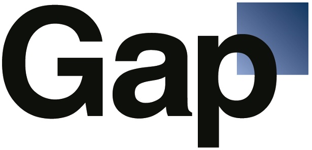
But while following the trend may look like playing it safe, recent history suggests it's often anything but - as demonstrated by Gap in October 2010. The clothing retailer made headlines when it withdrew a new logo after just one week, following a storm of negative feedback.

Then in 2012, the University of California abandoned a new monogram after finding itself the subject of intense media criticism and receiving a petition from Change.org that campaigned for it to be dropped - which collected over 54,000 signatures.
As it turned out, most people had misunderstood how and where the new logo would be used, wrongly believing the monogram - which consisted of a gradiated yellow-coloured 'C' letterform inside a blue 'M' – was going to replace the longstanding University of California seal.

Despite the confusion, the university buckled under the pressure and announced that the new logomark would be making a tactical retreat. "The monogram was only a piece of the visual identity system," explained Daniel Dooley, senior vice president at the University of California, in a statement.
"While I believe the design element in question would win wide acceptance over time," he continued, "it is also important that we listen to and respect what has been a significant negative response."
Savage criticism
Graphic design expert Armin Vit, co-founder of design firm UnderConsideration and editor of branding blog Brand New, felt the UC mark was a solid piece of design that didn't deserve such savage criticism. He wrote an open letter to the university, expressing his disappointment at seeing the establishment succumb to mob mentality instead of having faith in its own creative decisions. "But when over 50,000 people say they don't like something, it takes a lot to say: screw it, we're going to stick with what we've done," Vit concedes.
"A new identity is basically the manifestation of an introspective period," he adds. "You're coming out and saying: 'This is who we are and what we want to be known for.' You can't say: 'Sorry, we have no idea who we are.' That's why it's more tricky than launching a product."
Why stripped-down logos get criticised
Gap and UC are not unique - new logo designs are often panned after being viewed out of context. "Design blogs pick up logos and display them for comment in a vacuum," reflects Paula Scher. "It's not a good way to judge form. Form is something you come to accept. The best logos may initially look weird, but you have to view them in continual use over a period of time to understand if the form is working."
"When the media asks people to view a logo in a white square on a website, they don't know how to judge that," agrees Vit. "There's no real association, no context and no experience of the way in which it's going to be used - and most people hate it because people hate change by default."

The majority of identity design involves this type of change - taking identities that have existed for a number of years and updating them. Most companies hold some degree of brand equity, as Bill Gardner explains, citing Coca-Cola as an example of a brand that understands this particularly well.
"The secret behind Coca-Cola is they regularly revisit the script logo and modify it ever so slightly," he argues. "They continually evaluate its relevance. If you compare today's logo with the original, it's evident there's been a change, but we didn't realise because it's so incremental and therefore it's not evident to the public."
Dramatic redesigns
Indeed, stories of 'bad' logos tend to occur immediately after a dramatic redesign. "The brand will have built a lot of equity around a particular visual appearance - so a radical departure is a bad idea," argues David Airey. That said, "if there's been a radical change in how the company operates, there's a much stronger reason for a similar change in the brand identity.
"If a design is backed up by a strong, emotive, appropriate idea, there's much less room for criticism. At the same time, polarising design is often the most effective - where the outcome is either loved or hated. You can't please everyone, so don't waste time trying."

This is a viewpoint shared by Charlie Hay, creative director at Campbell Hay, which devised the brand concept for Myspace during its third major redesign. "It was very satisfying to see that the Myspace project split opinion. That meant it had done its job - people thought it was worthy of comment," he believes.
And while an ultra-simple identity may attract criticism at first announcement, there's always potential for it to come to life once it's applied in a wider context - or simply has time to gather some momentum. Armin Vit cites the ubiquitous Nike tick symbol as a mark that didn't initially display obvious potential to build brand equity. Indeed when Nike co-founder Phil Knight first saw it, he reportedly said: "I don't love it, however it will grow on me."
Looking behind the logo
So there's no right or wrong answer to 'should you simplify' - and above all, it's vital to understand the actual nature of the job of designing a logo.
"If a new client says they want us to carry out a branding project, our answer is generally to ask if they mean they want a logo or they actually want us to carry out a branding project," says Hay. "You do have to get the client to buy in and understand what they're asking you for, and it's important as an agency or as a designer to understand that question as well."
"A logo for a large organisation is both designed and negotiated," adds Paula Scher. "The job is to understand the history, business goals, competition and users of the organisation's product and service, and help them create and embrace a visual language that will enable them to speak to all audiences in every possible medium and platform, and always be recognised."

"What's important is that audiences recognise the system when they see it. They don't need to know they are recognising it. A designer has to convince a whole lot of people to change their behaviour and wear the same clothing at once, and feel good about it.
"That isn't easy. Often, the systems have to be flexible enough to allow for different tones of voice from different divisions or departments."
Why simple logos succeed
In Scher's opinion, it's a good idea to try to keep a logo simple because it has to do a lot of complicated things. "It might change colour, be attached to secondary typography, have to exist with a pile of other complicated logos, animate, contain patterns or make patterns, be used as a favicon, drop out or surprint over complicated photography, and so on," she reasons.
In the case of Weight Watchers, the company wanted to modernise its look and had already done some research, strategy and positioning work. "They found that they were a transformational company, but they looked surprisingly pharmaceutical," explains Scher. "They needed to look more like a lifestyle organisation."

Weight Watchers also needed to harmonise its branding across different divisions: with multiple collateral originating from an array of different design firms, it lacked a consistent design approach, leaving the logo as the only unifying visual. The design uses gradation as a visual representation of gradual weight loss, and is based on a customised version of Jeremy Mickel's Fort typeface.
When stripping down works best
According to Armin Vit, the best logos are clever without trying too hard. They pinpoint something specific about the product or service, and build on it. He draws attention to the Starbucks rebrand, which stripped out the typography to leave the iconic, recognisable mermaid.
Of course, stripping down only works when there's a strong, considered reason for doing so. As with all trends, blindly following for the sake of it will get you nowhere - and examples such as Gap and more recently the University of California show what happens when brands get burned.
The idea's the thing
In today's social media-fuelled age of immediate feedback, everyone's a design critic, with carefully considered branding solutions being exposed to public scrutiny much earlier than ever before.
But ultra-simple approaches that might cause outrage when taken out of context come alive when applied as part of a broader branding system: if the idea is strong enough, stripping back your logo can help it cut through the noise and stand out.
Words: Anne Wollenberg
Liked this? Read these!
- Discover the biggest logo design trends
- Download the best free fonts
- Illustrator tutorials: amazing ideas to try today!
- Free Photoshop actions to create stunning effects
- Create a perfect mood board with these pro tips
- The best Photoshop plugins
- The best free web fonts for designers
- Useful and inspiring flyer templates

The Creative Bloq team is made up of a group of art and design enthusiasts, and has changed and evolved since Creative Bloq began back in 2012. The current website team consists of eight full-time members of staff: Editor Georgia Coggan, Deputy Editor Rosie Hilder, Ecommerce Editor Beren Neale, Senior News Editor Daniel Piper, Editor, Digital Art and 3D Ian Dean, Tech Reviews Editor Erlingur Einarsson, Ecommerce Writer Beth Nicholls and Staff Writer Natalie Fear, as well as a roster of freelancers from around the world. The ImagineFX magazine team also pitch in, ensuring that content from leading digital art publication ImagineFX is represented on Creative Bloq.
