Match rebrand brings the intimacy back to dating
An earnest antidote to the 'swipe'.
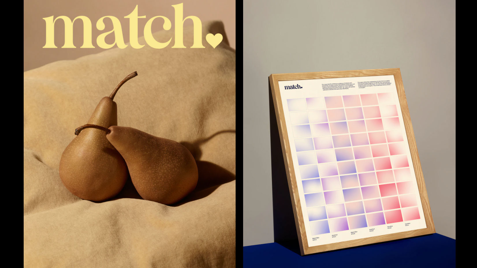
Dating service Match has rebranded with a grown-up redesign that aims to be about more than the 'swipe'. Because, after all, before the rise of the apps centred around pure proximity to fellow singles, there was Match. One of the earliest dating tools (it's celebrating its 25th anniversary), Match offers a more traditional approach to the dating process than others (based on y'know, interests and stuff), and the company hopes to build on that difference moving forward.
This classy rebrand, full of arty imagery, retro-feeling filters and a refreshed logo, has the pandemic fully in mind. After all, the days of meeting random folk after a night of frenzied swiping are gone for now. The earnest vibe harps to a time of authentic connection and conversation – things which are still possible right now (albeit virtually). Inspired? Create your own arty pictures with these VSCO filters, or one of these Photoshop tutorials.
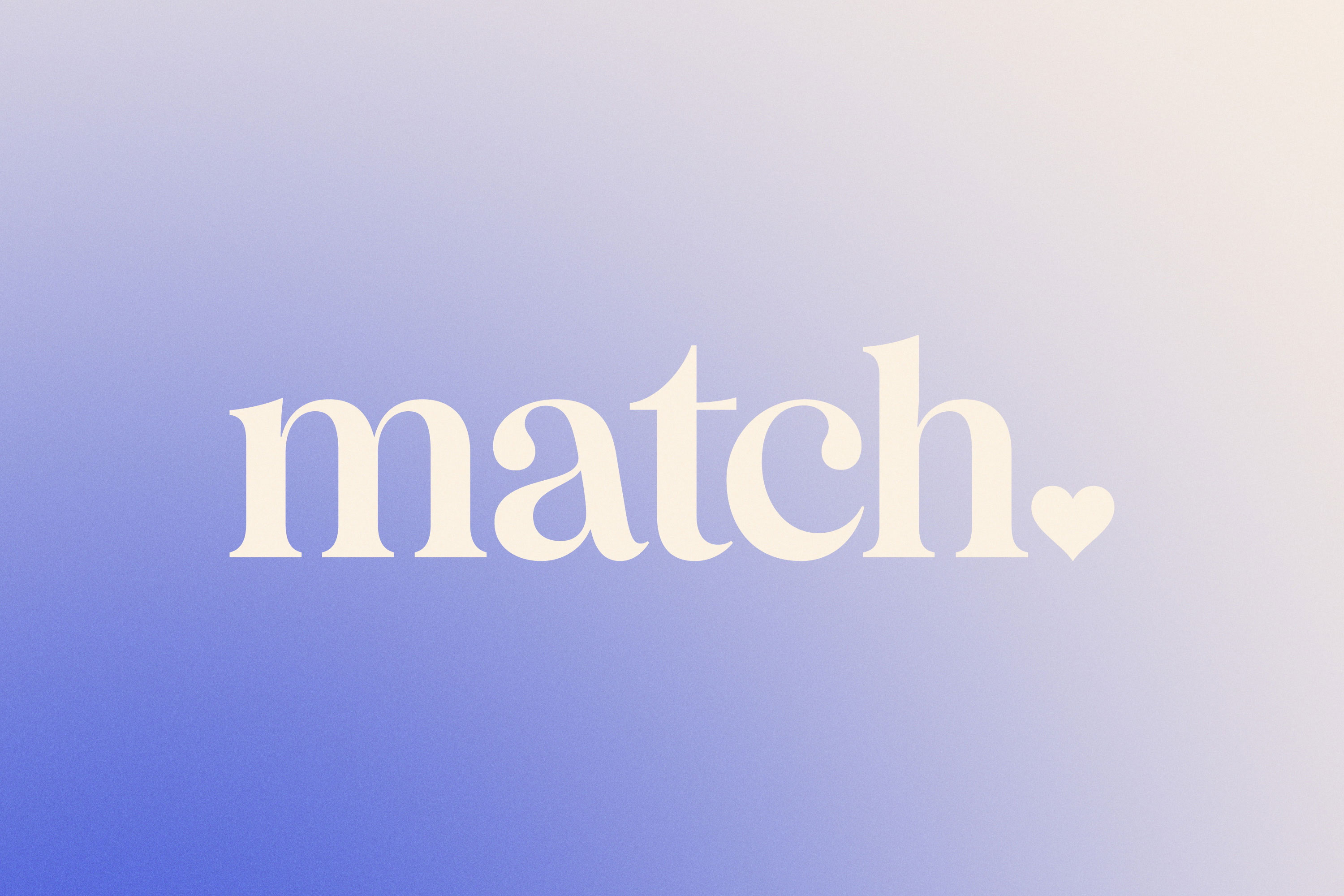
Positioning Match as a soothing balm to the "panic-induced, anxiety-ridden journey" that dating has become, agency Collins has altered Match's colour palette to be less in-your-face, and more "tonal and inviting". This means gradients and softness, as opposed to the stark, bold block colour of the previous incarnation. There's a logo tweak as well (above), with the heart moved from the top to the bottom – reminiscent of a full stop, and designed to instil confidence in the service (see the old logo below).
Article continues below 
The messaging deploys a super-intimate tone, forging a relationship between Match and the user. Match states that 'when you're ready to find someone, we're right there with you' (below), a clever strategy given an authentic bond is what many are craving right now.
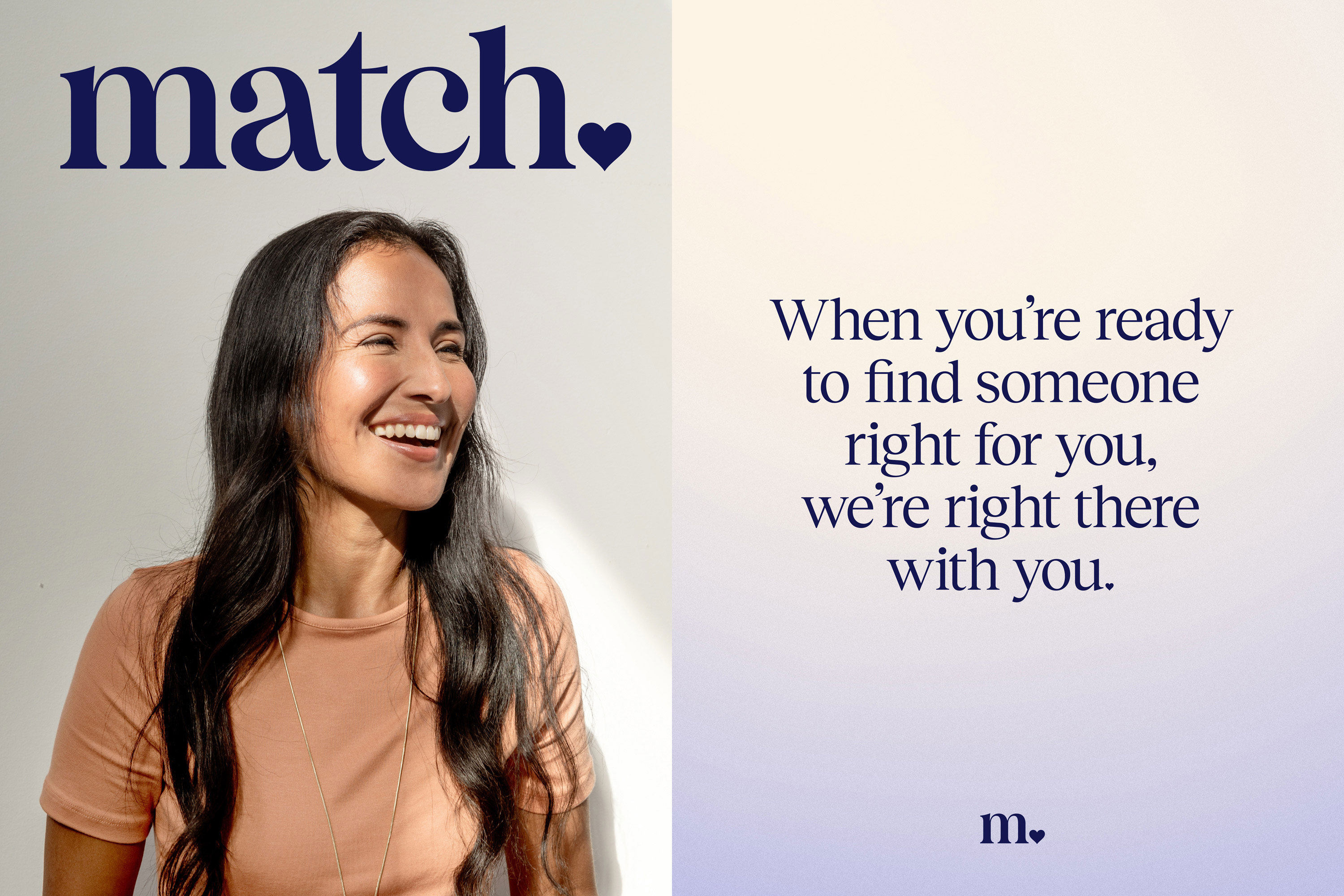
There's new typography, too. Simple and sturdy whilst elegant, Collins has invoked a classic vibe in keeping with the aim of the rebrand – to be the antidote to apps that require you to perform "thumb gymnastics". The typography also looks good on the app, which has a completely unfussy, stripped-back UI (below).
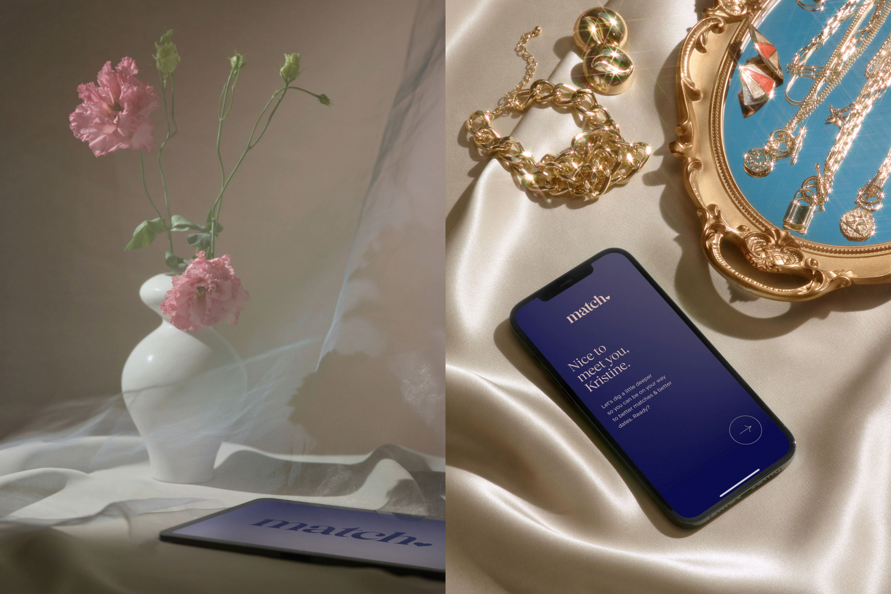
Though we feel the imagery is on the edge of feeling a little over-filtered, this is a rebrand with a clear purpose – and it does look beautiful. The earnest vibe is nicely counteracted by the inclusion of some more tongue-in-cheek imagery, too (the pair of pears in the image at the top of the page, for example).
By playing up the intimacy of dating, it's provided a solid antidote to the 'other side' of the app market so if that's what you're looking for, you'll know where to go for your dating needs.
Sign up to Creative Bloq's daily newsletter, which brings you the latest news and inspiration from the worlds of art, design and technology.
Want to explore an app rebrand of a totally different sort? See how Twitter recently messed things up with a grunge-y redesign. They ruffled up everything except the bird.
Read more:
- Is this the most mesmerising logo ever?
- The most controversial rebrands
- Logo design: All you need to know

Georgia has worked on Creative Bloq since 2018, and has been the site's Editor since 2023. With a specialism in branding and design, Georgia is also Programme Director of CB's award scheme – the Brand Impact Awards. As well as immersing herself with the industry through attending events like Adobe Max and the D&AD Awards and steering the site's content streams, Georgia has an eye on new commercial opportunities and ensuring they reflect the needs and interests of creatives.
