Use a column grid to align your typography
Mark Bloom, aka Mash Creative, walks through how to create perfectly aligned typography using a column-grid system for guidance.
Sign up to Creative Bloq's daily newsletter, which brings you the latest news and inspiration from the worlds of art, design and technology.
You are now subscribed
Your newsletter sign-up was successful
Want to add more newsletters?
A column grid system is a particularly useful tool for any designer wanting to create perfectly aligned typography. It can be used in both print design projects and in your web designs, to help you achieve pixel-perfect website layouts.
As Swiss graphic designer and teacher Josef Müller-Brockmann puts it: "The grid system is an aid, not a guarantee." It permits a number of possible uses, and each designer can look for a solution appropriate to their personal style. But one must learn how to use the column grid; it is an art that requires practice.
As a general rule of thumb, the more columns you have, the greater the layout possibilities. I typically use columns vertically, but for additional layout options you can also place rows across the page horizontally, to create ‘modules’.
Article continues belowIn this tutorial I’ll show you how to set up a column grid structure the old-fashioned way. Of course, InDesign enables you to create columns (the quick way) with margins and gutters when you create a new document, but by mastering column-grid structures in Illustrator, you can gain a real understanding of the mathematics and principles involved in creating the perfect grid-based design.
- Software: Illustrator CS5 or later
- Project time: 30 mins (grid only)
- Skills: Understand the mathematics that’s involved in creating a column grid system, achieve perfectly aligned type, strengthen your typography skills
- Support file
Step 01

In Illustrator, create your document for an A2 portrait poster (mine’s 420x594mm high). Decide how many columns you want for your poster - I find that multiples of four are ideal for this (so 4, 8, 12, 16, 20 and so on). I’m going with 16 in this case, since it should give me plenty to play with. But when designing an A4 brochure or magazine, for example, it would probably be more like eight or nine columns.
Step 02
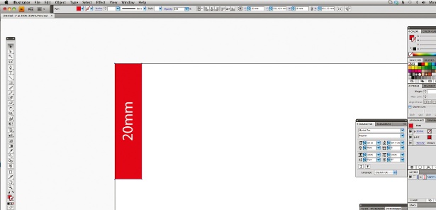
Decide on the size of your margins (the distance into your design from the edge of the artboard) and your gutters (the distance between the columns). I’m going for a 20mm margin on each side, with 4mm gutters. This will allow for a decent amount of ‘safe space’ between the borders and the artwork.
Step 03

Now work out where to put your guides - to do this, take your page width (420mm) minus 40mm (the 20mm left and 20mm right margins), which equals 380mm, in this case. Now multiply your gutters. Quick hint: this will be one less than the number of your columns, so in this case 16 columns means 15 gutters. Each gutter is 4mm wide, so I’ve multiplied 4mm (gutter width) by 15 (number of gutters), which equals 60mm.
Sign up to Creative Bloq's daily newsletter, which brings you the latest news and inspiration from the worlds of art, design and technology.
Step 04
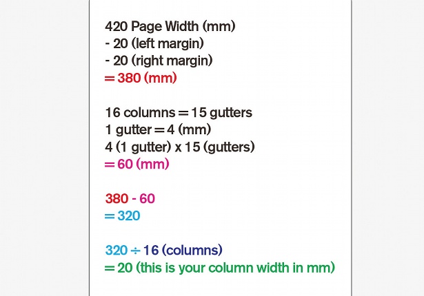
To work out your column width, take your gutter width total (in this case, 60) away from your artboard width, excluding margins (380, here) – so 380 minus 60 leaves us with 320. Divide this value by the number of columns (16) and you’ll get your individual column width (20mm). If you’re bad at maths, like me, use a calculator for this.
Step 05
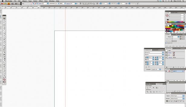
Show your rulers (View>Show Rulers) to help you measure, and drag a vertical guide onto the artboard. Using the X co-ordinates, set your first guide to zero. Repeat this again to 20mm (your left margin). Remember that you’ll need to make sure your guides are unlocked (View>Guides>Lock Guides) at this stage.
Step 06
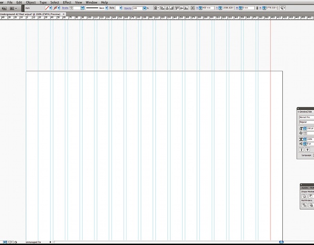
Continue setting guides at 40mm (first column), 44mm (first gutter), 64mm (second column), 68mm (second gutter), and so on. Your penultimate guide should be set at 400mm and your last at 420mm. You can repeat this process horizontally, if required, using the Y co-ordinates to create ‘modules’.
Step 07
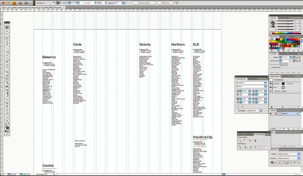
The first step to designing your poster is gathering content and pasting it into individual text boxes. In this case I’m designing a poster using the London Underground tube lines as the subject, and I found all of the information I required online. Copy and paste your text into separate text boxes - I’m using the name of the tube line and each of its stations - and loosely start laying out the content.
Step 08
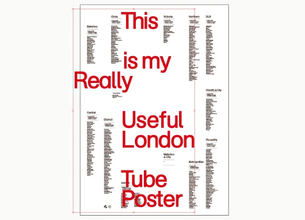
A lot of my design inspiration comes from the 50s and 60s International Typographic Style, made famous by the likes of Wim Crouwel and Josef Müller-Brockmann. The use of grids and large titles were commonly used by the ‘godfathers of design’, so to echo this style I’ve opted for an apt title name set in my own custom cut of AG Schoolbook, at a font size of 190pt.
Step 09
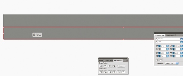
For the central visual element of my poster, I want to design something new that will symbolise all 12 of the tube lines. First, draw a rectangle. Hold and click on the object while pressing Opt/Alt+Shift, and drag the object directly below to duplicate it. Using smart guides, line it up perfectly underneath the original - then hit Cmd/Ctrl+D to duplicate the object until you have a total of 12 rectangles.
Step 10
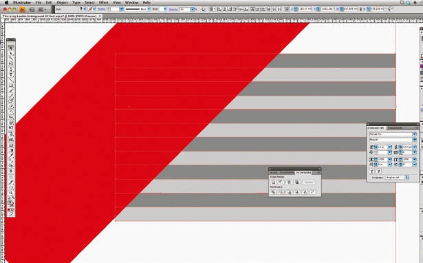
Draw a large rectangle, then use the Rotate tool to set it to -45°. Place the rotated rectangle above the 12 rectangles on the left-hand side (Object>Arrange>Bring To Front) and use the Direct Selection tool to select all 13 objects. Open the Pathfinder panel, select Trim and cut the rectangles at 45°. Doing this will automatically group the objects together, and give them one sheer face, so you’ll then need to ungroup the objects (Object>Ungroup).
Step 11
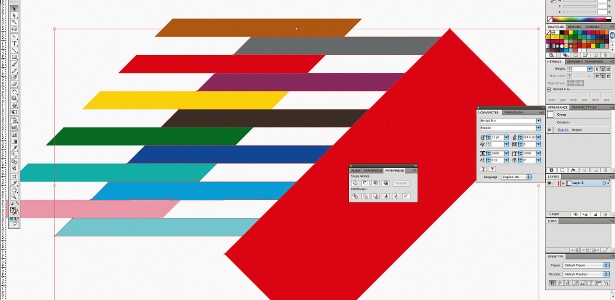
Repeat this process for the right-hand side of the rectangles to again get a diagonal line across, then change each rectangle to a different tube line colour. Now select alternate rectangles and drag them to the right to achieve the offset look seen here. Lastly, select all 12 objects, group them together (Object>Group), rotate the whole shape by -45° and then centre it to the artboard - both horizontally and vertically.
Step 12
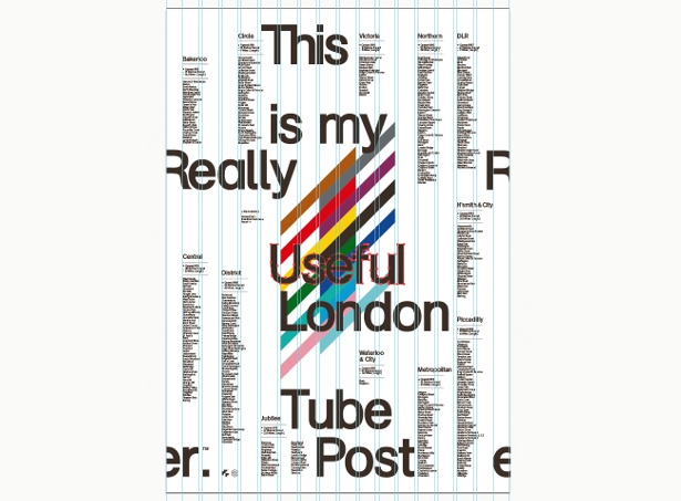
Once you have all of the individual elements required for your poster placed in the document, set about laying out the type around the central design element. Setting type is a bit like piecing a jigsaw together: it takes a while, but eventually you’ll find a basic layout that you’re happy with. Using the 16-column grid enables you to ensure all the text and elements are perfectly aligned with each other.
Step 13
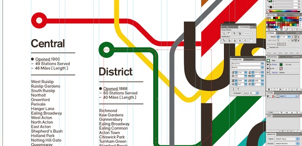
Now draw some lines using the Pen tool, joining the central element colours to each tube line description with routes that resemble the map of the London Underground system. Clicking on your start point, plan a way out from the central element to the tube line title - holding down Shift will enable you to draw straight lines and 45° angles. Next, round off the angles between lines by creating extra nodes near to the bends - using the Convert Anchor Point tool (under the Pen options), adjust them to achieve a smooth bend.
Step 14
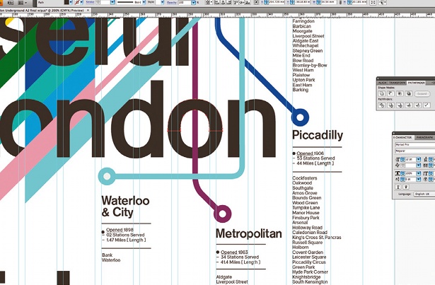
Now convert your main heading text to outlines (Type>Create Outlines), and then begin interweaving the letters into the central design elements. I’ve done this by both trimming (as in step 10) and bringing the tube lines forwards or backwards on layers (Object>Arrange>Bring To Front, or Send To Back. When converting text to outlines, remember that this is a destructive process so keep a copy of the previous version, just in case.
Step 15
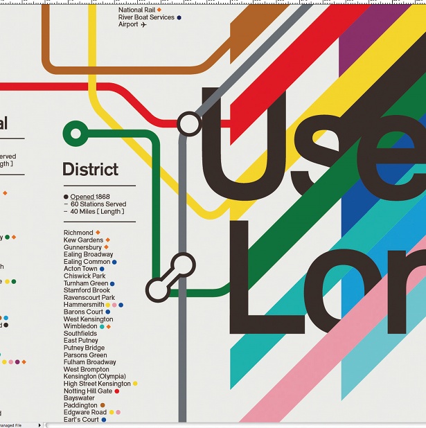
To finish off the poster I’ve added some final touches, including circles of colour to represent the interchanges at each station and junction points to join different coloured tube lines to each other. Lastly, check the alignment of individual elements to your column grid to ensure everything is perfectly aligned. The poster is available to purchase from the Mash Creative e-shop.
Words: Mark Bloom
Liked this? Read these!
- Download the best free fonts
- Free graffiti font selection
- Free tattoo fonts for designers
- The ultimate guide to designing the best logos

The Creative Bloq team is made up of a group of art and design enthusiasts, and has changed and evolved since Creative Bloq began back in 2012. The current website team consists of eight full-time members of staff: Editor Georgia Coggan, Deputy Editor Rosie Hilder, Ecommerce Editor Beren Neale, Senior News Editor Daniel Piper, Editor, Digital Art and 3D Ian Dean, Tech Reviews Editor Erlingur Einarsson, Ecommerce Writer Beth Nicholls and Staff Writer Natalie Fear, as well as a roster of freelancers from around the world. The ImagineFX magazine team also pitch in, ensuring that content from leading digital art publication ImagineFX is represented on Creative Bloq.
