The ribbon method: how Sawdust made these beautiful numerals
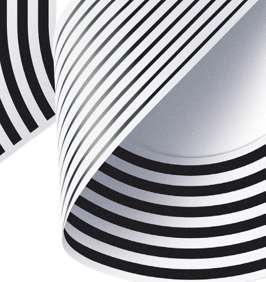
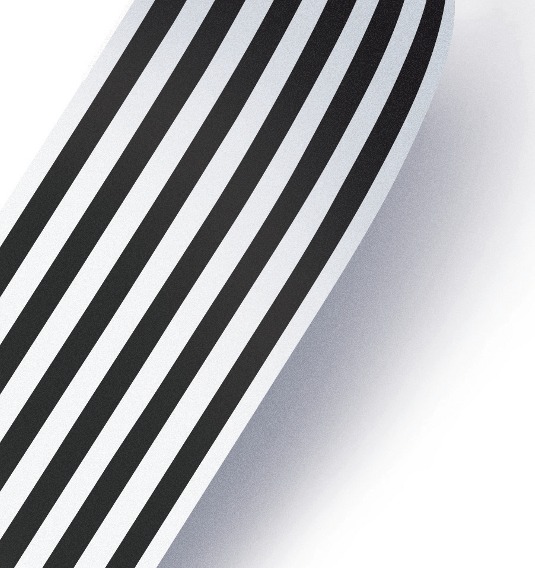
Developing the custom ribbon numerals for the Shanghai Ranking book was a major part of the project, as co-founder Jonathan Quainton explains Ribbon numerals.
Sign up to Creative Bloq's daily newsletter, which brings you the latest news and inspiration from the worlds of art, design and technology.
You are now subscribed
Your newsletter sign-up was successful
Want to add more newsletters?
Sawdust created a set of bespoke ribbon numerals as part of their design the for the Shanghai Ranking book - here they explain their process and some of the challenges they faced along the way.
Step 1

We wanted the ribbon style to reflect our graphic, systematic style rather than being too handmade or uneven. At the start, it was a case of experimenting to see if we could produce each number from one continuous strip of ribbon.
Step 2

We printed strips of paper with two line weights, positioned them and took photos to see how the light reacted. For example, we used see-through tape for the raised end of the ‘2’ and then referenced the way the shadows fell.
Article continues belowStep 3

The bottom of the ‘5’ proved particularly challenging because we didn’t want to simply use straight lines – the idea was to keep it true to a classic typeface, so we repeatedly printed the rounded part until we got it just right.
Step 4

We redrew the numerals in Photoshop and had several fully ready before we showed the client. They were predominately designed to be quite large, but they also needed to work at much smaller sizes so there was a lot of testing involved.
Words: Jonathan Quainton
Liked this? Read these!
- Create a perfect mood board with these pro tips
- The ultimate guide to logo design
- Great examples of doodle art
Seen some exciting letterforms lately? Tell us in the comments!
Sign up to Creative Bloq's daily newsletter, which brings you the latest news and inspiration from the worlds of art, design and technology.

The Creative Bloq team is made up of a group of art and design enthusiasts, and has changed and evolved since Creative Bloq began back in 2012. The current website team consists of eight full-time members of staff: Editor Georgia Coggan, Deputy Editor Rosie Hilder, Ecommerce Editor Beren Neale, Senior News Editor Daniel Piper, Editor, Digital Art and 3D Ian Dean, Tech Reviews Editor Erlingur Einarsson, Ecommerce Writer Beth Nicholls and Staff Writer Natalie Fear, as well as a roster of freelancers from around the world. The ImagineFX magazine team also pitch in, ensuring that content from leading digital art publication ImagineFX is represented on Creative Bloq.
