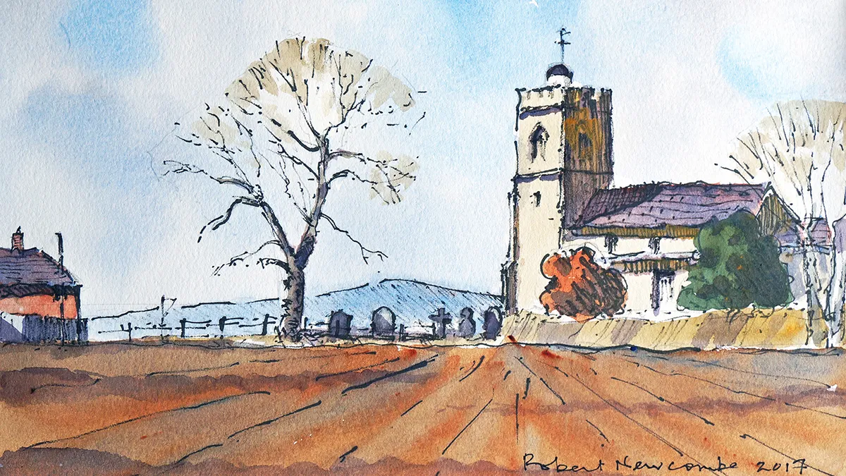
Medieval churches, green pastures and slate-topped farm houses are synonymous with the villages that litter the British countryside. Here I'll use my own 'five C’s of painting' – Concept, Composition, Contrast, Colour, Completion – as logical steps to paint the beautiful medieval St Laurence’s Church in Weston Underwood, the next village from where I live in the Cotswolds.
The photograph of the church was taken on a sunny but cool day in April from the edge of a field at the back of the church. I put a 3x3 grid on the photograph to help draw my composition. To do this, draw a 14 x 10-inch border on your watercolour paper and this will be exactly proportional to the dimensions of the photograph. Once done, draw a 3x3 grid lightly with a B pencil on the watercolour paper, which will proportionately match the grid on the photograph and enable you to transfer the image accurately.

For this painting, I used:
- Winsor & Newton Professional Watercolours in Raw Sienna, Burnt Sienna, Burnt Umber, Cobalt Blue, Ultramarine Blue, Brown Madder, light red.
- Bockingford Not 140lb (300gsm) 11x15-inch.
- Isabey Squirrel Mop Brush (size 10) for the broad washes and Escoda Perla size 8 and size 12 to use on the architectural details.
- For a pen, try a sharpened matchstick (such as Bryant & Mays Extra Long Matches) dipped in a bottle of waterproof Indian Ink. The matchstick makes it easy to achieve a line with character.
- B pencil.
- Putty rubber.
01. Paint from the photo

The first C is Concept (what you want to say in the painting). The concept here is an English country church on the edge of a village. I decide to refine the concept to create a warm autumn painting in contrast to the cool spring feel of the photograph; the concept now is an English country church in autumn. I also decide to have a strong sun from the left to light up the left facade of the church and create strong shadows for tonal contrast at the centre of interest.
02. Draw a pencil outline

Composition is the next C and refers to the arrangement of the painting. A pencil outline of the main elements is drawn by referring to the 3x3 grid on the photograph and putting dots on the watercolour paper grid where the main elements strike the grid lines. Then it’s a case of joining the dots – no detail, just the outline of the objects. For clarity, I’ve drawn the gridlines, dots and outline in strong 4B pencil, but you should draw these lines with a B pencil as lightly as you can.
03. Start the ink drawing

Line and wash is particularly useful for details on the buildings and drawing the trees. To produce a line with character, I’m using a sharpened matchstick dipped into waterproof black Indian ink. It is particularly good fun flicking in the trunks and branches of the bare autumn trees. As the ink drawing is completed first, it is critical that the ink is waterproof and doesn’t run when the watercolour washes are applied. As I’m left-handed, I start drawing on the right-hand side of the paper to avoid smudging the ink; if you are right-handed start on the left.
04. Complete the ink drawing

You will note I have made some adjustments from the photograph: I left out the rather ugly bush at the centre left of the photograph, which I felt competed with the church. I’ve also indicated some plough furrows in the foreground to create the autumn feeling but reversed the direction of the furrows to give directional perspective lines leading the eye to the centre of interest – the church. I also added a distant hill to improve the composition and add depth.
05. Hatch in the shadows

The next C to explore is Contrast (tone values). This refers to the darkness or lightness of objects in the painting; I create the tonal plan for the painting at the ink drawing stage by hatching in the shadows using vertical lines. The sun is coming from the left so there will be shadows on the right-hand side of the tower,the buttress and the gable end of the church, as well as an eaves shadow caused by overhanging roof. If you want to erase the grid lines, now is the time.
06. Paint the sky

Colour is the next C to consider, specifically whether it is warm or cool. I’ve decided on a predominantly warm painting so the sky will be warm light grey clouds with blue patches. I mix a warm light grey from Cobalt Blue and light red and another pan of strong Cobalt Blue. Using my mop brush, I apply clean water where I want the clouds and leave the paper dry for the blue patches. To emphasise the centre of interest, I put blue sky behind the church tower, leaving the domed cupola the white of the paper. Then I quickly paint the light grey wash into the damp paper, creating soft-edged clouds and drop in some more blue patches in a single wet-into-wet wash.
07. Begin the foreground

One of my concept decisions was to change the season to autumn and create a freshly ploughed field in the foreground in rich browns and reds to give warmth to the painting. The plough furrows were drawn in ink so at this point, a strong wash of Burnt Umber and Burnt Sienna is sloshed on with my mop brush. The shadows created by the furrows are dropped in while the wash is still damp.
08. Start a first wash on the buildings

I add a touch of Raw Sienna to my grey cloud wash to emulate the dull yellow grey of the Cotswold stone. Using my number 12 round brush, I paint the walls and tower of the church in addition to the gravestones.
09. Finalise the wash

The church, cottage roof and the domed roof of the cupola are all painted with a strong mix of Ultramarine Blue and light red mixed on the paper to vary the wash. I then use light grey again for the lead roof on the facing extension and paint the cottage walls light red. The large bush in front of the church uses Ultramarine Blue and Raw Sienna, and the other bush is Burnt Sienna. Both are put in while the church wall wash is slightly damp to give a soft-edge effect. The long dead grass at the edge of the field is watery Burnt Umber.
10. Add a shadow wash

The hatched shadows are reinforced with a strong shadow wash, which will turn on the sunshine. Shadows aren’t grey; they are a darker tone of the colour of the object plus some purple from the sky and reflected light from adjacent elements. For shadows I use a transparent mix of Ultramarine Blue and Brown Madder; the transparency of the shadow wash allows the colour to show through, which I reinforce with some strong colour dropped into the wet shadow mix, for example, Raw Sienna into the tower shadow.
11. Make the final touches

Completion is the final C. At this stage, I’m nearing the finish of the painting and there is a danger of adding too much. The trees need some indication of shape, so using quick downward strokes I dry brush in some light Burnt Umber. Then I emphasise the furrows in the foreground with some corrugated cloud shadows using the same shadow mix as before and dropping in some neat Burnt Sienna as the local colour.
12. Enjoy your work

At this point I refer back to my concept; English country church in autumn. Have I achieved my concept? I think I have, so the painting is finished.
This article originally appeared in issue 11 of Paint & Draw magazine, offering tips and inspiration for artists everywhere. Buy issue 11 here.
Related articles:

Thank you for reading 5 articles this month* Join now for unlimited access
Enjoy your first month for just £1 / $1 / €1
*Read 5 free articles per month without a subscription
Join now for unlimited access
Try first month for just £1 / $1 / €1
