How to create a striking manga character
Artist Valentina Remenar combines different painting styles to create her manga sci-fi warrior.
Sign up to Creative Bloq's daily newsletter, which brings you the latest news and inspiration from the worlds of art, design and technology.
You are now subscribed
Your newsletter sign-up was successful
Want to add more newsletters?

This painting was created as a poster for a Japanese event held in Slovenia, but even though it was a commissioned piece I was given the freedom to paint anything I wanted.
- Here's a quick guide on how to draw manga!
Because there was a Japanese theme, I decided to paint a manga character and also include some elements that represented Japanese culture, such as a katana sword. I also wanted to create a sci-fi environment and combine several different art methods, such as photobashing and 3D modelling.
When I start planning a concept I usually try to include elements that will help viewers to recognise what the painting will be used for, and place these at the focal point, which in this piece is the character and his katana.
I also decided to paint the character in a semi-realistic manga style, in order to give the piece a sense of solidity and make it look more believable. This will nicely balance the fact that the overall idea is straight out of my imagination: a sci-fi warrior combined with traditional Japanese elements
01. Making a rough sketch
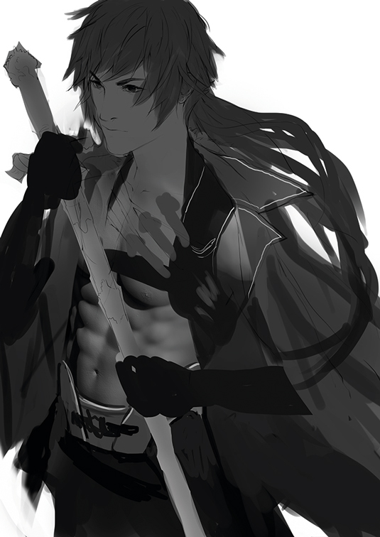
I usually begin in black and white. I create a rough composition and sketch for the character, using large black surfaces so I can quickly define the pose, the outfit and the composition. I also use 3D elements on the character's torso. I model and render this in ZBrush, then place it on the sketch.
02. Start photobashing
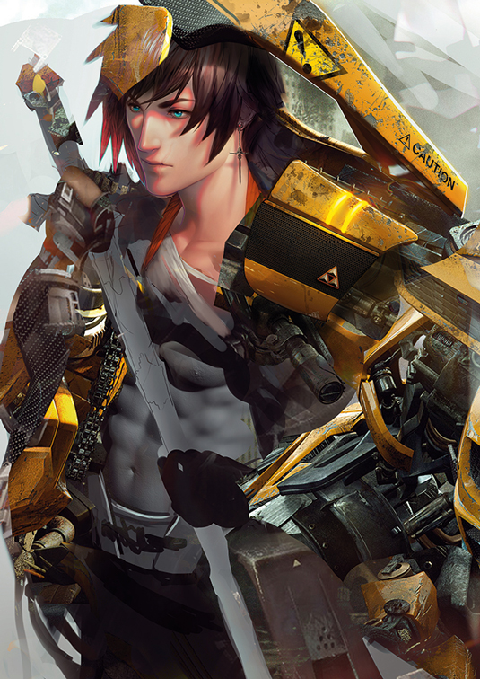
Now I combine my manga painting style with photobashing. I use cropped photos of various motor parts and place them around the character so it looks like he has a mechanical suit and arm. I start detailing the character and add colours using Overlay and Soft Light layer modes.
03. Painting the portrait
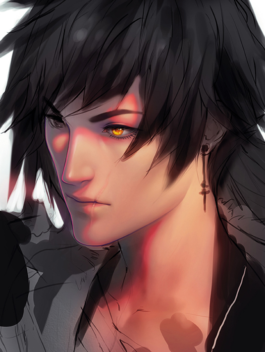
For the character's face, clothes and hair I use a default Hard Round Pressure Opacity brush and change its Hardness, using 0-40 per cent for softer blending and higher values for detailing. I use a vivid pink line to split the highlights and shadows, then paint the highlights with warm tones and the shadows with colder, pink-purple tones.
Sign up to Creative Bloq's daily newsletter, which brings you the latest news and inspiration from the worlds of art, design and technology.
04. Picking colours for highlighting
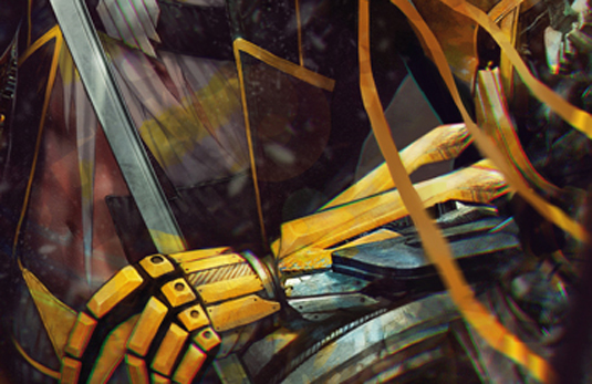
I set my light source at the top right of the image and add brighter, more vivid colours on the character's shoulders, arm and headpiece, so that the character catches the viewer's eye. For shadows I used less vivid colours and colder tones.
This tone difference is also visible on the character's face, where I use a soft pink line between lighter areas and shadow sections to achieve a nice contrast between the colder shadows and warmer highlights.
05. Give the armour a three-dimensional look
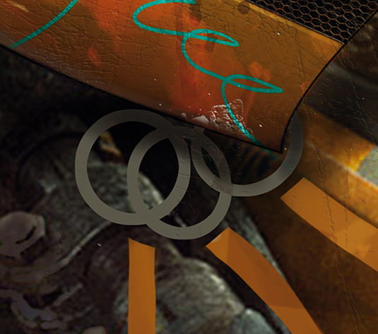
For some of the painting's details I use the Bevel & Emboss option, such as for the damaged parts of the armour on his shoulder and some metal details. I paint damaged parts or metallic parts with flat colour first, then apply the Bevel and Emboss effect for a more realistic 3D look.
06. Setting the background
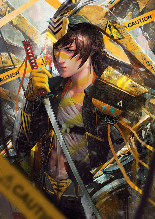
Now that my character is looking more finished, I decide that I need to hange the composition slightly. I move the figure to the centre, which will enable the viewer to see more of the environment. I want it to look like he’s standing in an abandoned ruined building, so I place various elements around him randomly.
07. Creating depth
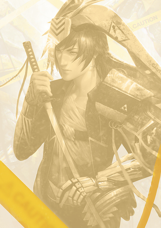
I make a point of placing different elements in the fore-, mid- and background. To create a sense of depth I place elements (the caution tape and cable) in the foreground, then blur them and make them darker so they don’t distract the viewer's eye from the character in the mid-ground.
For the background I use less-saturated colours and lighter tones, so the character will be more contrasted and stand out more.
Photoshop custom brushes
Rough Round Bristle
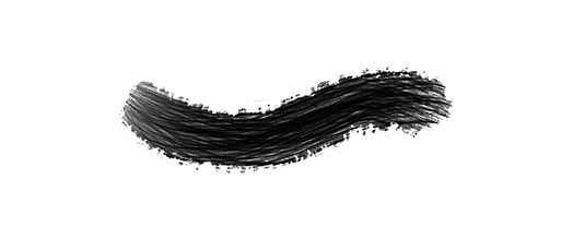
I use this brush for drawing war-paint on the skin and rough detailing.
SnowStorm
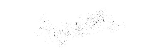
This brush enables me to quickly draw snowflakes in the scene.
Words: Valentina Remenar
Valentina is a freelance illustrator who produces art for games, cards, posters and books. She paints alongside her twin sister Marina, who's two minutes younger than her. This article originally appeared in ImagineFX magazine issue 121.
Like this? Read these!
- How to paint a galactic princess in Photoshop
- How to create line work that glows
- Free Photoshop brushes every creative must have

The Creative Bloq team is made up of a group of art and design enthusiasts, and has changed and evolved since Creative Bloq began back in 2012. The current website team consists of eight full-time members of staff: Editor Georgia Coggan, Deputy Editor Rosie Hilder, Ecommerce Editor Beren Neale, Senior News Editor Daniel Piper, Editor, Digital Art and 3D Ian Dean, Tech Reviews Editor Erlingur Einarsson, Ecommerce Writer Beth Nicholls and Staff Writer Natalie Fear, as well as a roster of freelancers from around the world. The ImagineFX magazine team also pitch in, ensuring that content from leading digital art publication ImagineFX is represented on Creative Bloq.
