These logo design disputes are utterly ridiculous
From Apple to Kanye West: the daftest design debates.
We've seen plenty of design disputes over the last few years, and most of them centre around that most sacred of brand elements: the logo. Many a brand (and, weirdly, many a celebrity) has taken issue with what they claim to be an overly similar design to their own.
But for every clear-cut case of copy and paste, there's a baffling claim. Here are some of the recent logo disputes that, for us, have fallen into the latter category. And if you want to create a logo that definitely won't be mistaken for another, check out our guide on how to design a logo.
Apple vs Prepear
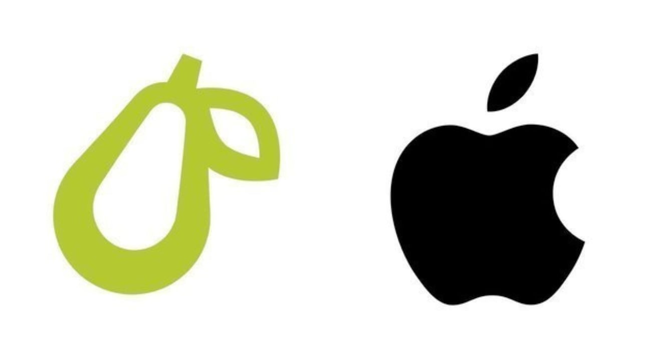
Back in 2020, Apple ruthlessly targeted a small business in a move that seemed to signal its intention to own the rights to the entire fruit bowl. The issue? Meal-planning app Prepear used a pear as its logo. That's right – a pear. Not an apple.
Article continues belowAccording to Apple's filing, the Prepear logo featured a "minimalistic fruit design with a right-angled leaf, which readily calls to mind Apple’s famous Apple Logo and creates a similar commercial impression."
In the end, the whole thing came to a rather baffling conclusion. The case was finally settled, with Prepear agreeing to slightly alter its logo to avoid causing a "dilution of the distinctiveness" of Apple's. And it changed the design by slightly straightening the bottom of the pear's leaf. It makes sense for Apple to want to protect one of the best logos of all time, but the change was so minor that we have to wonder if it was worth the effort (and no doubt money) on Apple's part.
Kanye vs Walmart
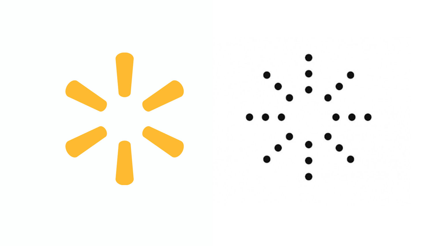
Last year, Walmart took issue with a sun-shaped logo (below) intended for use as part of Kanye West's fashion label, Yeezy. Walmart said the logo, featuring a collection of dots in the shape of the sun's rays, was far too similar to its own sun-shaped logo, and that it will create "confusion" and a "false suggestion of a connection" to Walmart's brand.
Walmart refused to accept defeat after a first attempt to block the logo was quashed, amending its original claim by replacing its "Deception/False Designation of Origin" claim with a "False Suggestion of a Connection" claim. But it's unsurprising that the initial claim was thrown out – with its extra, dotted lines and monochrome colour scheme, the Yeezy design is hardly a spitting image of Walmart's.
Sign up to Creative Bloq's daily newsletter, which brings you the latest news and inspiration from the worlds of art, design and technology.
Chanel vs Huawei
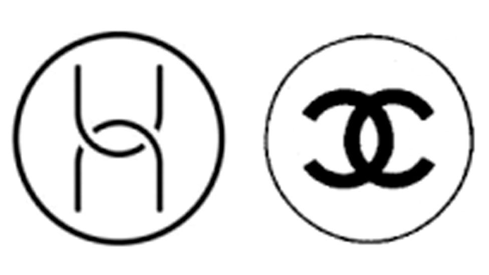
When was the last time you bought a Chanel computer? Last year, the fashion house was worried that tech brand Huawei's new logo, designed specifically for its computer hardware, was confusingly similar to its own.
Sure, both consist of two interlocking curves inside a circle – but they're essentially opposites of one another. Not only do the curves face a completely different direction, but Chanel's logo features more rounded curves and thicker lines. Oh, and they are, of course, completely different brands in completely different sectors.
Somewhat unsurprisingly, Chanel lost an EU court battle over the logos. According to the BBC, the EU General Court in Luxembourg ruled that the logos "share some similarities but their visual differences are significant".
XFL vs Togethxr
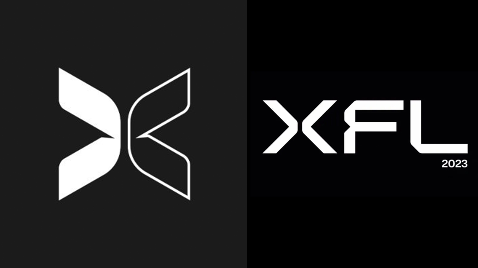
Another day, another logo dispute between celebrities. To much fanfare, actor Dwayne 'The Rock' Johnson revealed the new logo for the 2023 XFL football league this week. And to even more fanfare, footballer Megan Rapinoe called out its similarity to the branding for Togethxr (a company founded by Rapinoe's wife).
Both logos feature a sans-serif 'X' with a split down the middle – and the similarities end about there. While Togethxrx, a media company that "aims to change the way society views traditional roles for women," uses just an 'X' as its logo, XFL's logo features all three letters. And the 'X's aren't even that similar aside from the split in the middle – Togethxr's is rounded and two-tone, whereas XFL's is sharp, and all-white. They say X marks the spot, but it's hard to locate the issue here.
Want more logo controversy? Take a look at our pick of the worst logos of 2022 so far.
Read more:

Daniel John is Design Editor at Creative Bloq. He reports on the worlds of design, branding and lifestyle tech, and has covered several industry events including Milan Design Week, OFFF Barcelona and Adobe Max in Los Angeles. He has interviewed leaders and designers at brands including Apple, Microsoft and Adobe. Daniel's debut book of short stories and poems was published in 2018, and his comedy newsletter is a Substack Bestseller.
