Flat design be damned! Stunning photorealistic app icons
Skeuomorphism lives! Californian design studio CreativeDash thumbs its nose at flat design with these incredible iPhone icons.
Sign up to Creative Bloq's daily newsletter, which brings you the latest news and inspiration from the worlds of art, design and technology.
You are now subscribed
Your newsletter sign-up was successful
Want to add more newsletters?

Everyone's going flat design crazy right now, with Apple rumoured to be ditching skeuomorphic design, Facebook's icon going 2D, and everyone asking 'what is flat design?'. As a result, designers have been falling over themselves to showcase their 2D talents, with flat design concepts of everything from Instagram to iOS 7 appearing online.
Not everyone is bowled over by this most clean and primary of graphic design trends, however. We get as many correspondences slating examples of flat design as praising it, so it would be no surprise to find a counter-movement in the industry - and it could well be headed up by California-based design studio CreativeDash.
Photorealistic icons
These stunning photorealistic icons created by the San Francisco studio show what is left in the world of skeuomorphism to explore. "An app icon is the face of an app just as a book cover is the face of a book," the team says. "Even though people try to teach themselves to not to judge a book by its cover, it is still a very simple and efficient way to quickly assess something.
Article continues below"We produce a very clear and attractive 'face' for your app," they continue, "which intrigues a potential user and entices them to download." Does a plain, flat app do that? Let the debate continue...

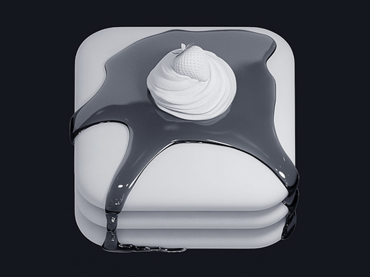
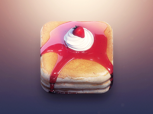

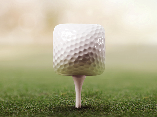
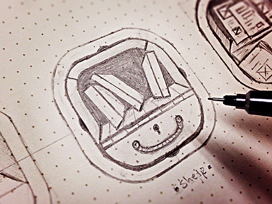

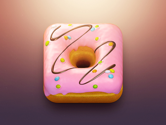
See more of CreativeDash's work on their Behance page
Liked this? Read these!
- How to build an app
- Download the best free fonts
- Adobe Photoshop CS6 hands-on review
- Create a perfect mood board with these pro tips
Is skeumorphism over? Is flat design the future? Let us know your views in the comments below...
Sign up to Creative Bloq's daily newsletter, which brings you the latest news and inspiration from the worlds of art, design and technology.

The Creative Bloq team is made up of a group of art and design enthusiasts, and has changed and evolved since Creative Bloq began back in 2012. The current website team consists of eight full-time members of staff: Editor Georgia Coggan, Deputy Editor Rosie Hilder, Ecommerce Editor Beren Neale, Senior News Editor Daniel Piper, Editor, Digital Art and 3D Ian Dean, Tech Reviews Editor Erlingur Einarsson, Ecommerce Writer Beth Nicholls and Staff Writer Natalie Fear, as well as a roster of freelancers from around the world. The ImagineFX magazine team also pitch in, ensuring that content from leading digital art publication ImagineFX is represented on Creative Bloq.
