Instagram app reimagined with flat design
With the shift to flat UI design showing no signs of abating, Instagram receives a redesigned concept interface.
Sign up to Creative Bloq's daily newsletter, which brings you the latest news and inspiration from the worlds of art, design and technology.
You are now subscribed
Your newsletter sign-up was successful
Want to add more newsletters?

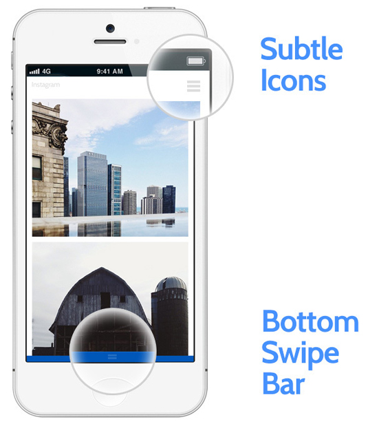
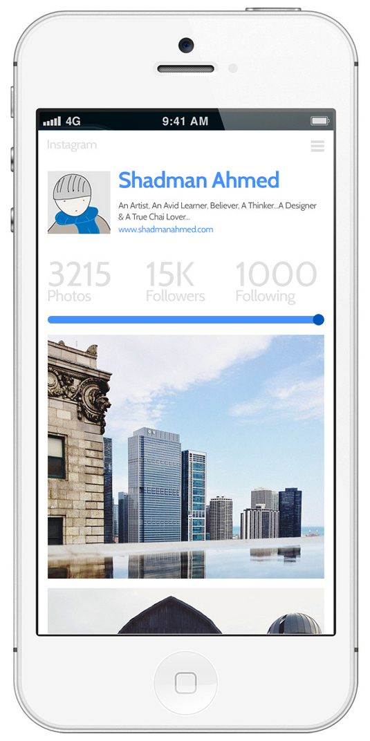
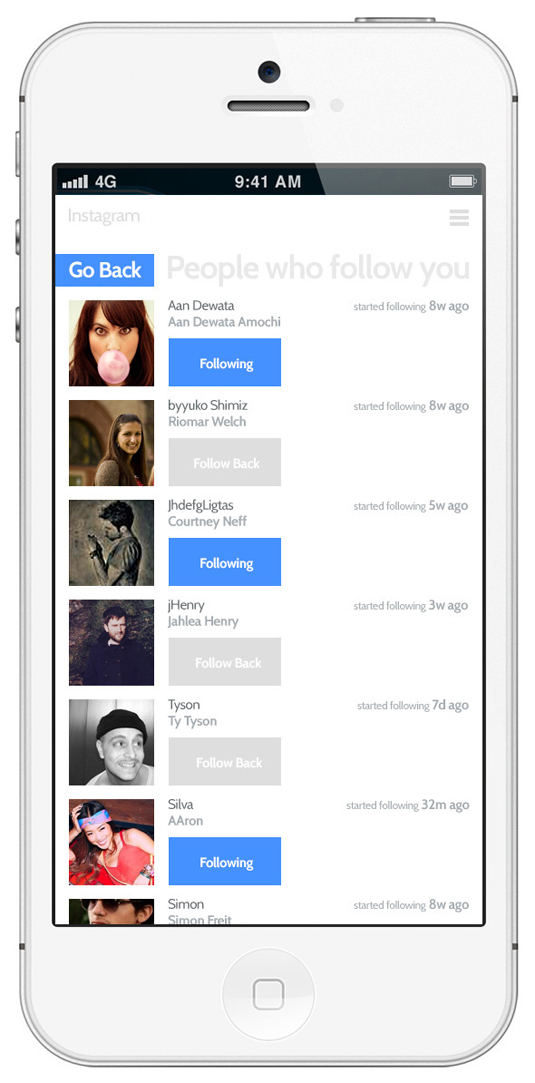
Another day, another major brand's design is flattened in the name of progress. Well, not officially, but just in case photography app Instagram should decide to follow the flat design trend, UX designer Shadman Ahmed has come up with this eye-opening concept.
- What is flat design? Find out here
Microsoft first trod the flat design path with its Metro/Windows 8 interface, but major players including Facebook, Apple and Ford have joined them in replacing 3D shading with clean 2D lines.
New Delhi-based designer Ahmed, who specialises in UX and UI design, has created the concept interface to give "a cleaner looking UI for Instagram". He has called the concept "White Space", and it features simplified versions of existing Instagram features as well as completely reimagining elements including the explore, options, and news/notifications screens.
Article continues below 


Check out more details about Ahmed's concept on his Behance page.
Liked this? Read these!
- How to build an app
- Download the best free fonts
- Adobe Photoshop CS6 hands-on review
- Create a perfect mood board with these pro tips
Would you like to see Instagram given a flat design-led makeover? Let us know your views in the comments below...
Sign up to Creative Bloq's daily newsletter, which brings you the latest news and inspiration from the worlds of art, design and technology.

The Creative Bloq team is made up of a group of art and design enthusiasts, and has changed and evolved since Creative Bloq began back in 2012. The current website team consists of eight full-time members of staff: Editor Georgia Coggan, Deputy Editor Rosie Hilder, Ecommerce Editor Beren Neale, Senior News Editor Daniel Piper, Editor, Digital Art and 3D Ian Dean, Tech Reviews Editor Erlingur Einarsson, Ecommerce Writer Beth Nicholls and Staff Writer Natalie Fear, as well as a roster of freelancers from around the world. The ImagineFX magazine team also pitch in, ensuring that content from leading digital art publication ImagineFX is represented on Creative Bloq.
