How a leading London airport was rebranded for the future
Behind the scenes on ico Design's fresh, flexible new visual identity for London Luton Airport.
Sign up to Creative Bloq's daily newsletter, which brings you the latest news and inspiration from the worlds of art, design and technology.
You are now subscribed
Your newsletter sign-up was successful
Want to add more newsletters?
Behind the scenes on ico Design's signage for London Luton Airport
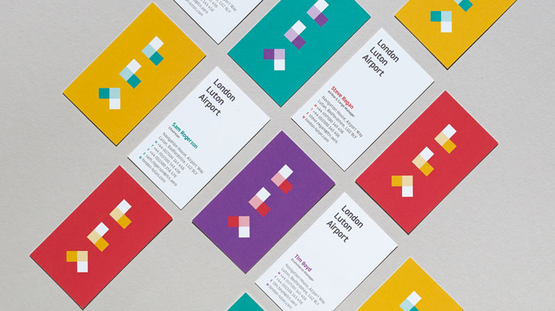
Vivek Bhatia: We knew that whatever identity we came up with, it had to be future-focused. It had to represent the ambitions and aspirations of the airport and also the idea that airports are incredible spaces, in the sense that they're not just meeting points, they're crossroads of cultures.
LLA will become a destination in its own right, and the identity should reflect that. Rather than it being a static identity, the new brand is something that has a core form but can be manipulated in lots of different ways.
The advantage of that is that we can use it in ways that work on a corporate level, on a local level, in print, in three dimensions and digitally, but also to speak to passengers in a more interesting, engaging and memorable way. Here's how we did the signage...
01. Balance personality with legibility
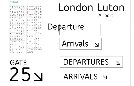
When it came to the typeface, initially it was about what felt appropriate; we wanted a sense of modernity but also something that would feel welcoming to passengers.
On a more functional level it had to be highly legible at different sizes, so we did many tests across notional signage, advertising and online applications. We also wanted something with sufficient personality that would unite all communication from the airport.
02. Talk to a type foundry
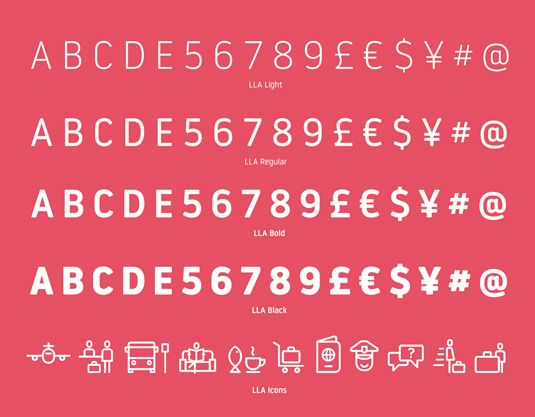
We approached Spanish type foundry Atipo as their typefaces had a sensibility that felt right for what we were trying to achieve. The LLA typeface was inspired by DIN, which has become a standard across the German transport system.
03. Develop the iconography
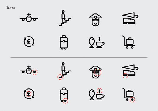
We were always keen for iconography to be coherent with the typeface and be part of it. We initially created a series of icons in the studio to get a feel for what we were after, before collaborating with Atipo to complete the full set.
Sign up to Creative Bloq's daily newsletter, which brings you the latest news and inspiration from the worlds of art, design and technology.
04. Focus on the fine details

There was some back and forth, but they totally understood. A few icons have more personality to add a little bit of delight without compromising legibility or understanding – the food and drink icon uses a fish and a mug, and the toilet signs have duplicates that work as wayfinding but also as graphics on arrival.
Words: Anna Richardson Taylor
The full version of this article first appeared inside Computer Arts 238. Computer Arts 241, a character design special, is on sale now.
Half-price CA subscription offer!
To celebrate 2015 degree show season, you can get an incredible 50 per cent off an annual subscription to Computer Arts magazine. For £39 you'll receive 12 months of industry insight, opinion and inspiration, delivered to your door.
Plus: sign up by 7 July 2015 and you'll receive Computer Arts' New Talent issue, featuring an extensive guide to 2015's most outstanding design graduates.

The Creative Bloq team is made up of a group of art and design enthusiasts, and has changed and evolved since Creative Bloq began back in 2012. The current website team consists of eight full-time members of staff: Editor Georgia Coggan, Deputy Editor Rosie Hilder, Ecommerce Editor Beren Neale, Senior News Editor Daniel Piper, Editor, Digital Art and 3D Ian Dean, Tech Reviews Editor Erlingur Einarsson, Ecommerce Writer Beth Nicholls and Staff Writer Natalie Fear, as well as a roster of freelancers from around the world. The ImagineFX magazine team also pitch in, ensuring that content from leading digital art publication ImagineFX is represented on Creative Bloq.
